Tuesday, December 28, 2010

Certification Updates

Standard Certification Classes 2011, North America
There are a few Papercrafting Certification classes in the next two months, but you won't see March or April classes on the calendar for another couple weeks. If you have questions about the program you can e-mail Nancy, nancy@copicmarker.com for more info.

Jan. 16 Phoenix AZ taught by Jennie Black Open to Public
Jan. 28 Los Angeles, CA (CHA) taught by Jennie Black Open to Public

Intermediate Certification Classes 2011
We still have plenty of space in the Intermediate class, so don't be afraid of applying, as that is bound to be a great class before CHA. These classes are for people who want to take their coloring to the next level. We discuss shading, composition, and coloring more realistically. However, it is important to have mastered basic marker techniques, like blending and feathering.

The purpose of the application is to make sure that we don't have to slow down the class for those who have not mastered basic concepts. However, most people who have been coloring for a couple years and taken the Standard Certification should have no problem passing the test. If this sounds like you and you think this is some great stuff to learn, then go ahead and fill out the application! You probably will make it in.

Jan. 27 Los Angeles, CA (CHA) taught by Debbie Olson & Sherrie Siemens subject to approved application

April, date TBA, Phoenix, AZ taught by Debbie Olson & Colleen Schaan Applications are not available yet

Click here for applications and class details (time/location/fees) for each session. Also, there are lots of classes coming up internationally as well:

International Certifications

UK Certifications
Wendy Kadzidlo, the instructor for UK Certification classes will be teaching a couple classes in the upcoming months.

March 4th – Stevenage, Herts, taught by Wendy Kadzidlo
May 27th – Warrington, Cheshire taught by Wendy Kadzidlo

For information on these classes, please e-mail Wendy: wendy@stampsandmemories.co.uk

Australian Certifications

5 March, Melbourne Beginner Certification - Taught by Mandi
12 March, Sydney Beginner Certification - Taught by Mandi (click here for Australia class info)

Other events
If you are attending Winter CHA in Los Angeles, CA then stop by our booth and check out the new releases. I'll be in the booth the whole week, demoing markers, as will many of our instructors. Next week we'll tell you what some of those releases will be, so stay tuned. Also, each of our instructors teaches classes of their own. Go to their blogs to find out more about their classes in your area and how to register for events. Have a Happy New Year!

Monday, December 27, 2010

Faux Tea-dyed flowers

Searching in my blog
Before I jump into today's tutorial I just wanted to explain something about this blog. I have tons of things archived over the last few years. You can approach this site by starting at the beginning, back in June of 2008 and reading through, or you can search topic by topic.

People occasionally ask me how to search through my blog. To search by topic, just type a word in the search bar up at the top of this blog. This will limit your search to only things on my blog.

If you are looking for information on a specific product line, then you can search using the glossary in the left sidebar. I hope this helps you find some hidden tutorials that you may have forgotten.

Faux Tea-dyed flowers
I made my own Christmas cards this year, and since I had to make so many, I kept the design VERY simple. It takes too long to color a cute little image on that many cards, so instead I used some hand-dyed paper flowers. You can use this same effect on wide ribbon to make it look tea-dyed as well.

These flowers are very easy to make with Copic markers, and look really cool when you are done. Before you start, be sure to have plenty of clean scratch paper under your work, as this gets messy.

First, take your paper flower and scribble on it with a middle/dark color. For this flower, I used R59. The final color will be both lighter and darker than this color, so test a few colors to find the one that will end up matching your project the best.


Next, you need to add a lot of colorless blender. I like using an empty water-brush that has been filled with colorless blender. If you don't have a water-brush, then you can accomplish the same thing by dipping your colorless blender straight into the big refill bottle, then dripping the blender on. This will make the flower very wet and make the inks flow around similarly to if you were actually dying the flower.


Wherever you drip the blender, the color on the flower will start to bleed away from that area.

If you drip in the middle first then the color will run out to the petals more. If you drip a small drop onto each petal then it will push the color out to the edges of each petal. The second flower was soaked evenly all over, see how the colors muted more and ran together more? If you like this look then go for it.

Once you get the look you want, let the flower dry completely before touching it. If you have a drop of ink on your finger and touch the wet flower, then it will pick up that color. If there is color on the scratch paper under the flower it could pick up that ink as well.

Here are some variations on the effect. The small pink/purple flower has a nice 2 tone feel, with purple added to the edges only, pink in the middle, then blended from the middle out. The little brown flower was the same, just with one color. The larger flower was scribbled more randomly so the white spots are more irregular.

Here is one of my finished, simple Christmas cards. I hope this has given you some ideas. Tomorrow I'll post about upcoming Certification classes. Next week we have some exciting announcements for 2011, so stay tuned!

Wednesday, December 1, 2010

Shadow Color & Certification

I wanted to share something that was recently shared with me by Ken O'Connell, the president of Imagination International, Inc. (Copic USA) and one of my former art professors.
He was recently in a bookstore, saw this book, and wanted to share this tidbit on lighting and shadows and snowmen, as we have been spending so much time on this blog discussing light and shadows, and many of you have seen my snowman coloring tutorial at the end of a Certification class. Sometimes it helps to hear a concept a couple different ways, from different people, so, from Ken...

Color in light and dark
The first mistake most people make in shading light and dark areas of an image is to think the light areas are white or whiter and the dark areas are black or blacker. This is rarely the case. Both Light and Shadows have color. Look closely. It is easier to see it in the light as it allows us to see the color better than dark shadows, but if you lighten the shadows you can see it clearly.

Basically Sunlight is yellowish and shadows are bluish. Why? Because the sun lightens ares that it shines on and the blue sky illuminates the shaded areas that block the sun. Sometimes the surface for a shadow has color and that combines with the shadow color to mix another color. Grass in the sun will be yellow green and grass in the shade will be blue green. The deeper the shade the deeper the blue color.

So light sources are often warm and shaded areas often cool but, the opposite is also true. In snow at night the moon light is quite blue and often the shadows are warm, especially if there are street lights to lighten up the shadows.

If you go to a bookstore this season, look a the children's book SNOWMEN AT NIGHT by Caralyn Buehner. It features lots of illustrations of snow people in moonlight with shadows of warm orange. It shows the light source of the moon (bluish) as well as the street lamps (yellowish). These two sources of light play a role in the light and shadow on the color of the snow, which we always think of as just white....

We will try to post more of Ken's discussion on light and shadow on the official Copic website blog sometime in the future.

Upcoming Papercrafting Certifications
2010 is winding to a close, and I want to thank everyone who attended a certification this year. We had a total of 52 classes in North America! Wow! Which means, that we are gearing up for a busy 2011, with more Intermediate classes and we are trying to hold Certifications in cities that have not had classes yet. Keep looking for more classes opening in the next month in your area. Remember, if you want to take the Intermediate class you need to take the standard certification first.

Standard Certification Classes 2011
Jan. 16 Phoenix AZ taught by Jennie Black Open to Stores & Designers
Jan. 28 Los Angeles, CA (CHA) taught by Jennie Black Open to Stores & Designers


Intermediate Certification Classes 2011
Jan. 27 Los Angeles, CA (CHA) taught by Debbie Olson & Sherrie Siemens subject to approved application

Click here for applications and class details (time/location/fees) for each session.

Upcoming Events
I will be teaching workshops this Saturday, Dec. 4th at Art Supply Warehouse in Westminster, CA. For teenagers, I will be offering a How to Draw Manga class, then for anyone who wants to attend I will be teaching a coloring class. Both classes require preregistration through the store, as space is limited. As this class is being held at an art store I will be focusing the discussion on art papers and inking supplies, though papercrafters are welcome to attend. Friday afternoon, Dec. 3rd, I may also be doing in-store demos, if time permits.

I hope to see you there!

Wednesday, November 10, 2010

Events This week

Today and Thursday I will be down at the University of Oregon bookstore, downstairs in the art department doing Copic demos and illustrations from about 10am to 5 or 6pm each day. Come and visit me and bring your Copic questions! This annual event at the bookstore has been going on for more than 25 years, and has many artists demonstrating all sorts of techniques, in conjunction with the annual sale. It's really inspiring to see so many talented people at work.

Thursday evening, Nov. 11th I will be teaching a Copic Marker Rendering Basics class at DIVA, at 110 W. Broadway in Eugene. To register for that class call 541-344-3482. This class is geared for artists, illustrators, professionals, and students who want to learn more about how to use Copic Markers. All supplies are provided.

Saturday Nov. 13th, I will be teaching a workshop at a fantasy convention in Portland. www.orycon.org

Meanwhile, here is a picture I drew and colored this week. It was for a client who decided they wanted a different image, so I can share this rendering with you.

She was drawn with a multiliner, then photocopied onto color laser copier paper. Her pants are colored with about 6 different shades of pink, from RV00 to RV21, and tiny hints of V12 and V17, with some C1 thrown in for good measure, then colorless blender was dabbed on to make the texture.

The Rabbit was colored with W1, W3, W7, E31, (these were scribble on to create the fuzzy look) and some hints of C1 and C3, with RV21 for the ears. The shirt was colored with RV00, V12, V17, BV04, RV13, and C3, then blended together with the colorless blender. Her skin is colored with E000, E11, E13, E33, and BV00. Her hair is all shades of Cool grays, with some hints of V17 thrown in to subtly match the hair to her shirt.

The final image is about 6 1/2 inches high, and took just over an hour to color. I hope you have a great day and get a chance to come see me this week, as you can see this final colored image in my example book.

Monday, November 1, 2010

Certification Updates

The intermediate class in Chicago was a great success! I am so excited about the subjects we covered in that class, and I know you'll love the suggestions for making your work look more lifelike. The manual for that class is overflowing with great suggestions for adding shadows and depth to your work, so if you love coloring and get a chance to attend an Intermediate class I strongly suggest it. In a few months we will post a list of upcoming 2011 classes, as well as a list of locations for Intermediate classes, so stay tuned! Meanwhile, the year is winding down, and we have a few standard Certifications coming up in North America.

Nov. 6th
San Antonio, TX taught by Jenn Balcer Open to the Public
Nov. 8th Richmond, VA taught by Colleen Schaan Open to the Public
Nov. 14th Halifax, Nova Scotia taught by Sherrie Siemens Open to the Public
Nov. 16th Detroit, MI taught by Debbie Olson Open to the Public
Nov. 20th El Paso, TX taught by Jenn Balcer Open to the Public
Nov. 20th Denver, CO taught by Marianne Walker Open to the Public
Nov. 21st Tampa, FL taught by Colleen Schaan Open to the Public

If you need an application for a Standard Certification, you can download one here.

Future Intermediate Classes (applications have NOT gone out yet, this is for planning only). More will be added to this list in the next couple months, so stay tuned:
January, 27 (Before CHA) LA, CA taught by Sherrie Siemens and Debbie Olson
April, Date TBA, Phoenix, AZ taught by Marianne Walker

Have a great week!

Saturday, October 16, 2010

Coloring around tiny details

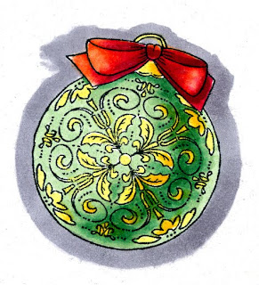
Sorry I couldn't get this post up earlier, but I was having blog problems. It's all fixed now, so here's the tutorial for the Just Rite Blog hop. If you look at the ornament I colored a few days ago, you'll notice that I was very careful about coloring the main ornament green and the tiny details yellow. I did not use the blender to clean up the areas, rather, I was very careful in my coloring.

Coloring Around Tiny Details
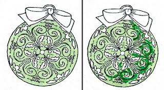
First, you want to start with the main color that you are working around the details. In this case, it was the light green. I stamped my image with Memento and made sure it had dried really well before coloring, since tiny details would show bleeding more than usual.

Carefully color with the base color, G12. I used the very tip of the brush and had no problem working around even the smallest of shapes. At this point, if I had made mistakes I could still clean out the white areas with my colorless blender, but I don't really need to on this image. When cleaning up you need to have a lot of patience. dab a tiny amount of blender on, let it dry, dab another tiny amount and so on. You can't scrub in the blender like usual to clean up areas.

Next, I lightly scribbled in the dark green, G17. I scribbled because I had to be careful to not oversoak the areas I want to blend, as it could easily bleed into the surrounding details.

Now I can ever so carefully go back with the G12 and lightly blend the darker green out. I want the areas where the darker green fades into the lighter green to be as smooth as possible to keep the dimensional illusion to the ornament. It's OK if I lose the darkest areas of the darker green.

Once the blending is dry I went back with the dark green and touched in my deepest contrast again. The base colors need to be dry in order to keep the edges crisp. Now you can really see the dimension on the ornament. I like the high contrast between the G12 and the G17- this is what makes the ornament look so round.

Finally, I colored the yellow details- lighter on the light side, and Y17 in the shadows. I was not as worried about precision, since the yellow would not show up if I accidentally colored over the green areas.

The paper I was coordinating with was very orange-red, so I used YR09 and RV29 for my base red tones on the bow. Then I darkened it with R59. This helped pull the reds together. Again, I was careful to keep all my highlights and shadows consistent with the main ornament so the whole image looked better. Then I colored a middle gray around the outside of the ornament, since I knew I would be cutting it out and I wanted some contrast between the ornament and the background paper, but I didn't want to cut two pieces of paper.

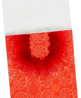
One detail that you might not notice right away on the final bookmark is that on the base papers, I wanted to coordinate the colors a little better, so where the light gray paper met the red I blended in a very light layer of C1 and C2. Then, under the area where the ornament is sitting I added some of the reds, again, feathering them out until it created a darker halo around my ornament that smoothly blended out to the reds of the paper. I also did this along the bottom edge of the red paper. Thanks for stopping by, have a great weekend, and I'll see some of you in a few days in Chicago!!

Wednesday, October 13, 2010

Just Rite Blog Hop

Christmas Bookmark
I realized while at the dentist this morning that I forgot to write the tutorial portion of this project for the Just Rite 12 weeks of Christmas Blog Hops #6!

Every Wednesday up until Thanksgiving some of your favorite designers will be joining some of the JustRite design team for a series of Christmas blog hops, showcasing JustRite’s entire Christmas Collection of stamps! This week, it’s most of the Copic design team and Certification instructors! So mark your calendars for Wednesdays at 9am Central for great Christmas gift, card & project ideas, starting at the JustRite Inspiration blog!

You may think that I have fallen off the face of the internet, and I do apologize, however, I have been polishing up the new Intermediate Certification manual (which is going to be jam packed with information) and getting ready for Chicago next week.

My project today was made with the new Christmas Ornament Set and Christmas Nested Frames & Occasions set from Just Rite.

I colored the image using G12, G17, Y13, Y17, YR09, R29, R59, C1, C2, C4, and 0. The background paper is from the Cosmo Cricket Everafter collection. I thought it paired perfectly with the pattern on the ornament. The pale gray paper is a textured paper I've had for years. The bling is from Prima, and the big ribbon is from Offray.

Thanks for stopping by today, and I'll be sure to type up the full tutorial tomorrow.

Please visit these designers’ blogs to see what fabulous Christmas projects they have for you on the hop today!

Sunday, September 26, 2010

Fall Leaves Header

You may have noticed a few days ago that I switched to a new header for the season. This image is from a picture I colored a few years ago. For the complete tutorial on how I colored the picture of markers, please visit this older post.

Meanwhile, come visit me in Savannah at the College of Art & Design. I'll be in the booth Friday and Saturday down at the SCAD River Club.

Tuesday, September 21, 2010

Rainy Tutorial

Dripped Water
Today I wanted to show you some simple methods to show, wet, drippy things. i know I've shown water drops in earlier posts, reflections on water, but I figured you can never have enough water tutorials, as water can be pretty tricky.

I started by choosing my light source and coloring the galoshes in shades of yellow. The scanner didn't pick it up, but I used Y06, Y38, and E35. The E35 helped tone down the shadows, otherwise they would have looked glowing orange instead of shaded yellow.


When we want something to look wet or shiny, the best way is to have very strong contrast between light and dark. In this case, we'll want the puddle of water to look wet, and we'll make the galoshes shiny, and add drops of water on both the umbrella and the galoshes. Since the image is so tiny, I'm going to worry about adding contrast back in later.


Next, I colored the water with B41. I want this to look dimensional, so I left strong white highlights on the edges that were closest to the light. I darkened the shadows with B45 and added a dark rim around the bottmo edge, especially on the shaded edges of the water. Already, the water is looking more wet and is catching the shadows from the boots and umbrella nicely. Now we can move on to coloring the umbrella.


I want the umbrella to be pink and purple. Notice that the way the light is shining, it is the inside of the umbrella that will be the brightest, not the outside. Also, keep in mind that the bottom of the umbrella outside will have darker shadow than the top of the umbrella, as there is less light bouncing around under the umbrella.

I colored the purple areas with B12, B17 and a hint of B79 to darken it up. Then, I colored the pink areas with RV00, RV02, RV04, and a hint of E04 to tone down the neon pink on the outside of the umbrella, yet keep the same feel of the base pink tone.

Now I am ready to add some drips of water. To do this, I start by grabbing my darker blue, B45 and adding spots on strategic places around the boots and umbrella. Don' go crazy- just add enough to make it look like it still has some drips left on the surface.

Last, with a tiny brush, take a jar of Opaque White and a really tiny brush and add a speck of white back into the center of each drop. Add a couple shiny highlights onto the edges of the galoshes that sick out closest to the light. To make the water appear shiny I added a couple simple parallel lines along the surface.

Now I have a pair of drippy wet boots and a wet umbrella. I hope you have a dry day today and have fun coloring!


Class Updates

It's officially Fall here in Oregon, which means that the rain has started. Maybe in April I will see the sun again. I apologize that I have not blogged in a while, I have been very busy writing the new Intermediate Manual, so all my tutorial efforts have been going into that book. To get you into the mood for rain, I'm sharing a quick tutorial on coloring a drippy umbrella and galoshes.

Before I get into that, here is an update on all Certification Classes coming up this Fall:

Sept. 25th Salt Lake City, UT taught by Jennie Black Open to the Public
Sept. 26th Calgary, Alberta taught by Sherrie Siemens Open to the Public

Oct. 2nd
Buena Park, CA taught by Jennie Black Open to the Public
Oct. 8th Jacksonville, FL taught by Colleen Schaan, Open to the Public
Oct. 15th Vancouver, WA taught by Jennie Black, Open to the Public
Oct. 21st Chicago, IL taught by Lori Craig, Open to the Public
Oct. 22nd Chicago Intermediate taught by Marianne, Sherrie, & Debbie Spaces still available

Nov. 6th
San Antonio, TX taught by Jenn Balcer Open to stores & designers
Nov. 8th Richmond, VA taught by Colleen Schaan Open to stores & designers
Nov. 14th Halifax, Nova Scotia taught by Sherrie Siemens Open to the Public
Nov. 16th Detroit, MI taught by Debbie Olson Open to stores & designers
Nov. 20th El Paso, TX taught by Jenn Balcer Open to stores & designers
Nov. 20th Denver, CO taught by Marianne Walker Open to stores & designers
Nov. 21st Tampa, FL taught by Colleen Schaan Open to stores & designers

If you need an application for either Intermediate or Standard Certifications, you can download one here.

Also, there are lots of classes coming up internationally as well:

Oct. 25th Brisbane QLD, taught by Kathy Jones (click here for Australia class info)
Oct 27th Wiesbaden, Germany taught by Diny Sprakel (for class information please e-mail Britta: b.rumpf-burblies@holtz-gmbh.de )
Nov. 8th Sydney, NSW , teacher TBA
Nov. 20th Melbourne, VIC Taught by Mandi Lee Klinger
Nov. 21 Elcot park Hotel, Nr Newbury, Berkshire, UK taught by Wendy Kadzidlo (click here for UK class details)

Whew! there are a LOT of classes this Fall! Now, onto the tutorial...

Monday, September 13, 2010

New classes coming up!

As the seasons change our Certification instructors are busy adding classes. Next week there will be a whole bunch of NEW applications going out, including:

Nov. 14th Halifax, Nova Scotia taught by Sherrie Siemens
Nov. 16th Detroit, MI taught by Debbie Olson
Nov. 20th Boulder, CO taught by Marianne Walker

You can check out the full list of currently available applications here. There are still a couple spots in the Intermediate class open as well, so get your applications in quickly.

Meanwhile, we have some great events coming up this Fall as well. Over the weekend I had the pleasure of doing a demo at the Eugene Teen Mayor's Art Show. Where else can you see me this Fall?

Sept. 30-Oct. 2 Savannah, GA Savannah College of Art & Design Art Materials Trade Show
Oct. 30 Eugene, OR Maude Kerns Art Center, Teen Manga Drawing workshop (to register please call 541-345-1571)541.345.1571541.345.1571 541.345.1571
Nov. 10 & 11th Eugene, OR University of Oregon Tools of the Trade Show, U of O Bookstore
Nov. 11th Eugene, OR Adult Marker rendering workshop, DIVA Art Center (to register please call 541-344-3482)

I'm looking forward to seeing everyone in the next few months!

Monday, August 30, 2010

Feather Blending, again


I had a great time at the Manga demo in Portland this weekend, and I had a chance to color this wizard picture I had drawn years ago. It's always fun to re-visit old images and color them with fresh eyes. I like this version a lot better than the version I colored oh so long ago.

Just to give you an idea of scale, these large manga pieces that I occasionally show are full-page sized, they are not small pictures, and are made for my example book. If you ever meet me at a show, bug me to let you look through my example books- it's fun to see bigger work sometimes, and see how I use techniques on a large scale.

You'll note in this picture how I show distance by making things in the back blueish. I know I've explained the blue-things-far-away before, but it never hurts to talk about how to make it look correct in a finished piece.

Feather Blending - Purple Mountain Majesties
I wanted to use this piece as an example of good feather blending. I've talked about feather blending a few times before (1, 2) but it never hurts to review.

Many of the Intermediate Applications I received I have had to turn down because they did not show proper feather blending. To me, this means I must not be explaining it well enough. This is a tricky concept, so it's getting an advanced label. What really makes it tricky is the amount of practice you need in order to find good color combos and time it takes to figure out the proper technique.

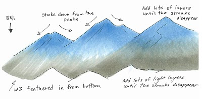
If you look at the mountains in the background, you'll see that they blend from blue, to purple, to warm gray. Blue and Warm Gray are opposites, in that Warm Gray is brownish toned and Blues and Blue violets are far away from them on the color wheel.

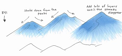
I started the mountains by coloring with B41. I stroke from the top of each peak, down to the base, flowing in the direction of the mountain. I am lifting up at the end of each stroke so that I have less ink at the base and more at the peak. As you can see from the third peak, I apply lots of very light layers to achieve the look I'm going for. I did criss-cross my strokes slightly for a proper feather, but I am consistent with the base feathered and the top of the peak dark.

Next, I feathered in W3 from the bottom in exactly the same technique, this time, making the base dark and the feathering go back up into the mountain. I added lots of very light layers to achieve the proper blend. I think on the actual picture I used W2, not W3, but you get the idea.

You can see on the third peak how the layers blending more and more, and you notice the streaks less and less. Sometimes I'll come back with the blue and add another light layer after I added the second color, just to get it a little smoother.

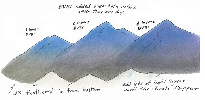
Last, you'll notice on my final mountains that it has the pretty purple fade. After I was done feathering the blue and the gray I added a faint layer of BV31. How much is a matter of personal taste.

You can see from these mountains that the more you layer the pale purple over the whole area, the more it shows through. The third mountain is colored as if it is in front, but it looks like it has more shadow than the others, so it could have been colored as if it were in back simply by adding more BV31. The purple is strongest in the middle because there is the least amount of dye on that spot on the page. This gives the purple a place to fill in, if that makes any sense.

On the final mountains in the main picture I added a faint streak of BV23/BV25 to darken the shadows on the left side of each peak. This makes it look a little less flat, but not so much that it detracts from the main image.

I used too many random colors to list, but I did use one other technique, which you might not have noticed. On the rocks in the foreground I dampened my nasty rag and blotted off some browns and grays that were already on there. This added the hint of texture you see on the front rocks.

I hope this has inspired you to practice the feather blending again. This is tricky, but when done right, it looks really good. Have a great week!

Friday, August 27, 2010

Events & Updates

Sunday from 2-5pm I'll be at Kinokuniya Beaverton, located inside of Uwajimaya's Japanese grocery store (10500 SW Beavertn Hillsdle Hwy, Beaverton, OR) .

I'll be doing Copic demos, coloring Manga, and generally having a great time, so stop in and say hi! Meanwhile, Nancy wanted me to remind people that there are lots of Certification classes coming up, so get your registrations in right away...

Intermediate Certification
Chicago, Oct. 22nd, Taught by Marianne Walker, Project by Sherrie Siemens and Debbie Olson
(the next session will be before Winter CHA, then regularly thereafter)

I am still reviewing Intermediate Applications, for the class in Chicago in October, so please submit them this weekend. Qualified attendees will be notified early next week.

It is important to read the application carefully and show your best coloring skills- I am picky about the coloring that I will accept into the class. I do not see the names on the coloring pages, only the coloring ability demonstrated, so give me your best representation if you want to be accepted.

If you need an application for either Intermediate or Standard certifications, you can download one here.

North American Standard Certifications this Fall
Please note that when you download an application to attend a certification class there is also an information file to download as well. This has the specific location, times, and other important details. Here are all the classes that are currently available to apply for:

Albuquerque, NM Aug. 29th Taught by Jennie Black Open to Public
Branson, MO Sept. 3, Taught by Lori Craig Open to Public
Pittsburgh, PA Sept. 6th, taught by Colleen Schaan Open to Public
Oakland, CA Sept 11th, taught by Jennie Black Open to Public
Minneapolis MN Sept 16 (before Scrapfest) Taught by Debbie Olson and Lori Craig Open to Public
Salt Lake City, UT Sept 25th Taught by Jennie Black Open to Public
Calgary, Canada, Sept 26th Taught by Sherrie Siemens Open to Stores & Designers
Buena Park CA, Oct. 2nd, Taught by Jennie Black Open to Stores & Designers
Jacksonville FL, Oct 8th taught by Colleen Schaan Open to Stores & Designers
Chicago, IL, Oct. 21 Taught by Lori Craig Open to Stores & Designers

Applications have not gone out yet for the following locations:

Richmond VA, Nov. 8 Taught by Colleen Schaan
Halifax Nova Scotia, Nov. 11th Taught by Sherrie Siemens

Wednesday, August 25, 2010

Links and upcoming events

I wanted to share a couple quick links with you today. First of all, for those of you in the UK you will be happy to note that there is a Certification coming to your area in a few months:

UK Copic Certification
With Wendy Kadzidlo (UK Copic Certified Regional Instructor)
Sunday 21st November 2010
Elcot park Hotel, Nr Newbury, Berkshire.
Click here for more information.


Copic Blog
For those of you who are looking for some inspiration in a different direction, have you checked out the official North American Copic blog recently? Here you'll find neat artists featured that use Copic products, interviews, and other great Copic things, so check it out!

Tuesday, August 24, 2010

Intermediate Applications


Applications for the Chicago Intermediate class have now been sent out. Please fill those out and get them back to us right away, as the class will be filled within a few days. Remember, we will NOT accept applications unless BOTH pages are completed and returned.

You can download an application here.

Thursday, August 19, 2010

Demos in 'Frisco


It is gorgeous right now here in San Francisco! Yesterday I had a fabulous demo at Flax Art down on Market Street. This afternoon I'll be at the Grand Opening of the new Blick Art Materials store, so stop by and visit if you're in the neighborhood.

Here is the picture that I had a chance to color yesterday afternoon. I drew the black line work while at Anime Expo in July, and I've been waiting for a chance to color it in. I love doing demos! It gives me a chance to color and chat with so many neat people. Stop by today to see what new artwork I'll be coloring. Have a great week, and I hope you find some inspiration from my work.

Paper: Color laser copier paper, Some of the colors used: Skin: YG11, YG06, G85, E70, Skirt/Shirt: G85, G99, BG99, Y28, E59, Hair: Y21, Y28, E09,

Monday, August 16, 2010

Upcoming Events

This has been a very busy Summer, and there's a lot more happening this Fall. If you're looking for opportunities to see Copics in action come visit me at one of my upcoming demos:

Wed. Aug. 18th, Flax Art Materials, San Francisco, CA demo from 2 to 5pm
Thurs. Aug. 19th Blick Art Materials Grand Opening, San Francisco downtown from 1 to 4 pm.
Fri. Aug 20th Lane County Fair, Eugene OR Youth Art/Manga drawing from Noon to 8pm.
Sun. Aug. 29th Portland, OR Kinokuniya Beaverton 2-5pm Manga demo
Friday Sept. 10th, Eugene, OR, Eugene Mayor's Teen Art Show Opening Reception, Maude Kerns Art Center, 6-8pm
Fri-Sat Oct. 1-2, Savannah GA, Savannah College of Art & Design, Art Materials Trade Show

I'll be setting up more demos as the season progresses, so keep watching. I hope to see you soon!

Friday, August 13, 2010

Certification Update

Upcoming Certifications
you'll notice a new logo for the certification classes. I needed a good way for people to see the difference between the Beginner and Intermediate classes, so now, look for the colored logo. Yellow for Beginner, Purple for Intermediate.

North American Beginner Certifications this Fall
Please note that when you download an application to attend a certification class there is also an information file to download as well. This has the specific location, times, and other important details. Here are all the classes that are currently available to apply for:

Atlanta, GA Aug. 23 Taught by Colleen Schaan Open to Public
Green Bay, WI Aug. 21 Taught by Debbie Olson Open to Public
Albuquerque, NM Aug. 29th Taught by Jennie Black Open to Public
Branson, MO Sept. 3, Taught by Lori Craig Open to Public
Pittsburgh, PA Sept. 6th, taught by Colleen Schaan Open to Public
Oakland, CA Sept 11th, taught by Jennie Black Open to Public
New Orleans, LA Sept. 15th taught by Jenn Balcer CANCELED
Minneapolis MN Sept 16 (before Scrapfest) Taught by Debbie Olson and Lori Craig Open to Public
Salt Lake City, UT Sept 25th Taught by Jennie Black Open to Stores & Designers
Calgary, Canada, Sept 26th Taught by Sherrie Siemens Open to Stores & Designers
Buena Park CA, Oct. 2nd, Taught by Jennie Black Open to Stores & Designers
Jacksonville FL, Oct 8th taught by Colleen Schaan Open to Stores & Designers

Applications have not gone out yet for the following locations:

Chicago, IL, Oct. 21 Taught by Lori Craig
Richmond VA, Nov. 8 Taught by Colleen Schaan

If you need an application for any of these locations you can download one here. Send in completed applications right away, even if you are not qualified, as the waiting lists fill on a first-come, first-serve basis.

If you have any questions please contact our Certification Coordinator Nancy, nancy@copicmarker.com (Here is a photo of Nancy doing a make 'n take at the Splitcoaststampers booth at the CHA Summer Supershow.)


European Certification
Friday, 10th September 2010 Hagen, Germany on (one day before the Stempelmekka Fair). This class will be held in German. Taught by Diny Sprakel (she's a fabulous instructor, and you'll be sure to have a great experience!). For more information on European classes please contact Britta, at b.rumpf-burblies@holtz-gmbh.de

Australian Certification
August 30, Melbourne, VIC
Taught by Mandi Lee Klinger - FULL
October 25, Brisbane, QLD
Taught by Kathy Jones
for more information please contact copicmarker.com.au

Intermediate Certification Details

Intermediate Certification
Chicago, Oct. 22nd, Taught by Marianne Walker, Project by Sherrie Siemens and Debbie Olson
(the next session will be before Winter CHA, then regularly thereafter)

The application for the intermediate class will be available in about a week. Below are the technical details of the class for those of you who are interested in attending. I will have more information about specific topics as time progresses:

• Class size is limited, so apply early.

• Class runs from 9am to 4pm with a 1 hr. lunch break, then 6 to 8pm for the project. You MUST be available to attend the whole day or you will not be listed as having completed the training. People who cannot attend the evening event will not be accepted into the class.

• Fee: $199, due within 3 days of accepted application. NO EXCEPTIONS! Demand is very high for this first session and you will be bumped if you do not pay within the 3 days. Same cancellation policy as with regular certification (see the details section where regular applications are posted).

Important Note:
You must have completed your regular certification prior to submitting the application for the Intermediate class. There are no exceptions.

Application Process:
• As soon as you get the application fill it out COMPLETELY and submit it.

• No applications are accepted early.

• You cannot save a space for a friend- they must be accepted on the same basis as everyone else.

• This application is harder to fill out than a standard application, so fill it out and return it right away.

• To apply you must prove a mastery of basic topics covered in a regular certification, as the instructors will NOT be reviewing any topics covered in a regular class.

• Coloring will be required in the application.

• The application will be a downloadable PDF. This will need to be electronically returned to us as a jpeg. The best method is to print it out, complete the application and follow the directions, then scan it or take a clean, easy to see photo of the relevant sections for us to review. We MUST decline applications that are not returned properly, since demand is so high for this session.

• DO NOT SEND ANY ADDITIONAL CARD EXAMPLES! This will not change your chances of getting into the class. The examples you provide in the application will be exactly the same as everyone else, and they prove to us that you have practiced coloring and are ready for the next level.

• Applications will be reviewed as soon as we get them, and you will be notified upon acceptance.

Don't feel bad if you are not accepted. Space is very limited, especially since this is the first class. We are keeping applications neutral and will not accept people simply because they are a "craft-lebrity" or "a big name in crafting". We need to assure that everyone attending the class is dedicated to coloring already and driven to learning techniques that will take their work to a new level. The instructor has a lot to cover in a short time, and people who aren't confident in their techniques could slow down the whole class.

There will be more Intermediate Classes as time passes, so if you don't get in the first time, don't give up! Practice all of the blending techniques, practice smooth coloring,...just practice, practice, practice! Many of the topics covered in the class I have talked about over the years here on my blog. The difference is having the instructor right there to help you through your tough situation. Ideally, everyone would have a chance to get the one-on-one attention that will be provided in the class, but it is very hard at first.

More information will be on the Copic website once the applications go out, so please do not e-mail nancy with questions yet!

Thursday, August 5, 2010

New Products CHA Summer 2010, part 4

Color Swatch Book
One last neat thing that we introduced at CHA this Summer is the new Copic Color Swatch Book. This handy, travel-sized organizer is perfect for keeping your colors organized and having a reference book that is customized by you!

The Color Swatch Book is printed on very nice bright white cardstock, ideal for giving you accurate color readings. The back cover unfolds and tucks between pages to protect while filling in swatches. The book measures approx. 7" x 3.5" (about the size of a checkbook) and has 18 pages with color groups and directions.

Each page is organized so you can see Natural Blending groups and see where you might be missing colors in your personal spectrum. As you can see from this photo of the BG page, I can quickly see which colors I want in the BG family that will blend with the BG09 I already have. For space purposes, some blending groups are listed on the same line, (See the BG30's and the BG40's), but wherever possible each group is given it's own space.


Best of all, the cover is left uncolored (see the book in the photo behind the colored version)- you get to color it how you want! I drew the cover art based on illustrations from the Art Noveau movement 100 years ago. I really love the flowing lines and repeated floral patterns from the 1910's and 20's.

Drawing Process
I drew the art lightly first with a pencil then traced it on my light table with a .25mm Multiliner SP. I went back with a thicker pen to darken in the larger dark areas. Then I scanned it into the computer and cleaned up some of the lines. Last, I took my artwork into Adobe Illustrator and converted it into vectors to give it the smooth thick/thin line quality that you see here.

Coloring Process
I really had fun coloring the final cover of my swatch book! Best of all, each person can I started with my lightest colors, in this case, the green. I used YG41 and faded each stem so it would be easy to blend into the next color. Next I added BV00 and feathered it into the green of the stems. I also tapered the BV00 into the top of each "blossom", leaving the tips white. Then I feathered E04 back into the BV. After I had the blossoms finished I darkened the green stems with G85. Anywhere the stems look like they go behind each other I was sure to make it a little darker. this gives the curling lines more individual strength.

Next I darkened the leaves. I wanted them to have the same general tone of the stems, but still be distinct. To do this I could either make them lighter or darker than the stems, so I opted to make them darker. I Began with a base of YG41, darkened with the G85, then added a touch of B39 to really deepen the green without turning it grey, since there really wasn't a darker green that I wanted to use that would not turn it gray, and G29 would leave a different feel to the tone. As it is, the hint of deep blue really gives dimension, in my opinion.

Last, I added a touch of dimension to each blossom with a dot of BV04 blended with the BV00. I colored teh marker with C1, BV23, and C5. By throwing the BV23 in instead of the C3 it also adds a bit of color depth to an otherwise stale gray. I added crisp shadows under each leaf that covers the marker with the C5. I colored the logo with the YG41 lightly faded into the BV00. The tips of the marker are colored with BV00, BV04, and a hint of E04 to pull in the pink from the blossoms. The fine white lines on the shiny marker body were made with Opaque white that I carefully applied after I was completely done coloring.

I hope this gives you some inspiration for coloring your own beautiful swatch book cover. Once you color yours send me a link! I'd love to see what you make.

These new swatch books are now shipping, so ask your local Copic retailer if you would like to get one for yourself. The Blending Card will be arriving in stores in a couple weeks.