A few weeks ago, our social media team asked me if I could work on a plein air sketch for them. For those of you not familiar with plain air, it is the chance to draw something out in nature, while you are sitting there in front of it.
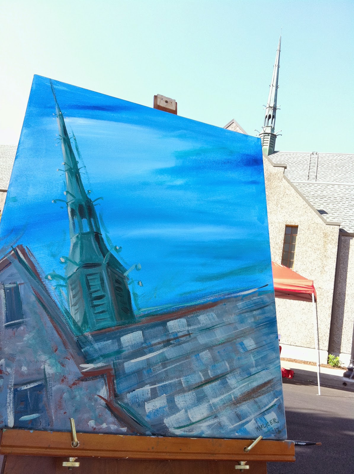
I've done a few plein air paintings over the years, it's a lot of fun. Here is a plein air painting from 2013 that I made of a church. You can see the resemblance to the church steeple, but it is a lot more expressive than some of my marker illustrations.
It's been a while since I worked on a plein air sketch in Copics. As you probably noticed on this blog, I have a lot of different styles that I draw in. Some are detailed, some are a bit more whimsical. The trick with plein air is to balance detail with speed while capturing the essence of the thing you are drawing/painting.
So, part of my personal challenge was while I was traveling to nail down some time to work in plein air sketch of a place I was visiting.
One afternoon while I was in New Orleans I actually managed to get a few hours! I wandered around a few neighborhoods and finally saw this striking yellow building with a red car in front. My time was ticking, so I began my sketch.
I was working with a regular old pencil in my Copic Sketchbook. I was sure to keep a clean piece of scratch paper under my work at all times, so it didn't bleed through to the page underneath.
Now, usually, I would suggest to not color over pencil lines, because it can stain your nibs, but I was in a rush, and I was careful about scribbling any pencil residue off my lighter colored nibs.

As a side note, once you color over pencil lines, you cannot erase them.
I worked with a base of Y21 and threw in YR14, YR18 and some other yellowy colors as I worked on the building itself. I block in large areas first, and work into more details, I'm not too fussed about accuracy of perspective, etc. I really just want to get the vibrancy of the color and the feel of the building.
The roof I made with W1, and W4. I used the chisel end of the W4 to suggest the shingles (there are a lot of strange angles going on in that roof!) I threw in hints of the cool grays as well. Then, I blocked in the windows with a rich, dark B97.

Next, I added a blue sky and a light gray suggestion of other buildings in the background. I added the window boxes with a nice selection of greens.
After I had a light suggestion of a sky and buildings, I added branches and leaves from the tree I was sitting under.
The red car was made with R24, R29, R59 and some grays. I also colored the windows with B95, and B97. I colored the truck in cool grays. I was careful to leave the shiny areas of the truck lighter. The cement was colored in a variety of warm grays and a few lighter cool grays. I also added C7 into the roof.
(By the way, don't tell my mom about this blog post. She'd get really upset about my lack of accurate perspective. She is picky about stuff like that).
I then just worked my way around the rest of the picture filling in details. The siding on the building next door was corrugated, so I colored in streaks, leaving a lot of color variation to suggest the texture.
The bricks on the other building were a lot of fun. I started with my lighter grout color as the base, Cool and warm grays, then added the darker brown/red bricks (E13, E15, E18, E31, E33, E35, E37)over the top.
Again, windows were colored with the B90's family of colors. I added opaque white afterwards to give the panes a shiny highlight.
I used the tip of the chisel nib to draw in the railing on the balcony. You don't want to go back and try to change the wall colors at this point, as it would cause the darker ink to smear, and unlike most of my drawings, I didn't use the multiliners at all.
Eventually my time ran out. It took me about 1.5 hrs to draw this 7" x 10" plein air sketch. Overall, I am pretty happy with how it came out. Does it match the building exactly? No, not really, but it captures the colors and essence, which was really the point. It was also a lot of fun to work on such a tight deadline, forcing me to work outside of my usual style.
Here is another pic of the finished piece. It was nice to get out in the fresh air, instead of being hunched over my desk at home or work, coloring away.
I hope you can also get out and try doing your own plein air sketch. Even if you don't think you're skilled, just get out there and try it! I think you'll be surprised. Just start small and work into the finer details.
Good luck in all your projects!

 This Saturday, April 28th I will be teaching two Coloring Flowers classes in Salem, OR at Runaway Arts & Crafts. Spaces are still available! These are perfect beginner classes and are pulled directly from my book "Coloring Flowers with Copic Markers." Come join me!
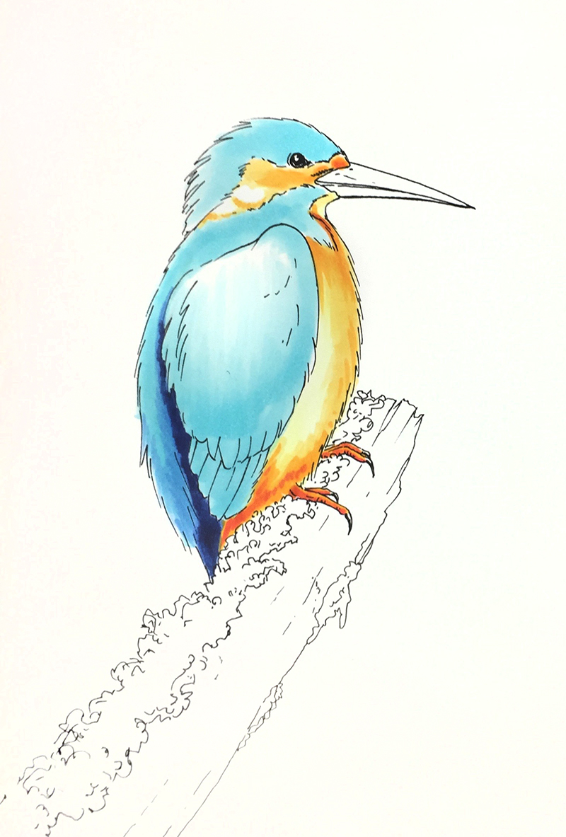
 In the meantime, I have been drawing and coloring a wide range of beautiful images. I'll post a few just to give you an idea. These are more of my complex drawings, so I won't go into the colors used, as it was way too many to keep track of!