Showing posts with label draw it yourself. Show all posts

Tuesday, April 21, 2015

Plein Air Marker Sketch

A few weeks ago, our social media team asked me if I could work on a plein air sketch for them. For those of you not familiar with plain air, it is the chance to draw something out in nature, while you are sitting there in front of it.
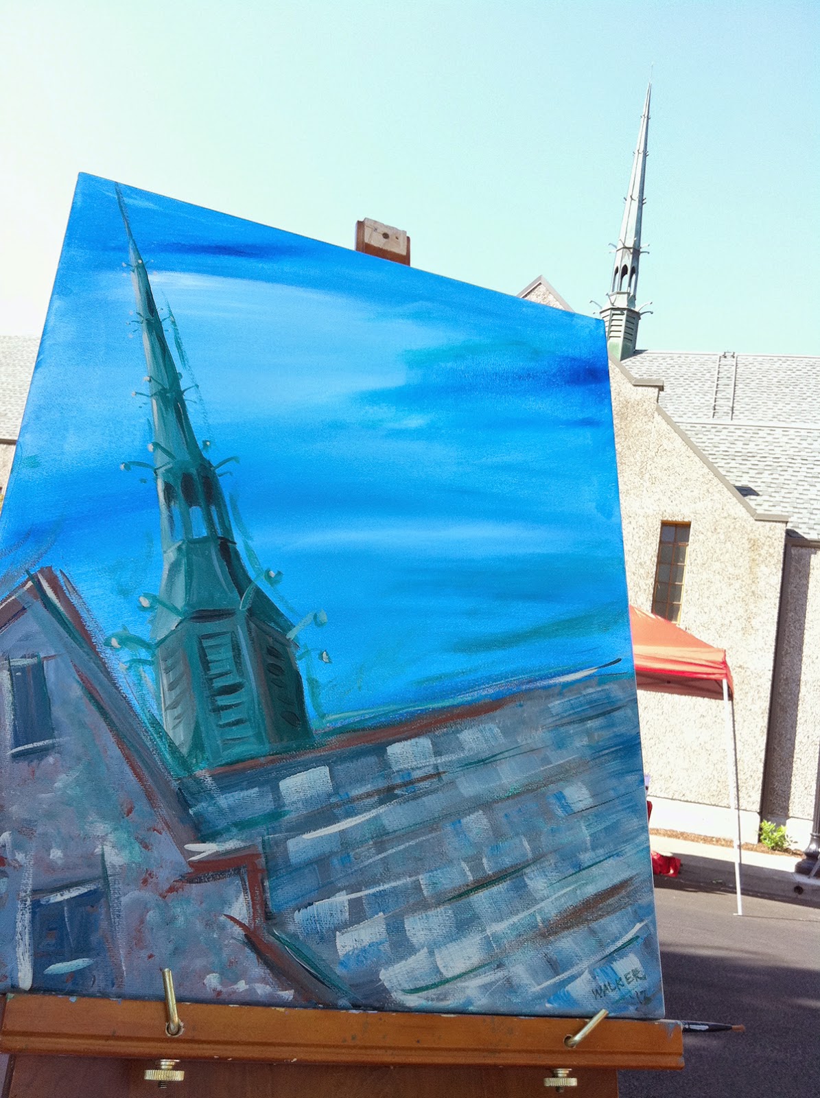

I've done a few plein air paintings over the years, it's a lot of fun. Here is a plein air painting from 2013 that I made of a church. You can see the resemblance to the church steeple, but it is a lot more expressive than some of my marker illustrations.

It's been a while since I worked on a plein air sketch in Copics. As you probably noticed on this blog, I have a lot of different styles that I draw in. Some are detailed, some are a bit more whimsical. The trick with plein air is to balance detail with  speed while capturing the essence of the thing you are drawing/painting.

So, part of my personal challenge was while I was traveling to nail down some time to work in plein air sketch of a place I was visiting.

One afternoon while I was in New Orleans I actually managed to get a few hours! I wandered around a few neighborhoods and finally saw this striking yellow building with a red car in front. My time was ticking, so I began my sketch.

I was working with a regular old pencil in my Copic Sketchbook. I was sure to keep a clean piece of scratch paper under my work at all times, so it didn't bleed through to the page underneath.

Now, usually, I would suggest to not color over pencil lines, because it can stain your nibs, but I was in a rush, and I was careful about scribbling any pencil residue off my lighter colored nibs.


As a side note, once you color over pencil lines, you cannot erase them.

 I worked with a base of Y21 and threw in YR14, YR18 and some other yellowy colors as I worked on the building itself. I block in large areas first, and work into more details, I'm not too fussed about accuracy of perspective, etc. I really just want to get the vibrancy of the color and the feel of the building.

The roof I made with W1, and W4. I used the chisel end of the W4 to suggest the shingles (there are a lot of strange angles going on in that roof!) I threw in hints of the cool grays as well. Then, I blocked in the windows with a rich, dark B97.


Next, I added a blue sky and a light gray suggestion of other buildings in the background. I added the window boxes with a nice selection of greens.
After I had a light suggestion of a sky and buildings, I added branches and leaves from the tree I was sitting under.

The red car was made with R24, R29, R59 and some grays. I also colored the windows with B95, and B97. I colored the truck in cool grays. I was careful to leave the shiny areas of the truck lighter. The cement was colored in a variety of warm grays and a few lighter cool grays. I also added C7 into the roof.

(By the way, don't tell my mom about this blog post. She'd get really upset about my lack of accurate perspective. She is picky about stuff like that).

I then just worked my way around the rest of the picture filling in details. The siding on the building next door was corrugated, so I colored in streaks, leaving a lot of color variation to suggest the texture.

The bricks on the other building were a lot of fun. I started with my lighter grout color as the base, Cool and warm grays, then added the darker brown/red bricks (E13, E15, E18, E31, E33, E35, E37)over the top.

Again, windows were colored with the B90's family of colors. I added opaque white afterwards to give the panes a shiny highlight.

I used the tip of the chisel nib to draw in the railing on the balcony. You don't want to go back and try to change the wall colors at this point, as it would cause the darker ink to smear, and unlike most of my drawings, I didn't use the multiliners at all.

Eventually my time ran out. It took me about 1.5 hrs to draw this 7" x 10" plein air sketch. Overall, I am pretty happy with how it came out. Does it match the building exactly? No, not really, but it captures the colors and essence, which was really the point. It was also a lot of fun to work on such a tight deadline, forcing me to work outside of my usual style.


Here is another pic of the finished piece. It was nice to get out in the fresh air, instead of being hunched over my desk at home or work, coloring away.

I hope you can also get out and try doing your own plein air sketch. Even if you don't think you're skilled, just get out there and try it! I think you'll be surprised. Just start small and work into the finer details.

Good luck in all your projects!

Friday, February 13, 2015

Inchie Maze

As many of you know, I really like mazes. I like to draw them, and have loved drawing mazes since middle school. So, when we were asked to do a fun project for the Inchie Blog Hop, I knew I should make a Valentine maze.

I started with a 2" Inchie Arts Matboard square in a light cream color. I grabbed my fine little 0.03mm Multiliner and started drawing my Valentine maze.

Just so you know, there is a solution to this maze, I don't know what it is, but there IS a solution! It took me a couple minutes to finish drawing the maze. Now for color.


Mat board is a bit softer fibered than the papers I usually work on, so I wanted to do as little blending as possible in order to prevent bleeding. I've played with Inchies a lot over the last few years, so I knew that I could get away with starting dark and adding my light back in, and that would prevent bleeding more.

I started with a dark purple "glow" to the background with V17. I kept the edges rough so they will be easier to blend. Just so you know, the color dries lighter than you think on this surface, so I added another coat of color after the base coat had dried. This helps me get the darkness I want.


Next I came in with my lighter, BV13 to blend the V17. I was careful to avoid over-soaking the paper, as I wanted the other hearts to be lighter.

Then I proceeded to color and blend the smaller hearts as I usually would, starting light and adding dark.

I used RV02, R43, V12, V04, B41, BV00, and RV10

I finished my cute little Valentine by coloring a piece of ribbon with my V17 marker and glued it on the back using the X Press It Gel Glue.

I know that my secret Valentine at work today would love it! (I had to wait to post this in case she saw it online before she made it to work today). She is an aMAZEing person, so she totally deserves a cute little maze valentine.

Remember, if you are local, stop by the Oregon Asian Celebration this weekend to see the Copic demos in the Youth Art Room.

I hope you have a very happy Valentine's Day. Be sure to give something handmade to someone this weekend!


Friday, January 25, 2013

Oregon Asian Celebration Artwork, part 2

Coloring a large, detailed image
This is a continuation of the process post from a few days ago.
 When I started coloring this picture, I didn't know that this one was going to be my final version. I started with the intent of just testing colors and techniques, but the image started looking so nice, that I decided to run with it.

 Usually, I suggest doing a quick color test on anything large or complex. On this image, testing involves trying colors of the skin, beads, and how to get the texture on the snake skin. This photo is my first color test.

You can see that there is a slight color variation between his face and the rest of his body. I was testing the idea of adding a faint green to the shadows, to accent the beads and to add variety from the tones on the snakeskin. 

Notice how I bled out of the lines BADLY on the elbow, and to a lesser extent on the snake. I'm not worried because I know that I can clean that up with the colorless blender, and if I can't, I know that I will be erasing that area anyways once I scan in the final picture.


I don't remember what colors I used for this image, sorry! I do know that I used G21 on the beads, a base skin tone of E50, and I used a lot of Y28, to the point that I had to borrow a Y28 from my set at work to finish the image.

This next step-out photo shows the base yellow under all the snakes. I took these pictures with my phone, so be aware that the colors looked a lot smoother in real life.

I know I've mentioned it before, but base tone makes a huge difference, particularly in this image, where I am using the colorless blender to add texture to the snakes. The yellow base will come through the dots of colorless blender, even after I layer on a few more colors.


For those of you who know how much I promote the use of contrast in skin colors, note how dark I go on my skin tone shadows. I also added hints of the same G21 I used on the beads into the darkest tones, to pull those colors together a bit more.

Here is a close-up of the snake-heads in progress. See how I color them smoothly with a range of tones, then go in and add the textures with my colorless blender? I touched, dot-by-dot, with my sketch blender pen to get the fine dots. In this image you can really see my layers of green also incorporated on the snakeskin.

Just so you know, the paper makes a huge difference. I work on a thin, tight-fibered paper so that my edges are crisp when doing this technique. Because the paper is thin, I use less ink, and my colorless blender has an easier time moving ink around.


Here is the final, scanned, color corrected image I submitted to the Asian Celebration Committee. I think the skin highlights came out a bit lighter than I wanted, but overall, I am pretty pleased with the way this came out.

However, after this was done, we changed our mind about the color scheme on the final poster. I was not about to re-color the whole picture! This took hours and hours to color. Luckily, in this day and age, we are blessed with Photoshop.

Here is the final artwork, incorporated into the finished poster. Notice what changed?

I'll be demoing Copic Markers each afternoon from 3-4 in the youth art room during the Celebration. I hope to see you there.

I hope you enjoyed this brief glimpse into the process and how artwork can easily change over time. Have a great weekend!


Wednesday, January 23, 2013

Oregon Asian Celebration 2013

Working with clients & the creative process
Each year I look forward to sharing the artwork I create for the Oregon Asian Celebration. This year, the process went pretty smoothly, so I'd like to share you how I go about working with a client, to get the image that will make both sides happy.

I initially met with their graphic designer and discussed the theme. This is the year of the snake, and the theme they wanted to go with is "Choose the path of Awareness". We wanted to focus on the snake, but also balance, harmony, and peace. This was tricky, as most of the art they had looked at from others included snakes, but they seemed to be in threatening poses.

So we started searching the internet for Asian/Indian/Pacific Island images including snakes. We found lots of tattoos, but in our searching, we found the perfect balance of peace, tranquility, and snakes. Here are some of the google image searches that caught our attention.

In our searching, we found this statue, and decided to base our image on this figure. In researching we found that this is a statue of one of the early founders of Yoga, Patanjali. His statue is usually depicted as seen here, with the figure meditating, hooded by cobras. He rests on a series of snake coils.

So, a week or so later, I sent the clients my initial sketches.

Here are some of the initial drawings. Each time, they came back and suggested changes. It is fun to see the progression of a drawing like this. Not that any of these are really bad drawings, they just didn't convey the feeling the client wanted. Some are really rough, some are much cleaner.

When drawing a complex image like this, and knowing that my client will want changes, I make most art versions as two or three layers (the third drawing was a rough sketch, so it did not get the same treatment). Many times your client will say something like: "I like the guy, but the snake tails don't work." By drawing each as a separate layer, it makes it much easier to swap out one part- I don't have to redraw the whole image.

Here is the 2nd version, with the different layers broken apart so you can see how I drew them.


 Finally, after much going back and forth, and getting approval from everyone who needed to see it, I created an image that everyone was happy with. You can see traces of the original statue, but it has more life and feels more open and inviting.

The key to success in freelance illustration is being flexible. A committee rarely likes your favorite version, but remember, you are working for them, so they are paying you for what they want. I really would have had a lot of fun drawing and finishing the 3rd version, but I knew that image would not fly with the committee, so I only sent a rough sketch (I didn't have time to draw it nicely, knowing that the client would not approve it). it also helps that I have worked with them for many years, so I can gauge better what they will and won't like. I still sent in the rough sketch, just on a long shot that they might like it.

A simple tip for working with clients: When you are working on a project like this, try not to send your full, high-res files until the last, or until they are ready to pay you.

In a few days,  I will show you a few steps in the coloring process, and I'll show you the final poster. I hope you enjoy seeing a bit more of the behind-the-scenes process when working with a client.


Friday, August 17, 2012

Quick Sketch and Certification

Back from Japan
I just had the wonderful opportunity to spend a week in Japan, teaching some wonderful Japanese people all about Copics. This was my first time in Japan, so I got to travel all over Tokyo and see some amazing things. What a great experience! In honor of that trip, I drew this quick sketch, based on a beautiful garden we visited in Tokyo.

This was drawn with N0, N2, N4 and N6 on a sketchbook (I can't remember which brand, as this drawing was for a friend).

Traveling to other countries and seeing the skill and talent of so many diverse people really reminds me why I love this industry so much. While I can't speak Japanese, art and crafting crosses so many language barriers. We all create for similar reasons. The things we make come from our hearts. I really felt the love from all my new Japanese friends. I hope they had just as good a time taking my classes as I had teaching them.

But, now I am back to my desk, and back to catching up on work. Time to update people on Certification classes in North America.

Standard Certification Classes, North America
We are entering our busy Fall class season. There are many locations coming up in the next few weeks, so keep checking your e-mail for our newsletter to see which classes are coming to your area. These classes fill quickly, so register as soon as you see them!

To register for any of the standard classes listed here, please visit our website.

Aug. 24th Dallas TX taught by Cindy Lawrence FULL

Sept. 14th Orlando, FL taught by Colleen Schaan FULL
Sept. 21st Vancouver, BC taught by Sherrie Siemens
Sept. 28th Sacramento, CA taught by Debbie Olson
Sept. 29th Warwick, RI taught by Cindy Lawrence

Oct. 5th Indianapolis, IN taught by Colleen Schaan
Oct. 12th, Philadelphia, PA taught by Debbie Olson

Opening soon:
Oct. 26th Portland OR, taught by Sherrie Siemens


Intermediate Certification Classes, North America
To register for any of the Intermediate classes listed here, please visit our website

Aug. 16th Kansas City, MO taught by Debbie Olson there are still spaces left, Call!
 Aug. 25th Dallas TX taught by Cindy Lawrence FULL


Sept. 15th Orlando, FL taught by Colleen Schaan FULL
Sept. 22st Vancouver, BC taught by Sherrie Siemens
Sept. 29th Sacramento, CA taught by Debbie Olson
Sept. 30th Warwick, RI taught by Cindy Lawrence

Oct. 6th Indianapolis, IN taught by Colleen Schaan
Oct. 13th, Philadelphia, PA taught by Debbie Olson Almost FULL!!

Opening soon:
Oct. 27th Portland OR, taught by Sherrie Siemens


Wednesday, July 25, 2012

Quick Dinosaur sketch

Local Events
I have been very busy this Summer, but I wanted to quickly share a few things. This Thursday and Friday I will be teaching some fabulous Papercrafting Certification classes in Eugene. If you have not seen a list of all the classes that we have open, we have many on our website:

Standard Classes

Intermediate Classes

We hope to see you at one of our classes soon!

CHA Sketch
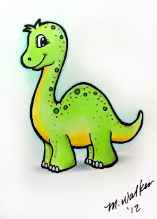
Meanwhile, I wanted to share a simple, quick drawing I did last week while I was at CHA, coloring in the Copic booth. It is always such a neat experience to see my papercrafting friends and meet with so much talent. I had a little time to work on my own doodles while I was helping out, so this little guy came from a free moment. It is nice to have a chance to draw something for myself every now and then, so I don't have a tutorial.

I drew this little dinosaur with a .8 multiliner, onto X-Press It cardstock. He is colored with YG11, Y21, YG63, B02, C3, BG10, and B00. I used the colorless blender to fade the gray shadow and the BG10 sky out to the white of the paper.

This week, I hope you find some time to doodle and color for no reason but to have fun!

Tuesday, April 17, 2012

Savannah Sketches and upcoming events

I had the pleasure of spending last week doing class presentations at Savannah College of Art and Design. One day between classes, I had a little time to do some quick sketches around the beautiful city of Savannah. Here are a couple of those sketches.

I drew these in my Copic Sketchbook, with a 0.03mm multiliner, no pencil. Some of the finest lines did not show up when scanned, but these were really rough sketches/studies anyways.

I had been driving from one building to the next, when the porch on this house really jumped out at me, so I decided to draw it and fix the wood/brickwork in my mind.

As this is a rough study, for a finished piece, I would redraw everything, being more careful about my angles and lining things up properly. Instead, I wanted to get the big picture in my mind first.

A note about this second sketch. I was not drawing to make an exact recreation of each building. Rather, I was creating stylized images using elements that I saw and was inspired by.

These quick sketches were more studies of elements. So, in real life, the balcony did not have the ornate uprights, but another building nearby did. The planters were not really next to that doorway, but I had seen some by another building. Also, to be at the angle which my perspective suggests, would imply that I was actually viewing this from a second floor as well, when in reality, I was sitting on a park bench across a square from the doorway and balcony I liked.

I urge you, even if you don't consider yourself a great artist, sit down and sketch something that inspires you. It could just be a pencil or a piece of wood, it does not have to be as complex as these buildings.

Meanwhile, If you would like to come to some upcoming events, then you are in luck! In April I have a few fun things coming up that I would love to see you attend.

April 26, Eugene, OR, University of Oregon Bookstore, 10am to 5pm. I will be there with my books and portfolios, talking about Copic products and showing techniques. Come and see me!

April 27, Phoenix, OR, Scrappy Crafts. I will be doing demos from noon to 4pm, and then we will have a book signing party from 6 to 8pm.

April 28, Medford, OR, Central Art Supply. I will be teaching a class from 10:30 to 12:30 for any artists interested in learning marker techniques and how to choose papers and inks.

Tuesday, January 10, 2012

New 12 colors artwork

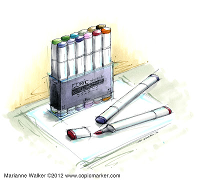
I promised last week when I posted the new 12 colors that I would show the artwork I drew for the new colors. I just finished coloring it, so I figured I would share, before I forget which colors I used.

Drawing the Marker Set
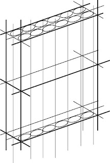
For this illustration, I was having a hard time getting the angles right on the marker set, so I created a guide in Adobe Illustrator to draw from. On something angular like a set of markers, this works well.

I don't like using rulers when I draw, since the computer does it better anyways, so rather than sketching this by hand and messing with a ruler or straight edge, I drew it all on the computer, scaled it to the size I needed, then used this as the base for my drawing.

I sketched it with my light table, using a o.o3mm multiliner onto nice paper. Then I scanned the drawing in and cleaned up the lines slightly. I printed it out onto thin, nice paper. I prefer coloring larger pictures on thin paper, as it uses less ink. This final artwork is about 7"x7"
I colored the final with T2, T4, T6, BG93, BG90, BG58, B000, B00, E81, E84, E89, E04, R56, V20, V22, V25, BV35, RV52, G43, G46, YR30, YR27.

For those of you who are starting to notice shadows, pay attention to the B00 and BG93 that I threw into the shadows. I did this to liven up the shadows and liven up the artwork. Note that I also added YR30 and B00 into the highlights. I added the rough sketchy lines in the background to liven those areas up as well. You probably don't notice much of this at first, but it helps to add variety to the whole. I did very little blending on this illustration, except for the purple/gray marker label, and even then I tried to keep it sketchy.

Again, new colors should be available in February, so get ready!

Wednesday, September 21, 2011

New Blog Header

Running Horses
You may have noticed that I have a new Blog header. This morning I decided that my old header was just a little out of season. I also felt like drawing some horses. I ran a google search on horses to get ideas on perspective and angles for the three horses.

I drew them with a pencil first onto scratch paper, then I inked the image on a new sheet of paper using my light table...then I didn't have to erase. So, I sketched out the following illustration using a 0.05mm Gray Multiliner and a 0.05mm Sepia multiliner. Then I started coloring. Tomorrow I will post a tutorial with the steps I took in coloring the horses and markers.

Have a great day!

Tuesday, April 19, 2011

Doodle Wings

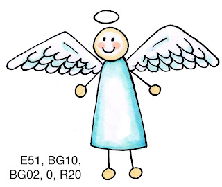
Draw It Yourself - Doodling Wings
Since the overwhelming response from the survey suggests that I should post some simple tutorials on how to draw, I think this tutorial is a great one to work on if you are a total beginner at doodling.

Wings are a simple way to "doodle-up" any design. The great thing about wings is that they are easy to start with. For this, you'll need a pencil, paper, and a multiliner (I used a .3mm).

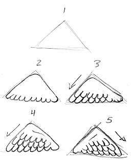
1. Lightly draw a right-triangle in pencil. The long edge will be the feathers, so you can turn the triangle whichever way you need to get the feathers turned how you need them. Depending on the shape of the triangle, the wings will change shape. For more open wings, make the triangle longer.

2. In slightly darker pencil, round out the edges of the triangle. Keep the two short edge lines smooth. Then, make a series of U's along the bottom edge. They don't have to be perfect.

3. Think which way the wing will point. Make another series of U's along the top edge of the outer U's. These should angle slightly to match the angle of the wing. (if there isn't an angle, that's OK as well). Notice that I only make U's along 2/3 of the wing. Leave the edge of the wing featherless, as this is where it attaches to the body.

4. Make another row of U's, again, angled with the triangle and only going about 2/3 of the way across. Depending on the size of your triangle, you simply make more and more rows of feathers. On the area without feathers, draw a little line to hint at bones under the feathers.

5. Make a matching wing pointing the other direction.

6. Trace the outlined pencil with your multiliner. This step is what makes it look more clean and professional. I use a light table so I don't have to erase. If you know that you will be erasing your pencil lines, then try to keep those light so it will be easier to erase.

Congrats! You've drawn a pair of wings! Now, you can check out this older post of mine about coloring feathers. You'll notice that the image of wings in that post is similar to what you have drawn here.

Here is my final, cute little stick-angel. The wings turn an otherwise boring stick figure into a cute little doodle that would work in many situations. I hope this inspires you to go out and doodle some wings :) Have a wonderful week!

Sunday, January 9, 2011

Copic New Products part 3


Copic has a lot of new products coming out this year at the 2011 Winter CHA trade show! To win a free 2011 Copic Color Swatch Book, leave a comment on my post from Friday. Tomorrow morning I will draw three winners from my blog, as will each of our designers, so be sure that you've left a comment on each Copic designer's blog!

Other Copic Books

I am personally thrilled that so many of you are interested in a lighting book for beginners. If you are looking for a good coffee-table book filled with an assortment of sketchbook works by various artists (myself being one of the contributors) you can purchase the book Sketching With Copic by Ken O'Connell, president of Imagination International Inc. (Copic North America). You can purchase it through the website Blurb.


For those who are studying storyboarding, layout, and marker rendering we have brought in a great book from Europe- Visualizing Ideas. Inside you can find examples of fashion sketches, storyboards, automotive design, product design, and so much more! This is a great beginner book that i wish i'd had when I was studying storyboarding. Everything in this book was made with Copic markers, which I love, because it shows a great variety of end uses for the markers. We have a few copies at our warehouse, but you can also find these online from various places.

Many of you had questions about where you can purchase my Lighting book when it comes out...it will be available from your favorite Copic resellers. I will not be selling it direct from my site.

Meanwhile, here is one more new item to look forward to seeing at the CHA show...

2011 Copic Catalog

front & back cover_2011

Unlike past years, the new 2011 Copic catalog is a showcase of artists and inspiration, as well as a place where you can find all your favorite Copic supplies. See gorgeous creations from a variety of artists, from paper crafting to pop-culture. The illustrations are GORGEOUS! Some are so lifelike, you'd swear they were photos...so later this year I'll post links to some of the artists included in the new catalog.

The new catalog will be available in the booth at CHA, and will also be available for download soon from the Copic website. You'll be able to find this new catalog in your local stores at the beginning of February!

We'll have one more new product announcement tomorrow -- and I think you'll really like this one!!

Saturday, January 8, 2011

Copic New Products part 2

Here's the second sneak peek of new products you can find in the Copic Booth at Winter CHA. Don't forget to leave a comment on yesterday's post to be entered for a special prize drawing.
Shadows & Shading: A beginner's guide to lighting placement,
book by Marianne Walker

This little project has been keeping me very busy this winter! This is much of the reason why I haven't been posting as much. I know that many of you read my blog and print it out. You are constantly asking "When will you make a book, so I don't have to print things out?!?"

I have been listening!
I took the fundamentals of coloring with shadows and have compiled them in this simple to use reference book. This book is for beginners, and applies to anyone who colors, from papercrafters to artists. You do not need to know how to draw to add shadows like a professional artist! This guide easily steps you through how to correctly add shadows and make your coloring look more dimensional. The wire-bound book comes with 4 clear printed guides to help you add shadows properly on your own work, without all the frustration and guess-work. This book will be available in March, though you can get a sneak peek at CHA.

If you want to attend a hands-on workshop that teaches these same concepts as they relate only to papercrafting, then register for the Intermediate Certification nearest you! Our team decided after the first Intermediate class in Chicago that people need to have access to more information about shadows and shading, as there is only so much time in the day to teach so many things besides shading.

This book does not teach how to draw, just where to add shadows and highlights when coloring. I am making it appropriate for both fine-art as well as papercrafters. As you can see from the simple sketch above, the shadows make all the difference. You can see and touch these objects- they look alive and dynamic. That is the power of contrast and shadows. I can't tell people enough- add more contrast into your work! This book is not Copic specific either, rather, it is for any coloring medium.

Why did I write this? Because I know many of you never had a chance to take art classes in school. Or, you took an art class, but didn't understand what the teacher was explaining. My goal is to help you feel comfortable with art techniques, even if you don't consider yourself an artist.

So, look for the finalized book in March, and see a prototype in our booth at CHA. Meanwhile, go leave a comment on yesterday's post to win a prize of a new swatchbook.

Thursday, August 5, 2010

New Products CHA Summer 2010, part 4

Color Swatch Book
One last neat thing that we introduced at CHA this Summer is the new Copic Color Swatch Book. This handy, travel-sized organizer is perfect for keeping your colors organized and having a reference book that is customized by you!

The Color Swatch Book is printed on very nice bright white cardstock, ideal for giving you accurate color readings. The back cover unfolds and tucks between pages to protect while filling in swatches. The book measures approx. 7" x 3.5" (about the size of a checkbook) and has 18 pages with color groups and directions.

Each page is organized so you can see Natural Blending groups and see where you might be missing colors in your personal spectrum. As you can see from this photo of the BG page, I can quickly see which colors I want in the BG family that will blend with the BG09 I already have. For space purposes, some blending groups are listed on the same line, (See the BG30's and the BG40's), but wherever possible each group is given it's own space.


Best of all, the cover is left uncolored (see the book in the photo behind the colored version)- you get to color it how you want! I drew the cover art based on illustrations from the Art Noveau movement 100 years ago. I really love the flowing lines and repeated floral patterns from the 1910's and 20's.

Drawing Process
I drew the art lightly first with a pencil then traced it on my light table with a .25mm Multiliner SP. I went back with a thicker pen to darken in the larger dark areas. Then I scanned it into the computer and cleaned up some of the lines. Last, I took my artwork into Adobe Illustrator and converted it into vectors to give it the smooth thick/thin line quality that you see here.

Coloring Process
I really had fun coloring the final cover of my swatch book! Best of all, each person can I started with my lightest colors, in this case, the green. I used YG41 and faded each stem so it would be easy to blend into the next color. Next I added BV00 and feathered it into the green of the stems. I also tapered the BV00 into the top of each "blossom", leaving the tips white. Then I feathered E04 back into the BV. After I had the blossoms finished I darkened the green stems with G85. Anywhere the stems look like they go behind each other I was sure to make it a little darker. this gives the curling lines more individual strength.

Next I darkened the leaves. I wanted them to have the same general tone of the stems, but still be distinct. To do this I could either make them lighter or darker than the stems, so I opted to make them darker. I Began with a base of YG41, darkened with the G85, then added a touch of B39 to really deepen the green without turning it grey, since there really wasn't a darker green that I wanted to use that would not turn it gray, and G29 would leave a different feel to the tone. As it is, the hint of deep blue really gives dimension, in my opinion.

Last, I added a touch of dimension to each blossom with a dot of BV04 blended with the BV00. I colored teh marker with C1, BV23, and C5. By throwing the BV23 in instead of the C3 it also adds a bit of color depth to an otherwise stale gray. I added crisp shadows under each leaf that covers the marker with the C5. I colored the logo with the YG41 lightly faded into the BV00. The tips of the marker are colored with BV00, BV04, and a hint of E04 to pull in the pink from the blossoms. The fine white lines on the shiny marker body were made with Opaque white that I carefully applied after I was completely done coloring.

I hope this gives you some inspiration for coloring your own beautiful swatch book cover. Once you color yours send me a link! I'd love to see what you make.

These new swatch books are now shipping, so ask your local Copic retailer if you would like to get one for yourself. The Blending Card will be arriving in stores in a couple weeks.

Thursday, July 22, 2010

Quick Inspiration


You can learn to be more creative
I was recently sent this link to a Newsweek article from a couple weeks ago, and I think it is very telling... If you don't think you're very creative, then think about how society made you think that way and how can you counter it- trust me, your WHOLE life will improve if you think you're creative and act upon that creativity...

Newsweek Article- The Creativity Crisis