 Pre-Soaking backgrounds with the blender
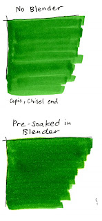
Today's background technique is very straight forward. This is a good technique if you are covering a REALLY large area, like for architects using wide markers, though I am showing it with the chisel end of regular Copic markers.
 I colored in streaks to really show the smoothness difference between the blender and the paper that wasn't pre-soaked (if I colored in circles it would be totally smooth. This way was easier for me to tell that I was putting down exactly the same amount of ink between the two samples)
For a smooth, even background you can get a really juicy blender marker and pre-soak the area you want colored (I inked my blender just before doing this to make sure it was good and juicy). Stay inside the lines. While the area is still damp, add your background color. Very simple, very easy.
You may not be able to see it very well, but on my pre-soaked sample of green it goes outside the lines at the top a bit. This is because I accidentally went outside the lines with my blender, so my color wants to follow wherever the blender is. Also note, that the color is slightly different between my two greens. This is becuase it takes less ink to evenly color your paper when you pre-soak it. The backside also looks different, with the top example looking streaky but the bottom example is smooth but grainy, not perfectly smooth like it usually looks when I color regularly.
 The trick is to color while the background is still EVENLY damp (that's why it's so important to have a juicy blender). It takes practice to work quickly but smoothly before the base blender dries. Once the large area is done then go back and do the tiny areas. Remember to add blender to tiny areas as well, or else the color will be darker and look bad.
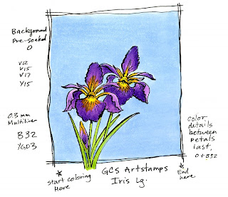
For my final example today I took this beautiful large iris by GCS Artstamps and I drew a box around it for my sky. You can see where I started (so my hand didn't drag through the wet area). and how I worked my way up, across, and then back down. I could have worked a little faster, as it is you can see how the side I ended on looks a little different than the other side. Hope this helps give you some good ideas about backgrounding, I'll have a few more ideas later this week.
Thank you again to everyone who wished me and my friends at Our Craft Lounge good luck on our new company. It's a lot of hard work, but it's worth it when people get to enjoy coloring new pictures.
Image: Iris lg. by GCS Artstamps Ink: Tsukineko Memento Tuxedo Black Paper: Copic sketchbook paper


2 comments:
Thank you for sharing these ideas. They are really helpful and images look beautifully colored.
Thank you! These tips are very helpful.
Post a Comment