Showing posts with label techniques. Show all posts

Wednesday, March 23, 2011

Shadows & Shading Blog Hop

Note: Commenting is now closed. Winner will be posted Monday. Thanks for commenting!!

Book Giveaway

The Shadows & Shading book is now available at many of your favorite retailers (sorry, we do not sell direct or else I could post a link), and so we wanted to offer a chance to WIN a copy for yourself.
Thursday the Copic Instructors in the US and Australia are doing a Blog Hop!!!

My new book, Shadows and Shading is great for beginners, either papercrafters or artists - this is the reference book you have been looking for to help you add shadows to give your projects more dimension. The book does not teach you to draw, rather to help you add shadow and shading. This is a wire-bound book that comes with 4 clear printed guides to help you add shadows properly on your own work. So far, the people who have read it love it! There's a lot to digest, so take it slow and read it often to let the concepts sink in.


Now, a Blog Hop wouldn't be as much fun without BLOG CANDY!!! Today or Tomorrow each of the blogs listed below will be posting an opportunity to win. One lucky commenter per blog, so you have lots of chances to win. That's right, simply leave a comment on this post and you'll be in with a chance to WIN this fabulous book!! You have until Sunday to leave a comment on my blog or any of the following blogs.

Here's the list of blogs you can comment on for your chance to win. Please note, this contest is only open to North American Residents on the North American blogs, and Australian Residents on the Australian blogs.


N
orth American Residents only:

Copicmarker Blog

Marianne Walker

Lori Craig

Sharon Harnist


Jenn Balcer

Jennie Black

Colleen Schaan

Bianca Mandity

Debbie Olson

Sherrie Siemens


If you live in the land down under, then you can win from one of the Australian Blogs:

CopicOz (Australia)

Kathy Jones (Australia)


Mandi-Lee Klinger (Australia)


Ok, Happy Hopping!!

Coloring Shadows Example - toy guitar
I don't know if I've shown this picture before on this blog, but it really does a nice job of showing a cast shadow. Cast shadows can be scary! You have to draw in a shape that isn't there. Aaack! However, it is worth it. Practice makes perfect, and the clear lighting placement guides included in the book are perfect for practicing without wasting paper.

Look at the first picture, without a cast-shadow shadow. While the object is beautifully rendered, it has no "place". It is a floating object without reference. This looks strange, because it is easy to see the dimensionality of the guitar and where the light is hitting it. The easiest way to "ground" our image is to add a cast shadow.

The shape of the shadow mimics the shape of the guitar. On this image, it is almost parallel. If you are worried you're not doing it right, you can take a second copy of the image, slide it over a bit, and trace it.

On this example you'll notice that my shadow is purple, not just gray. The shadow gets more gray as it gets farther from the eye. The shadow gets lighter under the neck because there is more ambient light.

Notice the neck and the top area with the tuning pegs. These are not colored a flat color, even though the light would hit those surfaces uniformly. By giving them slight color variation (lighter in the middle) it helps to add to the shine/dimensionality. The texture on the main body of the guitar was made with a colorless blender. This created the splotchy blended/washed out look you see.

I hope that you can come to see how much more life a shadow gives, have a wonderful creative journey, and good luck with the contest!

Friday, March 18, 2011

Detail Tutorial & Stylish Blogger Award

I wanted to do a quick tutorial on the Anime girl I posted a couple days ago. It's the little details that make the whole look so nice, and the details are easier than you think! Don't get overwhelmed, just try one or two of these simple ideas in your next project, and I bet you'll like the results.

Easy, Elegant Details
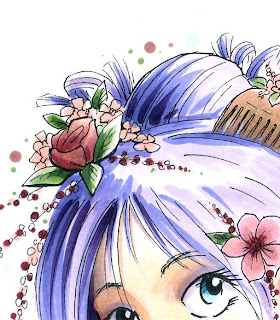
Face: The face is made of a good range of skin tones, for strong contrast. The detail here that I want you to notice, especially above the eyes, is that I used the same pale BV from the hair for the BV in her skin shadows. This makes her facial tones match better.

I also kept some shadows crisp, while I blended out the smooth areas as much as possible. I made sure that I shaded under the strands of hair in her bangs as well. Notice that I added a very faint gray/purple shadow on the edges of her eyeball. this gives it a little dimension, yet makes the white area still stand out.


Clothing: (Jing, this one's for you). Jing saw this picture in my portfolio at CHA and was impressed with the clothing. I explained how to do it and she was surprised at how simple the technique was. So I promised I would share it someday on my blog.

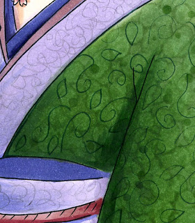
The rich green in her kimono is a couple shades of green, smoothly blended together. Then, while the background was still wet, I dabbed in some colorless blender. I also added a few dots of the darkest green to finish the texture. This created the subtle variation you see. Once it was dry, I took an olive 0.05 Multiliner and doddled in the darker swirls and leaves. The final effect, when viewed from a distance, looks like a very elegant pattern.

The purple fabric was much simpler. I blended the purple together, then to finish it off, I scribbled with a regular pencil the pale gray pattern. That's it. Because the pencil was so light, it kept the tones of the purple underneath and looks very nice.

Hair: I did not blend the hair at all. Rather, I colored it in simple streaks- I left the highlights white, then added BV00, BV04, and BV08. That's it. From a distance it looks much more complex. I just made sure that the streaks overlapped in a way that you can still see the individual strands from each layer. I made sure to darken the shadow side more than the highlight side, and deepen the area behind her head the most.

Even the flowers and blossoms are colored very simply. However, the detail in the drawing itself makes it look much more complex. I repeated the pattern of the blossoms in the sky around her head simply by dotting with the same light green and light pink. I dunno why, but for the last couple years I have enjoyed doing this, and I like the look it produces. Call it a personal quirk.

Also, I was presented to the Stylish Blogger Award by Robin. Thank you Robin!! I am happy to inspire you.

I don't really do the questions about myself, since those of you who are my friends on Facebook see enough of my personal life. I also must confess that I don't have time to follow blogs much. I've found that I have time to either be a media producer or media consumer, but not both.

However, I regularly go to the Copic Blog because there is such a variety of artists featured on there that I am always able to find inspiration...check it out!
Thursday, February 17, 2011

Coloring clouds

Yesterday I promised I'd show you a quick tutorial for coloring clouds. This is an easy technique that ends up looking really cool and very unique. I hope you give it a try. Remember, this effect only works on absorbent papers, not coated papers.

Coloring Clouds
It's always tricky to color something white with Copics, as you have to leave the paper white. Today's tutorial is super easy, and gives you a bit of flexibility with your sky designs, especially if you don't have an airbrush to mask off pretty, puffy clouds.

First, start by lightly feathering a pale blue into your sky (B41 in this case). Be sure to leave some white areas where the blue feathers in, as these will be your clouds. Try to keep the bottom of the area parallel with the horizon, as it will look more believable that way. It's better if they are slightly irregular shaped. Make sure the rest of the blue area is streak free, which may take a few light layers of color.


Next, go in from the middle of the white area with your colorless blender. Push the color from the middle of the white, out into the blue. Follow the natural streaks left in your work to create the irregular edges. How far out you push the color is up to you, but the more you push it out, the darker your edges will be.

This is a good time to experiment and try different effects or cloud shapes.


Try not to stop pushing until you are done with the whole shape, otherwise, you may get strange edges. It helps if your blender pen is really juicy and has been recently refilled. When you are done, your clouds should look something like this.

If you still see too much stray blue inside the cloud (like on the right edge of the bottom cloud in this diagram), you can always go back after the cloud is dry and push the color out again. If you try to fix it while the cloud is still wet then it won't do much.


Here are some other fun variations on the same effect. Each time the shapes are different, so play around until you get a look you like.

The bottom illustrations with a pair of clouds were made a little differently. First, the whole white area was blended out. Then, while the middle of the clouds were still wet from blender, I took the sky marker and drew in the puffy top of the bottom cloud. Because the base was wet, the line immediately became soft and fuzzy, just like the rest of the edges.

If you want to add a bit of color to the clouds, add it while the area is wet. Try adding some pale gray around the bottoms for a darker, ominous sky, or hints of pink or yellow for a cheery, whimsical effect.


The final image today of Easter Island is actually one I drew for the Shadows & Shading book. I could not run a marker coloring tutorial in the book on this technique, since I was using this illustration to explain a different concept. I can't remember which colors I used, but you can see that the clouds look convincing. I hope you have a great weekend and have a chance to color!
Monday, December 27, 2010

Faux Tea-dyed flowers

Searching in my blog
Before I jump into today's tutorial I just wanted to explain something about this blog. I have tons of things archived over the last few years. You can approach this site by starting at the beginning, back in June of 2008 and reading through, or you can search topic by topic.

People occasionally ask me how to search through my blog. To search by topic, just type a word in the search bar up at the top of this blog. This will limit your search to only things on my blog.

If you are looking for information on a specific product line, then you can search using the glossary in the left sidebar. I hope this helps you find some hidden tutorials that you may have forgotten.

Faux Tea-dyed flowers
I made my own Christmas cards this year, and since I had to make so many, I kept the design VERY simple. It takes too long to color a cute little image on that many cards, so instead I used some hand-dyed paper flowers. You can use this same effect on wide ribbon to make it look tea-dyed as well.

These flowers are very easy to make with Copic markers, and look really cool when you are done. Before you start, be sure to have plenty of clean scratch paper under your work, as this gets messy.

First, take your paper flower and scribble on it with a middle/dark color. For this flower, I used R59. The final color will be both lighter and darker than this color, so test a few colors to find the one that will end up matching your project the best.


Next, you need to add a lot of colorless blender. I like using an empty water-brush that has been filled with colorless blender. If you don't have a water-brush, then you can accomplish the same thing by dipping your colorless blender straight into the big refill bottle, then dripping the blender on. This will make the flower very wet and make the inks flow around similarly to if you were actually dying the flower.


Wherever you drip the blender, the color on the flower will start to bleed away from that area.

If you drip in the middle first then the color will run out to the petals more. If you drip a small drop onto each petal then it will push the color out to the edges of each petal. The second flower was soaked evenly all over, see how the colors muted more and ran together more? If you like this look then go for it.

Once you get the look you want, let the flower dry completely before touching it. If you have a drop of ink on your finger and touch the wet flower, then it will pick up that color. If there is color on the scratch paper under the flower it could pick up that ink as well.

Here are some variations on the effect. The small pink/purple flower has a nice 2 tone feel, with purple added to the edges only, pink in the middle, then blended from the middle out. The little brown flower was the same, just with one color. The larger flower was scribbled more randomly so the white spots are more irregular.

Here is one of my finished, simple Christmas cards. I hope this has given you some ideas. Tomorrow I'll post about upcoming Certification classes. Next week we have some exciting announcements for 2011, so stay tuned!

Saturday, October 16, 2010

Coloring around tiny details

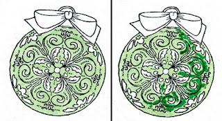
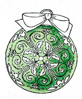
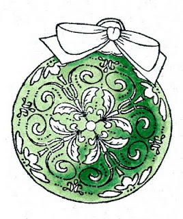
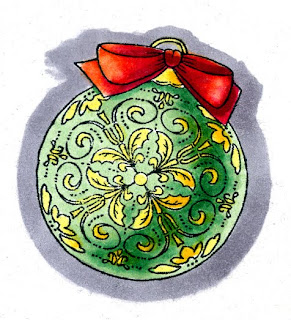
Sorry I couldn't get this post up earlier, but I was having blog problems. It's all fixed now, so here's the tutorial for the Just Rite Blog hop. If you look at the ornament I colored a few days ago, you'll notice that I was very careful about coloring the main ornament green and the tiny details yellow. I did not use the blender to clean up the areas, rather, I was very careful in my coloring.

Coloring Around Tiny Details
First, you want to start with the main color that you are working around the details. In this case, it was the light green. I stamped my image with Memento and made sure it had dried really well before coloring, since tiny details would show bleeding more than usual.

Carefully color with the base color, G12. I used the very tip of the brush and had no problem working around even the smallest of shapes. At this point, if I had made mistakes I could still clean out the white areas with my colorless blender, but I don't really need to on this image. When cleaning up you need to have a lot of patience. dab a tiny amount of blender on, let it dry, dab another tiny amount and so on. You can't scrub in the blender like usual to clean up areas.

Next, I lightly scribbled in the dark green, G17. I scribbled because I had to be careful to not oversoak the areas I want to blend, as it could easily bleed into the surrounding details.

Now I can ever so carefully go back with the G12 and lightly blend the darker green out. I want the areas where the darker green fades into the lighter green to be as smooth as possible to keep the dimensional illusion to the ornament. It's OK if I lose the darkest areas of the darker green.

Once the blending is dry I went back with the dark green and touched in my deepest contrast again. The base colors need to be dry in order to keep the edges crisp. Now you can really see the dimension on the ornament. I like the high contrast between the G12 and the G17- this is what makes the ornament look so round.

Finally, I colored the yellow details- lighter on the light side, and Y17 in the shadows. I was not as worried about precision, since the yellow would not show up if I accidentally colored over the green areas.

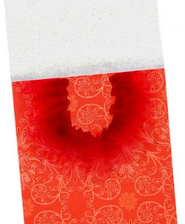
The paper I was coordinating with was very orange-red, so I used YR09 and RV29 for my base red tones on the bow. Then I darkened it with R59. This helped pull the reds together. Again, I was careful to keep all my highlights and shadows consistent with the main ornament so the whole image looked better. Then I colored a middle gray around the outside of the ornament, since I knew I would be cutting it out and I wanted some contrast between the ornament and the background paper, but I didn't want to cut two pieces of paper.

One detail that you might not notice right away on the final bookmark is that on the base papers, I wanted to coordinate the colors a little better, so where the light gray paper met the red I blended in a very light layer of C1 and C2. Then, under the area where the ornament is sitting I added some of the reds, again, feathering them out until it created a darker halo around my ornament that smoothly blended out to the reds of the paper. I also did this along the bottom edge of the red paper. Thanks for stopping by, have a great weekend, and I'll see some of you in a few days in Chicago!!

Tuesday, September 21, 2010

Rainy Tutorial

Dripped Water
Today I wanted to show you some simple methods to show, wet, drippy things. i know I've shown water drops in earlier posts, reflections on water, but I figured you can never have enough water tutorials, as water can be pretty tricky.

I started by choosing my light source and coloring the galoshes in shades of yellow. The scanner didn't pick it up, but I used Y06, Y38, and E35. The E35 helped tone down the shadows, otherwise they would have looked glowing orange instead of shaded yellow.


When we want something to look wet or shiny, the best way is to have very strong contrast between light and dark. In this case, we'll want the puddle of water to look wet, and we'll make the galoshes shiny, and add drops of water on both the umbrella and the galoshes. Since the image is so tiny, I'm going to worry about adding contrast back in later.


Next, I colored the water with B41. I want this to look dimensional, so I left strong white highlights on the edges that were closest to the light. I darkened the shadows with B45 and added a dark rim around the bottmo edge, especially on the shaded edges of the water. Already, the water is looking more wet and is catching the shadows from the boots and umbrella nicely. Now we can move on to coloring the umbrella.


I want the umbrella to be pink and purple. Notice that the way the light is shining, it is the inside of the umbrella that will be the brightest, not the outside. Also, keep in mind that the bottom of the umbrella outside will have darker shadow than the top of the umbrella, as there is less light bouncing around under the umbrella.

I colored the purple areas with B12, B17 and a hint of B79 to darken it up. Then, I colored the pink areas with RV00, RV02, RV04, and a hint of E04 to tone down the neon pink on the outside of the umbrella, yet keep the same feel of the base pink tone.

Now I am ready to add some drips of water. To do this, I start by grabbing my darker blue, B45 and adding spots on strategic places around the boots and umbrella. Don' go crazy- just add enough to make it look like it still has some drips left on the surface.

Last, with a tiny brush, take a jar of Opaque White and a really tiny brush and add a speck of white back into the center of each drop. Add a couple shiny highlights onto the edges of the galoshes that sick out closest to the light. To make the water appear shiny I added a couple simple parallel lines along the surface.

Now I have a pair of drippy wet boots and a wet umbrella. I hope you have a dry day today and have fun coloring!


Monday, August 30, 2010

Feather Blending, again


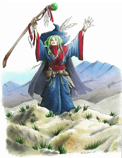
I had a great time at the Manga demo in Portland this weekend, and I had a chance to color this wizard picture I had drawn years ago. It's always fun to re-visit old images and color them with fresh eyes. I like this version a lot better than the version I colored oh so long ago.

Just to give you an idea of scale, these large manga pieces that I occasionally show are full-page sized, they are not small pictures, and are made for my example book. If you ever meet me at a show, bug me to let you look through my example books- it's fun to see bigger work sometimes, and see how I use techniques on a large scale.

You'll note in this picture how I show distance by making things in the back blueish. I know I've explained the blue-things-far-away before, but it never hurts to talk about how to make it look correct in a finished piece.

Feather Blending - Purple Mountain Majesties
I wanted to use this piece as an example of good feather blending. I've talked about feather blending a few times before (1, 2) but it never hurts to review.

Many of the Intermediate Applications I received I have had to turn down because they did not show proper feather blending. To me, this means I must not be explaining it well enough. This is a tricky concept, so it's getting an advanced label. What really makes it tricky is the amount of practice you need in order to find good color combos and time it takes to figure out the proper technique.

If you look at the mountains in the background, you'll see that they blend from blue, to purple, to warm gray. Blue and Warm Gray are opposites, in that Warm Gray is brownish toned and Blues and Blue violets are far away from them on the color wheel.

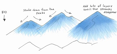
I started the mountains by coloring with B41. I stroke from the top of each peak, down to the base, flowing in the direction of the mountain. I am lifting up at the end of each stroke so that I have less ink at the base and more at the peak. As you can see from the third peak, I apply lots of very light layers to achieve the look I'm going for. I did criss-cross my strokes slightly for a proper feather, but I am consistent with the base feathered and the top of the peak dark.

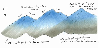
Next, I feathered in W3 from the bottom in exactly the same technique, this time, making the base dark and the feathering go back up into the mountain. I added lots of very light layers to achieve the proper blend. I think on the actual picture I used W2, not W3, but you get the idea.

You can see on the third peak how the layers blending more and more, and you notice the streaks less and less. Sometimes I'll come back with the blue and add another light layer after I added the second color, just to get it a little smoother.

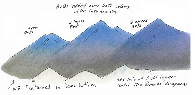
Last, you'll notice on my final mountains that it has the pretty purple fade. After I was done feathering the blue and the gray I added a faint layer of BV31. How much is a matter of personal taste.

You can see from these mountains that the more you layer the pale purple over the whole area, the more it shows through. The third mountain is colored as if it is in front, but it looks like it has more shadow than the others, so it could have been colored as if it were in back simply by adding more BV31. The purple is strongest in the middle because there is the least amount of dye on that spot on the page. This gives the purple a place to fill in, if that makes any sense.

On the final mountains in the main picture I added a faint streak of BV23/BV25 to darken the shadows on the left side of each peak. This makes it look a little less flat, but not so much that it detracts from the main image.

I used too many random colors to list, but I did use one other technique, which you might not have noticed. On the rocks in the foreground I dampened my nasty rag and blotted off some browns and grays that were already on there. This added the hint of texture you see on the front rocks.

I hope this has inspired you to practice the feather blending again. This is tricky, but when done right, it looks really good. Have a great week!

Sunday, July 25, 2010

New Products, CHA Summer 2010, Part 2


More new Products for CHA
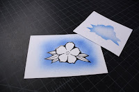
The next new product I want to share is also from Australia, new Mask-It masking film, from X-Press It Graph X. This stuff is perfect for those of you who frequently airbrush and want a high-quality mask that will last over and over again.

Mask-It is a clear, medium-tack adhesive backed film that is easy to cut, and easy to apply. It works great on cardstock and is perfect for protecting areas of your work that you want masked during airbrushing. One really nice point is that you can clean the surface between sprays, unlike using paper masks that get sticky from ink buildup. Best of all, since it's totally clear, you can assure accurate positioning every time.

Using Masking Film
If you have never used a mask before while airbrushing, then this tutorial should be really useful. There are many types and kinds of masking films, friskets, and adhesives available, but for today's tutorial we are using Mask-It, medium tack film.

1. Start with a copy of your image stamped or photocopied onto scrap cardstock. Apply a small piece of clear film over the stamped image. Make sure there are no air bubbles under the film, as this will distort the final shape when you re-use the film. Note: test your Mask It to make sure it will not pull up the fibers of your paper. If it seems to be stronger than the paper, then gently touch the adhesive to your clothing before applying to the paper. This will make it less tacky.

2. With sharp scissors, carefully cut around the scrap image. Save any pieces you will be using for masking. If you are airbrushing around a shape, save the inside, if you are airbrushing inside a shape and protecting the surroundings, then save the outside. You do not need to save the paper parts, just the clear Mask-It.

3. Apply the clear film to the area you want protected when you airbrush. This is tricky, since images with thin lines can shift easily, and you don't want to block any areas that should be airbrushed (it looks strange when you have an unintentional white halo around your art). Make sure that the film is smoothed down at the edges and won't move once you start blowing air.

4. Airbrush from the middle out. The medium tack film is great because even on fine detail areas it doesn't blow up around the edges, even if you've used the same mask a few times.

5. Carefully remove the frisket, and you're done! Save the used piece for your next project with that image. If you get a marker buildup, simply wipe the surface with hand-samitizer.

Come check it out in our booth this week- I think you'll fall in love with it just as much as we have. OK, I hope to post a few more new items before CHA starts, but I'm off to catch my fight now. Have a great weekend!

Tuesday, May 18, 2010

Working with Reds

Working with Reds
It seems like recently I've had a lot of people who have been having problems with their reds bleeding. Red is such an intense dye that I am not surprised at all, however, I haven't noticed a problem with my red projects, so I figured that I must color differently than you do.

Red is a strong vibrant color and has a lot of emotion in it. It can also cause a lot of emotion when you're in the middle of a great project and it bleeds into your other colors. Here are some tricks for keeping your reds in place.

If you look closely at this cute little stamp from Hero Arts (click on image to enlarge), you can see that his red shirt has bled out. I colored him in the traditional way I would usually color. I started with my lightest color, coloring in circles, evenly soaking the page. Then, I added the darker red, came back with the light, and blended them together.

The back of the paper is smoothly bended so I must be doing it right, but...Uh oh! Those reds bled outside the lines on the Neenah paper I was using. How can I prevent that?

Here are a few tips that should help you out:

• Work on an absorbent surface. Make sure that the ink is not bleeding simply because you're coloring onto something that is making the ink spread.

• Try a different paper. Neenah is on the soft side of the spectrum. Bazzil Simply Smooth (formerly Prism Simply Smooth) won't bleed as much, but then again, it may not blend in the same way either.

• Use Less ink. You don't really need to completely soak your paper, as red is forgiving. If it looks like the surface is evenly covered then that's good enough. Ignore the back of the paper, as the front is more important anyways.

• Try feather blending colors together. If coloring in circles over soaks the paper, then feather-blend your colors together, as this uses less ink.

• Let base layers dry before you add darker colors on top. The paper can only hold so much ink before it wants to bleed. if you let it dry a little (don't let it get completely dry or it will take more ink to blend) then it will accept more ink in the same spot before it begins to bleed.

• Avoid edges. If none of those techniques work for you, then be extra careful and don't color right up to the edges.

Note: It is very hard to fix bleeding reds with the colorless blender! You are more likely to create a bigger mess.

Here is how I colored him for my final picture. Since I didn't want to switch paper, I changed my technique instead. I decided to go with feather blending. I am working with the Natural Blending Group of R24, R29 and R59. Since R29 is the darkest in the R20's group, then I can shadow it with either R39 or even darker, R59. Since I like more contrast, I went with R59.

1. Start with your light color (R24) and feather it into darker areas. Leave it white where the darker color will be added.

2. Lightly feather in the darker red (R29) from the opposite direction.

3. Let the middle red dry a bit, then add the darkest red (R59). You don't want to take any chances, and two or more layers of red are really going to risk bleeding.

4. Let it dry some more and then feather some R29 into the R59 area, and feather the R24 into the R29. It may take a few LIGHT layers to really get the colors to blend, but it will work eventually.

Here is my final guy. As you can see from the back of this image, I used a whole lot less ink on this smoothly colored picture than I used on the first image, and it still looks great.

I lightly feathered the BG10 out as simple sky accent from his shirt. If my reds had bled at all, then this would have caused the red ink to spread all over the place as well. But you can see from the back of the paper that my ink does not soak all the way to the lines, unlike the first image. By using less ink overall, I am able to get my reds to work better.