Showing posts with label picking colors. Show all posts

Wednesday, August 14, 2013

Helpful Color Chart

Isolating Colors Chart
I hope you are having a great week! I was coloring a tutorial image for Tracing Memories outline, and I realized that a trick I use with attendees should probably be added to my blog.

An old trick artists use when they want to figure out what color something is, they isolate that color by looking through a card with a hole cut out of it. Then they can compare that one spot with the colors they are working with.

I know some people have taken their large Copic color charts and done something similar so they could identify color matches, by punching a small hole in each swatch. But, those charts are kinda small, and I don't have a long-arm small hole-punch. So, I made a special color chart that I wanted to share.

To make this easier for the class I'm working with, I created this helpful chart for 36 colors per half-page (72 colors per printout). This is set up so that you can punch the holes with a standard, single hole-punch.

To use this chart, right-click on the image and download it. Then, simply print it on your favorite marker paper and color in each rectangle with the colors you have. Write the color number next to it. Punch each hole. Then, line up the colored page with the area you are trying to color-match.

As you can see from this close-up of the dog photo, the grass is somewhere between G28 and G99. So, when I go to color, I will use a mix of those two colors. I actually want the grass a little lighter, so I threw some G24 into the picture first, then scribbled in G28 and G99.

For the lighter gray on the dog, my color guide told me that C2 is a good match. This is a really handy quick reference, especially if you have a hard time matching colors to the Copic color spectrum, or if you only have a limited range of colors and have a hard time figuring out which will match the best.

Here is the finished picture. I colored him with G24, G28, G99, YG11, YG13, YG17, G02, E33, E27, E49, 100, C2, C5, R85, and B41. instead of worrying about keeping the daisies white while coloring, I went back after I was done coloring and added them back in using Copic Opaque White. The original photo was taken by Chelsea Lowery, of her big dog, Rupert. He's such a cutie!

Thursday, December 27, 2012

Layering Different Tones

I was coloring a little girl for a graphic I am working on and I realized that I was going to color her in a different way than I have shown before, so you get this fun tutorial.

Usually I talk about coloring by layering colors in the same family, starting light, and adding dark, then going back and blending with the same light color. Today I'm going to show you how I sometimes blend with an entirely different color.

Blending with a different tone
In this image, I want a blue overtone, but I had a limited color range (I was being too lazy to walk into the other room and get all my markers). So, rather than start with a light blue, and gradually work darker, I started with a BG sequence.

1. In the first image, you can see I had BG01, BG45, and BG49. I added colors as layers, just like normal.

2. Here I added my more subtle blue tone by layering B41 over the whole image. I used it to blend, instead of the BG01, because the BG01 was too intense, and I needed a softer tone. Notice how the shadows retain their intensity, but the highlights now have a softer blue tone, and many of my harsh lines have softened (my final output will be very small, so i am not trying to blend out all streaks.


3. Last, I added the other colors to finish off the image. Because B41 is still in the same similar range as the BG family, you don't see much subtle variation, except that the BG has lost it's intensity.

But what if we totally switched color families?

Here is my second example. In this case, I did exactly the same thing, but I started with the fairy in the BV family. When you look at the second image, notice how the pale blue totally changes the whole feel of the artwork. I like this purple sequence much better. The blue highlights really set off the purple shadows.

So, in each case, only the base color changed. I know I have talked about base colors in the past, but I really want to drive the point across that the base color can change the whole feel of your work. This is a great way to work with a limited color range, or to match an image to a specific paper.

I hope I inspired you to experiment a bit with your color range, have a Happy New Year!


Thursday, August 5, 2010

New Products CHA Summer 2010, part 4

Color Swatch Book
One last neat thing that we introduced at CHA this Summer is the new Copic Color Swatch Book. This handy, travel-sized organizer is perfect for keeping your colors organized and having a reference book that is customized by you!

The Color Swatch Book is printed on very nice bright white cardstock, ideal for giving you accurate color readings. The back cover unfolds and tucks between pages to protect while filling in swatches. The book measures approx. 7" x 3.5" (about the size of a checkbook) and has 18 pages with color groups and directions.

Each page is organized so you can see Natural Blending groups and see where you might be missing colors in your personal spectrum. As you can see from this photo of the BG page, I can quickly see which colors I want in the BG family that will blend with the BG09 I already have. For space purposes, some blending groups are listed on the same line, (See the BG30's and the BG40's), but wherever possible each group is given it's own space.


Best of all, the cover is left uncolored (see the book in the photo behind the colored version)- you get to color it how you want! I drew the cover art based on illustrations from the Art Noveau movement 100 years ago. I really love the flowing lines and repeated floral patterns from the 1910's and 20's.

Drawing Process
I drew the art lightly first with a pencil then traced it on my light table with a .25mm Multiliner SP. I went back with a thicker pen to darken in the larger dark areas. Then I scanned it into the computer and cleaned up some of the lines. Last, I took my artwork into Adobe Illustrator and converted it into vectors to give it the smooth thick/thin line quality that you see here.

Coloring Process
I really had fun coloring the final cover of my swatch book! Best of all, each person can I started with my lightest colors, in this case, the green. I used YG41 and faded each stem so it would be easy to blend into the next color. Next I added BV00 and feathered it into the green of the stems. I also tapered the BV00 into the top of each "blossom", leaving the tips white. Then I feathered E04 back into the BV. After I had the blossoms finished I darkened the green stems with G85. Anywhere the stems look like they go behind each other I was sure to make it a little darker. this gives the curling lines more individual strength.

Next I darkened the leaves. I wanted them to have the same general tone of the stems, but still be distinct. To do this I could either make them lighter or darker than the stems, so I opted to make them darker. I Began with a base of YG41, darkened with the G85, then added a touch of B39 to really deepen the green without turning it grey, since there really wasn't a darker green that I wanted to use that would not turn it gray, and G29 would leave a different feel to the tone. As it is, the hint of deep blue really gives dimension, in my opinion.

Last, I added a touch of dimension to each blossom with a dot of BV04 blended with the BV00. I colored teh marker with C1, BV23, and C5. By throwing the BV23 in instead of the C3 it also adds a bit of color depth to an otherwise stale gray. I added crisp shadows under each leaf that covers the marker with the C5. I colored the logo with the YG41 lightly faded into the BV00. The tips of the marker are colored with BV00, BV04, and a hint of E04 to pull in the pink from the blossoms. The fine white lines on the shiny marker body were made with Opaque white that I carefully applied after I was completely done coloring.

I hope this gives you some inspiration for coloring your own beautiful swatch book cover. Once you color yours send me a link! I'd love to see what you make.

These new swatch books are now shipping, so ask your local Copic retailer if you would like to get one for yourself. The Blending Card will be arriving in stores in a couple weeks.

Thursday, September 3, 2009

Water in a pond

About a year ago I first talked about how to do water and reflections on water. My post back then was advanced. Today I want to show you a beginner example of rendering water in a simple little pond.

Coloring Bodies of Water
Before we proceed I suggest that you read this entire post from last year about doing reflections. I have modified the wording slightly in today's post, but read the whole thing to see it's final application.

I have included a reference photo from a recent trip to the lake. This was taken on a slightly cloudy day, on a very still lake. Look at each of the points in the photo that I describe below.

A couple of basic rules about water reflections-
(I'm simplifying so you can color it easier):

1. Still water gives crisp reflections, moving water will be broken. The more your water is moving, the more the reflection will be broken, so it's a matter of taste as to how much accuracy your reflection has. It looks more accurate to have still water near the object and gradually make water far away more broken as the light from farther away gets more distorted.

2. Reflections are about the same size as the original object. Reflections are just a trick of light on a body of water, and from a distance the main body of a reflected object looks about the same size. There may be a few stray bits of color reflected in ripples farther out, but for the most part, keep the reflections reasonable. If there is a distortion it will usually be towards the viewer.

Don't go overboard with the reflections! Remember which part of your artwork is most important - is it the objects above water or the reflections. You'll need to make artistic choices to make the important things stand out more.

3. Water is one or two shades darker/grayer than whatever it's reflecting. This is your clue that it's a reflection. Since the sky is usually blue, your reflection water usually has a slight bluish tint to it, which is where we get the idea that water should be blue. Water is not really blue, water is clear. We just draw it blue for simplicity sake.

The mood of the water also is determined by the color of the sky. On a dark, overcast day then you'll get dark water with little light reflected. On a bright, sunny day you'll have bright water with more light reflected off the surface. In my photo you can see that it's a middle day, so the water is kinda dark, but not too bad.


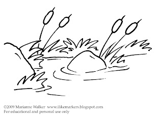
Blank picture to color
I have had a few of you request that when I do a quick drawing that isn't from a stamp then I should include a blank picture to print out and color.

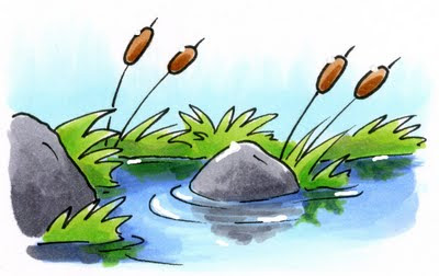
Here is a copy of the line drawing I am coloring today. You may print it for your own tutorial purposes. You can color with Copics over some inkjet printouts, so test before you print to know if your particular ink will bleed or not. Otherwise, you can print it on a laser printer or photocopy it and you'll have no problems coloring.

Water In A Pond
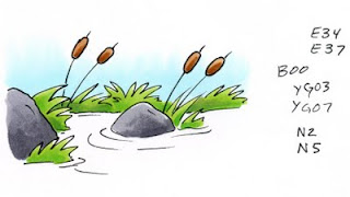
I'm starting today with anything above water already colored. That way we can focus on just the water. You'll see that my sky is a nice light B00 and my grass is a simple YG03 and YG07 combo. The rocks are a neutral gray and the cat-tails are a simple brown. This is a nice, easy scene to color - until you start coloring the water.

Let's take it in easy steps so you don't feel overwhelmed.

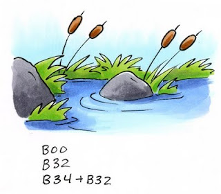
If we start by coloring the water the same color as the sky you can quickly see how flat and fake our scene looks. However, we must remember that the water will be the same tone as the sky - just slightly darker and grayer.

By adding a base tone of our sky color it will give the final picture hints of our underlying blue sky and pull the two elements together more. So go ahead, color your water with the same color as the sky (Other colors I like for blue skies include B0000 or B000, B32, BG10, BG0000)


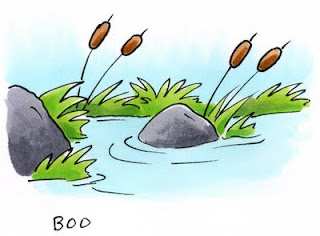
Next, we need to darken the water and tone it down a bit.

If I add a color that is in the same blending group as the sky then our water will be too vibrant. Remember, water is more gray than sky. In this case I will need to use a blue that is grayer by about 2 or 3 families, so I reach for something in the B30's. The lightest shade is B32, the last digit - 2 - tells me that it will be 2 shades darker than our original color which ends in 0.

I shadow the edges of the pond with the B32 and I leave the middle area still light, as this would have the most direct reflection of the sky. Already this is a big improvement over the flat blue we first had.

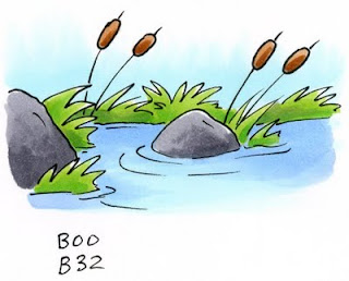
Time to add contrast. Remember, contrast makes things more interesting so we should always look for ways to improve our work. To give the water contrast and shadows I reach for a color that is 2 shades deeper than B32, which would be B34.

I darkened things near the shore, and the shadow side of each object near the water. I'm not adding too much, just enough to make it look interesting. Then I take the B32 and smoothly blend the dark blue into the middle color (You can leave yours kind of streaky as long as your streaks are in the same direction as the ripples). I also added a hint of shadow to the ripples to add variation as well.


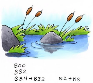
Now we can add the reflections of objects. This is a matter of personal taste. You might like the water just as it is.

I start with the largest objects. In this case it's the rocks. I take the same two grays I used on the rocks and I am lightly scribbling in the direction of the ripples. Note how it's not smooth and perfect and you can still see blue under the gray. This is OK. This is what increases the illusion of water. You can see that where I have a ripple I left the darker blue alone. This also heightens the idea of water.

The rock closest to us is much bigger and closer, therefore it's reflection is much crisper and deeper. The ripples don't affect it as much when it's that close.

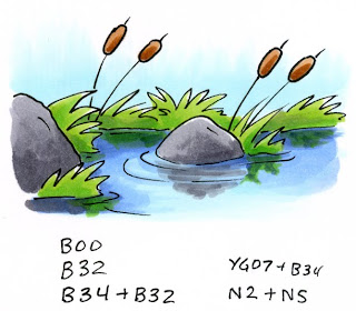
Now I can add the shadow of the grass. I use the darker of my two grass colors and lightly add the illusion of grass. to darken it up I added hints of the B34. This helps give the water a deeper, brighter blue-green feel, and it tones down the vibrant YG. Now our little pond looks almost done.

For the final step today I need to add white back in. To do this I took some opaque white and a very fine paintbrush (or toothpick) and I painted back in a few small highlights. I added some glints of light to the ripples in the water and I gave a dab of highlight to each of the objects in the picture as well. Now we can really feel how bright and crisp our day is with the sun shining on our serene little pond.

If you try coloring today's tutorial please send us a link of your example. I would love to see your colored picture! Have fun coloring.

Thursday, August 13, 2009

Contrast Contrast Contrast

People frequently show me their coloring and they ask me if they are doing it correctly. Almost always their coloring is great. It looks smooth, their blends are nice, and their colors match each other well. So why do they feel that there is a problem? Because their artwork doesn't jump off the page - it just looks flat and sits there.

Contrast
I know I mention it often, but the biggest reason the art doesn't look complete is because there isn't enough color range to make it exciting. To achieve the look of 3-D you need to have darker darks and lighter lights. Don't forget that Copics come in all 334 colors for a reason (I know the new pale colors are exciting, but don't forget about dark colors too!).

Look at the top example of this cute little turtle. I followed all the rules. I colored in color families that are all bright and vibrant. I picked colors in two color sequences that follow the Natural Blending groups. All my colors are just a few digits off from each other (except yellows because those are so vibrant you can get away with larger jumps). He's cute, you can see some shading, but he's kind of flat looking and plain.

Now compare him to the bottom example. All I did was take each color group from the first and add one shade another 3 or 4 digits darker (the yellow was shadowed with a grayer yellow, Y26). Just that one simple change in each color group makes the turtle appear more alive and rounded.

You might be one of the people who needs this. Look at your work. Hold it at arm's length and squint at it. Does it all blur together, or can you see shapes and forms because of the shadows? If your colors seem flat then add more shadows (go dig through my older posts to find out where to put those shadows). It may take a bit of effort to get out of your comfort zone to add the deeper colors. If you find yourself only using colors that end in a 5 or lower then I strongly urge you to add a bit of darkness in.

Try today's example for yourself. Color a picture in only 2 colors, then color the same picture and add in a darker value to each color family. I think you'll quickly see the change it makes.

Here is my final, easy card I made with this image. It's for my son's summer play-group teacher, his play group ends this week and he really likes his teacher. I stamped Kona with Memento ink onto Gina K. Pure Luxury cardstock, used Prima crystals, paper by Reminisce, and wrote the sentiment with my 0.3 mm Multiliner. Have a great week, and I hope to see you in Southern California this weekend!

Wednesday, February 4, 2009

Coloring White Birds and feathers

Here is another example of something that someone asked a while ago and I'm only now getting around to discussing it. Copic markers make it easy to color white things because of their extensive range of subtle colors. The brush nib on a Sketch or Ciao marker is the natural choice when coloring something light and airy like feathers. Today we'll combine both to make white feathers and birds with our markers.

Coloring White things
To understand what colors are good for coloring white things, you should review this older post. Basically any light color will work, it just depends on the "feel" of your object.

If you look at this collection of wings, you will see how the tone of the wing changes slightly when you pick a neutral color (N2) versus the warm color (E31) or the cool tone (B41). Some birds turn kind of yellowish on their undersides, so you may consider tinting a warm tone with yellow to pick up these subtleties.

Colors around an object will also influence what tone it should be. On my final image today of an egret, the pure white bird is standing on a log in a pond. Since the water is reflective and blue, the white egret will pick up cool tones from the water. If he were standing on a sandy area he might pick up subtle tints from the sand. If he had nothing around him, then his shadows might be a true neutral gray.

Putting a background behind something white helps it stand out more against the white of the paper. These wings look very bright because I put a solid blue background behind them. If I left the sky white there would be much less contrast and the white wouldn't be so dynamic.

Individual Feathers
Once you've picked a white tone, let's start coloring by looking at a single feather, since wings are made up of lots of feathers. A bird's feather, or "vane", is made up of lots of tiny rows of little "barbs" that grow out from the shaft. These grow at an angle that points towards the tip. Near the base of the vane are the "downy barbs" . The downy barbs are soft and don't reflect back light. The other barbs however, interlock to form a smooth, shiny vane which does reflect back light.

The feather curves slightly down from the shaft on either side, so you will get one side of a feather in shadow. When you are coloring something white your goal is to accent the shadows without losing the overall whiteness of the object. I strongly suggest that you start with light colors (colors that end in 0, 1, or maybe 2). Go sparingly with darker colors, using them only to accent the deepest shadow areas.

To accent the shadows it is best if you use the brush tip of your marker and work in strokes out from the spine of the feather, following the directions of the barbs. Work from the far edge in and from the spine out. This leaves a natural looking white in between the two colored edges, with color feathering in to the highlight area.

As a feather gets old or the barbs stop sticking together then you see the breaks in the edge. These will also catch the light at a slightly different angle and reflect it back. As you color, your strokes will accent these breaks and the subtle shadows they create.

Coloring a Wing
When you put the individual feathers together they overlap to form a solid wing. However, each feather has a slight curve and where two feathers overlap it creates a slight dip in the smooth surface.

Your goal is to accent the overlap and the shadows without losing the white. Again, work with light colors and practice lifting up at the end of your brush stroke. Make your strokes starting from the deepest shadow and feathering out to the light areas. Keep them consistent with the angle of the feathers.

If you are using a Copic original marker you can simulate the "lift" at the end by lifting up as much as possible at the end of your stroke, then coming back with a colorless blender from the opposite direction. This is also useful if you got your colors too dark. Go back from the opposite direction with the blender and push the extra dye into the shadows. On thin paper you can remove excess color by keeping a napkin or paper-towel under your work and it will help soak up extra dye.

For my final image today I drew this egret preening his wing on a log. My scanner did not pick up the subtle colors as much as I would like (the soft blue sky goes half-way up the picture and you can actually see where I made blue-gray strokes between feathers). However, you get the idea of how I use the subtle blues and grays to accent the shadows of white on his underside and where his feathers meet.

On another note, the background plants were colored first with the W2, E31, and G82. Then I added the B41 of the sky over the whole area back there. This washed the colors together and faded them in a more natural way to show the atmosphere and to tone them down, as I talked about in an earlier post.

All images today were stamped or drawn onto Gina K Pure Luxury 120 lb cardstock. Stamped images were stamped with Memento ink and drawn images were made with a 0.1 mm Multiliner SP.

Tuesday, December 2, 2008

Light colors

Copic makes a whole lot of colors. Many beginners have a hard time choosing colors and as such choose the wrong colors to start with. Also, many people find it strange that Copic offers so many grays (44 different grays) and that they have so many light colors. Why are there so many light colors? Today I just want to give you some things to keep in mind about the value of light colors and why you'll find yourself using up your light colors first.

Light Marker Colors vs. Middle or Dark colors
Beginners who use markers are usually drawn to bold bright colors (colors that end in 5-9). They buy colors that are nice and eye-catching, but usually end up being too dark for everyday use. If you are coloring with a traditional medium like paint, then you are used to buying dark and thinning out to the color you need. However, markers are a little different:

• Copic markers are not a paint. It's much harder to thin out to the color you want (unless you use the palette blending technique or lots of colorless blender). With Copic markers you will get much better results if you add and layer light colors to get the darker value that you need. The more you use Copic markers, the more you find yourself going for light colors, or colors that end in 0, 1, or 2.

• When you color smoothly your marker gets darker. The most common beginner problem that I see is that people are not coloring slow and even enough. On most un-coated papers this means that you can see color through the backside just as evenly as you can on the front. This shows that you are soaking your paper enough*. If you put one quick layer of a pale color down then it might not look very good. If you take that same color and slow down, coloring more evenly then it looks much richer and fuller (see my example with E31 from a week ago).

*Note: Super thick stamping papers like PaperTrey Ink or the new Gina K. paper is so thick that it might not be totally soaked through to the back. This is OK. Practice on thinnner paper and look at the backside until you get a feel for how it should look on the front. Then, color just as evenly on the thick papers. Although I say the backside should be smooth, the front side is most important.

• The difference between colors is very subtle. I usually suggest that you keep a 3 or 4 digit differeence between your colors when choosing blending groups because if you let an area dry and color back over it with the same color then you can usually get it another shade darker. Just by slowing down and coloring twice I can get a B12 to look similar to a lightly colored B14, or two shades darker.

When you layer middle colors, too quickly they lose their vibrancy and then are too dark (B37 vs. B39). Look at how a dark B37 is darker than the light stroke of a B39, so it is getting a 3 digit difference from one color. If you try to blend a B37 and a B39 they will be too dark and the whole area will look like B39. Use these sparingly and only for your deepest shadows or they quickly turn dark and are hard to blend.

• It's easier to layer colors from different families if they are light. In yesterday's example you can see how the G21 in the trees far away easily got shaded with a C3 and B32 to really change the tone and feel, though it's the same green as the base color for the close-up tree. In the shadows of the closest tree I added C8. You hardly notice because the shadows are so dark already. Also, on the second closest tree I say I used G28. To get it more subtle I touched it tip to tip with the G21. Then I had more of a color range to work with, since G28 is too dark by itself. Only the darkest shadows on the middle tree were directly colored with the G28 since it is too dark for details to show through.

Balance in All Colors
These thoughts are not to say that you have no need for darker colors. As I have mentioned before and I pointed out just yesterday, contrast adds richness and depth to our lives. However, to achieve visual balance you usually need less dark and more light. In my design classes it helped if you think of a scale. It takes a whole lot of light to equal out the visual impact of a little dark.

Really, you need a full variety of colors, but use the dark ones with care and practice (unless you're going for dark, moody pictures). In my personal set and the classroom marker set that I use when teaching it always ends up being my lightest colors that need to be refilled first. It's not that the dark colors are bad colors, it's a matter of dark colors being used sparingly. Next time you're picking out markers, just keep this in mind and stock up on those light colors and their refills.

For my final image today I used this beautiful Autumn Leaves stamp by Gina K. Designs and I colored it using only markers that end in a 3 or less. Very subtle, but easy to get blends between different color families, and my final image still looks nice and vibrant.

Tuesday, November 18, 2008

What Color did I use?

Before I get into the next background technique I wanted to touch breifly on something that may help many of you. You're digging through old artwork and you come across one that was colored with markers a while ago. Looking back at it now you think, "Wow. I really did a bad job coloring. I wish I could fix it."

You can! I mentioned a while ago that you can come back at any time and re-work old pictures. I briefly mentioned my method but I want to cover it in depth so I can build on it later. The first question to ask is-

What color did I use?
Hopefully you were good and you wrote down what you used. Build good habits now and it will help you in the future.

Plan ahead - Write it down
If you find yourself always looking at something and wondering what colors that you used then you should probably write them down. It's been a while since I plugged keeping an example book or a swatch book, so I'm going to remind you again- Keep a book with color combos you like / don't like. You'll never remember them all. As an artist that scans in all my work I can just write things off to the side so it's always there. I've talked to stampers who get into the habit of always stamping two copies- one for their project and if it comes out good then they color a second copy to keep in their example book.

A simple way to know your colors is to write it lightly on the back of your picture with a pencil. That way it won't detract from the beauty of the front. Especially if you're coloring a large stack of pictures and you have to stop in the middle- you'll know what the last color you used was.

Then, I keep two separate example books for papercrafting (my other example books are broken down by category- Fine Art, Manga, or Blog). I have one book with just techniques and one book filled with color combos. Next to each picture I wrote down what works or not so I don't forget (these Jeans are original art, not a stamp).

Example books for teachers or stores
For those of you who teach workshops, having little example books is invaluable. Class participants can flip through and get ideas or "recipies" on how you made a picture look the way it does. Then, if you find them always asking "oooh, how did you do this one?" you have a good idea of what to cover in your next workshop. I can't tell you how many times people have asked if they could take photos of my example books so they can remember a technique. If you make one yourself then you'll remember better what you did to get that look.

For store owners, having a simple technique or color combo book next to your display is a great way to help people who come into the store get more ideas on how to use the markers. These books don't have to be elaborate- just a few examples held together with a ring is usually enough, though more detailed books are inviting too. Whatever you make, make sure it's attached, since these have a tendency to wander off when you're not looking.

I forgot what color I used
For the pictures that you forgot the colors you used here are a few solutions.

1. Trial and error. On a similar paper scribble a bit and see what color it could be. In many cases I layered colors so I don't know what I used. When you test, test with a single swatch and test with an area you colored twice. This helps you know the range of one marker color, from it's lightest to it's darkest value. Then hold up your swatch and hopefully you'll find a match.

2. Use a hand-color chart. I know I've mentioned before, but if you haven't already started your own color chart, you should do so now. Go to the Copic Library and download our chart. Print this on the paper you use most frequently so your colors are most accurate. Then fill in what colors you have. That way you know.

Karen Lockhart, of Lockhart Stamp Co, took her large color chart and punched a tiny hole through each color so she can easily match up Copic colors with papers, old artwork, or whatever she needs to match. Some people make their own spreadsheets in a format that is easy to line up to get an exact match.

Secondary Color Chart
I say take this another step. Make a secondary color chart with your favorite blends. All on a clean sheet of your favorite paper, in a list, as easy as the main chart. Then you have a quick reference (papercrafters- you should make your own charts using your favorite ink colors and paper combos, or you can just use my chart).

Remember when I show you a color spotlight and I show little blended swatches? Here's your chance to do the same. I made you a blank chart you can use and share. This is half-page size, so you can get two on a page when you copy it or scale it to whatever size works best for you.

To use this chart-
1. Print copies on your favorite paper. For best results make these on a laser printer or from a regular photcopier, unless you know that your printer's ink will not bleed with Copic Markers.
2. Fill in the color family at the top. For instance, Y or E
3. For each row of swatches, start on the left with your base color. In the following boxes make your blends. I included 3 spaces under each box. You can make two or 3 color blends, just write them down!

Don't think that you should only do the Natural Blends for each color. This is your chance to experiment with odd combos (Or check the sidebar for people like Debbie or Sharon who have their favorite combos listed). For the really dedicated user, you may wish to have a different chart for each color you own. With 322 colors, you can see that the colors to blend are limitless. Just be warned, your book of these combos might get pretty big.

Care for a hand-color chart
Be careful where you store your hand-color charts. When you're not using it, tuck it away out of the light. This keeps the dye from fading and your chart will last a long time. Our warehouse keeps a hand-colored chart out in the open since they need it so often. It needs to be replaced each year, since the palest colors fade from the lighting. If you need to have a color chart out in easy sight, put it in something that will protect it from the UV rays.

It's getting late, so I think I'd better stop for the night. This wasn't the exact direction I was planning on going, but I feel that organizing your colors can help you with your creative process. Have a great day!