
Friday, January 6, 2012

New Colors for 2012

358 Marker Colors
As many of you have noticed from our designers last week, we now have 12 new colors for 2012. This means that Copic Sketch markers and inks are now available in a whopping 358 colors!
I will be posting more information about these new colors, along with some illustrations later this week. Until then, you can drool over the luscious colors :). Below are some of the thoughts that went behind the development of these colors. G43 & G46: These complete the G40 sequence. These are great greens...not too bright, not too yellow, not too gray. A new must-have green sequence.

BG57: This goes with last year's new color, BG53. These are not as bright as the BG40's but more vibrant than BG70's family.

BG90: A new, beautiful pale, gray BG to go with the other BG90's colors

E84 & E89: These were developed as a nice, slightly greenish brown sequence to match last year's E87

BV34: Poor old BV31 has been alone for so long, but now it has a darker companion color. A lovely grayish BV color.

V22 & V28: This completes the V20 & V25 sequence. These were developed to be nice purples without hints of pink or blue, but are slightly grayish.

RV52: A bright, but pale pink to go with RV55 from last year.

R56: For too long R59 has been alone. This is one of my new favorite, must-have colors. I sequence this with E04-R56-R59. Try it and trust me :)

YR27: This is a wonderful orange, not as brown as the E90's sequence, and not as intense as YR18. It fills out the other beautiful YR20's colors.

These markers are available as pre-orders from many places, and will be shipping in February. Come to our booth at CHA and you can see them for yourself. Booth #2390
Have a great weekend!

Tuesday, January 3, 2012

Keeping Portfolios, Part 2

Last week I discussed the reason for keeping a portfolio and proper manners when looking through other people's portfolios, now let's get into the specifics of how to choose the portfolio that is right for you. Thank you for the wonderful feedback on last week's post! I am glad that I can share something valuable with everyone. Next week, I will go into how to fill your portfolios.

Picking a Portfolio
There are a couple features that I consider very important when it comes to choosing the right portfolio. Right now, next to my desk, I have at least 8 portfolios, each with a specific purpose. In my next post I will discuss the content of a portfolio, today we are just going to work on how to choose the right type of physical presentation for your work.

1. Size
What is the largest thing you will be showing in your portfolio? If it is a standard page size, then go for that size of portfolio. If all your projects are the size of a small card, then maybe you should consider a small portfolio. If you have one big project and a bunch of little ones, maybe you can scan or photograph the big one to fit in your portfolio.

You can get a large portfolio and display multiple images on the same page, but make sure that the portfolio has enough space for each object to have "breathing room" or else the pages will look cluttered. I have 3 different sizes of portfolios, each for very specific purposes. Small card projects go into the small portfolios, my regular illustrations go into letter-sized portfolios, and then I have a really big portfolio for my 11 x 17 artwork. I could fit all my card projects onto a couple pages in the large portfolio, but then it would be cluttered and confusing to the viewer (see point 3).

Make sure to get a portfolio with enough pages for your work, but not too many. If you have bulky things in your portfolio, then stick to fewer pages, and get multiple portfolios. If you are only adding flat sheets of paper, then lots of pages are fine. My biggest portfolio is for my Manga/comic art, and it has 36pages/72 views, but nothing in it is thicker than a sheet of paper. My other portfolios range from 24 to 48 pages/views.

2. Easy to add (and remove) projects
Pick a portfolio where it is easy to slide projects in and out. I use the Itoya Art Profolios. They have 12-48 pages, and open at the top of each page, so it is easy to slide work in and out. You can make your own portfolio using a 3-ring binder and page protectors. This will allow you more flexibility in number of pages, and if you have bulky projects in there, this might be the better route to go.

Don't glue projects into your portfolio!! Make sure anything you add can be easily removed. The purpose of a portfolio is to show progress. If you color something a second time, and you do it better, then show the better project. It is hard to do this if the first one has been permanently glued into a book with fixed pages. If it must be held in place, use a removable adhesive that won't stain or discolor your work.

3. Neutral Foundation
Up into the 1800's, art galleries used to cover every bit of available wall space with art. Way up to the ceiling, and down low. You could stare at a wall and see 30 pictures all clustered around. This was hard on the viewer, and any art that was not at eye-level could easily be missed. Then galleries started simplifying, putting only one or two images at eye level, allowing plenty of visual breathing room. Gallery walls are usually painted white, or another neutral color. This has been proven to more effectively show off the work.

In a similar manner, a portfolio should not be cluttered, and artwork should be on a neutral (white, black, or gray) background. Having two projects back to back without something between them can be cluttered and confusing, especially if they are of different sizes, or on different colors of paper. Most portfolios you purchase from an art store already come with neutral pages, but if you are creating your own, keep this in mind. Make sure the neutral base is thick enough to completely hide artwork on the reverse page.

Here is an actual page from one of my portfolios. This is the only page where I have multiple images on each page. Usually I only have one picture per page. The left side is not bad, the right side is untidy, cluttered, and disorganized. The torn edges are unprofessional, and the artwork isn't even attached to the page, so the art shifts around. It shows the viewer that I don't really care about this art. These are doodles that happened to come out well, but the cluttered presentation does not do them justice.

4. Durability
Make sure that your portfolio will stand the test of time. Archival, acid free, and durable. I show my work all the time, and some portfolios don't hold up as well as others.

My favorite brand are the Itoya Art Profolios. They have lots of different models for different needs. I used to get the nice ones with a clear pocket in the front, so I could have art on the cover, and it has a spot for art on the spine (bottom portfolio in the photo above). However, the edges didn't hold up after a few years, and the clear part of the cover gets scuffed and torn. Now I get the cloth-covered edges, as these wear better. For the average artist, the ones with a clear pocket are probably fine, and I miss the clear spine for labeling. But, with so many hands looking at my work, I am willing to sacrifice for the stronger edges.

You can always build a portfolio from a 3-ring binder and clear page protectors, just take into account the features I discussed today.

I hope this gives you some ideas for picking a portfolio. Later this week I will start showing new items for 2012, and next week I will finish the information on portfolios. Have a great week!

Saturday, December 31, 2011

Certification Updates

Nancy told me that I needed to update the classes before I left for the long weekend, so here is a quick update. To apply to any of these classes, please visit our website and you will find an overview of the program. More classes open each week, so stay tuned for classes in your area.


North American Standard Certification
We now have our classes for the first few months of 2012. To apply to any of these classes, please visit our website and you will find an overview of the program.

Jan. 13th Memphis, TN Taught by Lori Craig CANCELED
Jan. 27th Anaheim CA, CHA Winter 2012 taught by Sherrie Siemens Open to Public

Feb. 3 San Diego, CA taught by Lori Craig Open to Public
Feb. 17th Richmond, VA taught by Debbie Olson Open to Public
Feb. 25 Miami, FL taught by Lori Craig Open to Public

March 3, Edmonton, Alberta, taught by Sherrie Siemens Open to Public
March 10, York, PA taught by Marianne Walker applications going out soon

North American Intermediate Certification Classes
Register now for these great classes. Remember, you can now apply for back-to back classes!

Jan 28 Anaheim, CA
Taught by Sherrie Siemens Open to Public
Feb. 18th Richmond, VA taught by Debbie Olson Open to Public
March 4, Edmonton, Alberta, taught by Sherrie Siemens Open to Public

Friday, December 30, 2011

Keeping Portfolios, Part 1

Happy New Year!
Portfolios
If you have ever met me at a demo or class, you may have had the opportunity to see one of my portfolios. I never travel without them, so if you see me out at an event, just ask to see them. I am always happy to share these, as I appreciate the chance to get feedback or to see what catches people's eye first. As 2012 is getting started, now is the time to work on New Year's Resolutions, and maybe one of those resolutions should be to work on your own portfolio.
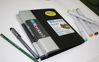
This new year, I urge you to start a physical portfolio (not a digital one), especially if you have never kept one before. In the Intermediate class, you are given a small portfolio to begin with. Now, in the standard class you are also given one. We wouldn't include these if we didn't think they were so important! If you would like to pick one up similar to the ones we use, you can find them at any art store, or you can easily make your own.

(Next week I will talk more about picking a portfolio and what to put in it).


The purpose of a portfolio
Any artist or crafter should keep a portfolio of their best work. This is a tool for improvement, and should not be considered a "bragging book". A good portfolio allows you, and your viewer, a chance to see your best work and give each piece individual, critical examination. By keeping work in one, central place, it is easier to compare and improve quality from piece to piece.
In my opinion, if you are an instructor, you NEED to have a portfolio and be willing to share it with your students.

As nice as photographs and blog posts are, nothing compares to being able to see an original work. The computer can be very deceptive, as it interprets colors differently than our eyes and shows work at whatever scale it wants to. Sometimes, you really need to see how big something is in real life, and not shrunk down on a computer screen. Looking at a portfolio is important for both the viewer as well as the creator.

Here are some of my personal thoughts on how to be a good portfolio viewer.

Etiquette in viewing portfolios
Give praise but don't gush. When people look through my portfolios, yes, I like to hear "Oh my goodness! That is amazing!" but I would rather hear "Oh my goodness! That is amazing. How did you do that technique?" I want a chance to teach through my artwork.

I never want to hear "You are sooo good. I could never be like you." It is nice to compliment, but don't embarass them by going over the top. Give sincere compliments and remember that with practice you could make work like theirs, or vice-versa.

A portfolio is not a tool for you to compare your work to another person. This is a self-assessment and feedback tool. Don't look at someone else's portfolio and feel bad about your own work. We are all at different places in our work at different times. A portfolio is of a person's best work, so when you look at it, try not to compare your problem areas with their strengths. Use other people's portfolios as inspiration and learning tools, ask constructive questions (mixed in with healthy praise).

Take notes. If you see something you really like, be it the way they shaded an image or colored hair, ask about their technique and practice it.

One time I really wanted to work on making round gemstones look luminous. So, I drew an image with lots of round gemstones. Then, I looked through an artbook by James Christensen to color the gemstones. He is an oil painter, and does a fascinating job rendering luminous stones. There are a couple pieces in my portfolio that are inspired by James Christensen. I could not have improved my technique as quickly without studying his work. This is a good use of another person's portfolio (in this case, an artbook).

Ask before you photograph. Never photograph someone else's portfolio without their permission, and never publicly display those photos without their permission and without giving them credit. Come back to the notes or photos, then try to incorporate those techniques into your own work. There is a saying in art "Copying is the greatest form of flattery." It is OK to copy techniques and colors you like, but whenever possible, attribute credit where it is due. Sometimes for legal reasons you cannot display photos of their work, as those pieces might be published or the rights might belong to someone else. In that case, you could face a potential lawsuit, so always get permission! Be considerate with your flashes, as original works may be light sensitive.

Ask before you touch. If you try to photograph an image and it is behind a piece of plastic, many times the glare will prevent you from getting a decent photo. Or, sometimes, you want to see a technique really close up, or you want to see the back of the paper to see how the ink soaked through. Always ASK before you touch the original. Flipping through plastic pages is one thing, touching the original is another.

In libraries, you are expected to wear linen gloves when touching original works. This is because each time you touch an original, your oily hands are transferring grease onto a project. Copic markers do not like oil and grease, so if a person tries to color that art again, it may not react the same. If you must touch an original, touch the edges, and avoid important features.

Try not to hover. If it is your own portfolio, you may really want to hear feedback. It is OK to hover and explain your work, but it is also OK to not feel obliged to stand there while they look through it. Be courteous to the viewer and consider if you are being over-protective and hovering. Sometimes that makes them uncomfortable, so try to be aware of their comfort level as well.

Next week I will have Part 2 about portfolios, meanwhile, have a wonderful and safe New Year!

Tuesday, December 20, 2011

Color Spotlight, B66

Head on over to the Copic Blog for the color spotlight on B66. Here is the new image I drew for the spotlight post to go along with the tutorial I posted yesterday. Yesterday's bird was the male swallow, today's illustration is of the female- hence the lighter colored breast feathers. More details can be found on the Copic Blog.

Monday, December 19, 2011

Coloring a Swallow

I finally got the time to write up the tutorial for the picture I colored last week. Tomorrow, you can see the color spotlight I made this tutorial for. I'm please with this picture because it only took 10 colors to make it look so neat.

Barn Swallow
I drew this barn swallow after being inspired by seeing a beautiful Victorian cut-out of one last week. I draw my pictures with pretty simple lines, because I like to rely on the markes for giving depth, however, I like my line work to stand alone sometimes, so added a lot of little lines that I knew would get covered up by coloring. I drew it with a 0.03 mm Multiliner SP, then photocopied it a couple times before I colored it. For coloring reference, I found this amazing website by photographer Rick Cameron.

I started with a simple base of grays to define my shadows. I don't have strong shadows in this illustration, because I wanted the top of the bird well lit, but I also wanted to showcase the vibrant belly plumage. I started with C3 and BV23. BV23 is my favorite alternate for C5...it is more purple and adds a little more richness to my cool grays.


Next, I feathered in a light base blue of B91 and B63. I layered B66 over that, (B66 is the color spotlight color that I'll feature tomorrow). I deepened the blue with the BV23 and C7. I did not blend much, rather, I kept my strokes in the direction the feathers grow so it looks more like natural color variation.

I darkened around the eye with C7, and darkened the wings with BV23 and C7. Again, I did not blend, instead I simply layered and feathered colors together . The top of the head is the only area where I blended the colors, as that is a very smooth area of feathers.


Next, I added my YR's. In looking at the photos of barn swallows, I noted that their chests are pale orange to brighter orange, depending on gender. I wanted a base that was not too vibrant, so I went with YR31. Then, I blended in YR12 and YR18. The YR18 was a perfect match for the photos I found online.

At this point, I held my image at arm's length and squinted...was it dark enough in the shadows? Did it look right overall? This is the point of self-critiquing that we discuss in the Intermediate Certification classes. This is also the point when I would clean up any spots where I went outside the lines (look at the gray tail feathers and how I fixed the mistake).

Last I needed to add a background of some sort. Usually I would just add a simple blue fade to suggest sky, but I didn't want to overwhelm someone with that much blue, so I decided to go more stylistic on my sky.

I made a mask from one of my photocopies of the bird and attached it firmly with some weak double-sided tape. Using the chisel end of the B63 I added a faint blue around the bird, getting darker closer to the bird. Then, I added larger speckles with the brush end of the B63 and a G12 marker. By airbrushing very lightly from a brush end, you can get larger speckles than if you airbrush directly with the chisel. After I was content, I added a final touch of Opaque white to the eye and beak.

Here is the final swallow. As I mentioned earlier, be sure to check out the color spotlight later this week on the Copic blog for other color combination suggestions for B66.

Thursday, December 15, 2011

Certification 2012 Updates

I have a lot little details to update today, so we shall see how much I can get through. Then, hopefully, I can get a tutorial posted tomorrow. Meanwhile, here are all of the upcoming certification classes around the world.

New Certification Information for 2012!
1. Standard and Intermediate Classes Back to Back
This Fall we have changed our policy regarding attending the Standard and Intermediate classes back-to-back. Many users have had our markers for many years now and have been happily coloring. However, there may be tidbits that you do not know about the Copic system, which is why we need to have a standard level before getting into the nitty-gritty of Intermediate. We still require you to have attended the Standard Certification before the Intermediate, but now you can take them back to back (Note: We do not recommend it, as we cover a lot of information in those classes).

2. Changes to the Standard Certification
In January 2008 I taught the first Copic Certification. The standard certifications taught up to this point have not varied much from that first class. Only the literature has improved, the content has been the same. With 2012 we are re-vamping the program. The same concepts will be covered, but the timing and supplies will be different.

In 2008 there were few papecrafters who knew about Copic Markers and how to effectively use them. Today, the average attendee in our Standard Certification has a lot more information available before they attend our class, more now than ever before (thanks in large part to all of you who already have been certified and have been spreading the word. Thank you!). If you attend the Certification this year, we will be switching to a portfolio format, similar to the format we use in Intermediate. There will be more coloring and a different assortment of products in your product pouch. We strongly suggest that you indulge this year and re-take the certification, especially if you want to brush up on your coloring skills.

North American Standard Certification
We now have our classes for the first few months of 2012. To apply to any of these classes, please visit our website and you will find an overview of the program.

Jan. 13th Memphis, TN Taught by Lori Craig Open to Public
Jan. 27th Anaheim CA, CHA Winter 2012 taught by Sherrie Siemens Open to Public
Feb. 3 San Diego, CA taught by Lori Craig Open to Public
Feb. 17th Richmond, VA taught by Debbie Olson Open to Public

North American Intermediate Certification Classes
Register now for these great classes. Remember, you can now apply for back-to back classes!

Jan 28 Anaheim, CA
Taught by Sherrie Siemens Open to Public
Feb. 18th Richmond, VA taught by Debbie Olson Open to Public


For all North American Residents, you can register for classes directly from our website.


World-wide
Certification Classes
In many countries outside of North America, there are opportunities to take Copic Certification classes. As new regions establish their programs, I will try to announce their classes as I hear about them.

Germany
Feb. 2nd, Wiesbaden, Germany taught by Diny Sprakel, in English
Please apply for this class by contacting Britta b.rumpf-burblies@holtz-gmbh.de
If you are European, check out the Copic blog for Europe.

Australia
New classes for 2012 have not been announced yet. If you are interested in keeping up with some fabulous tutorials, contests, and finding out what events are going on in Australia, please visit the Australian Copic blog.

Have a great weekend!