Showing posts with label color spotlight. Show all posts

Tuesday, September 10, 2013

NY Fashion Week 2013

I was doing some research this week on colors, and realized NY Fashion Week is going on now! They released a nice chart and write-up on the 2014 Spring Fashion colors, and I love color charts.

I went through the effort of matching the Spring 2014 Pantone® colors to the closest Copic colors and whipped up this fun graphic and illustration. Enjoy!

If you also want the full color report for Spring 2014 and to know how they choose colors, you can download it here.

Tuesday, December 20, 2011

Color Spotlight, B66

Head on over to the Copic Blog for the color spotlight on B66. Here is the new image I drew for the spotlight post to go along with the tutorial I posted yesterday. Yesterday's bird was the male swallow, today's illustration is of the female- hence the lighter colored breast feathers. More details can be found on the Copic Blog.

Monday, October 24, 2011

Portland this weekend!

Color Spotlight and Events
Happy Monday! I'm in a whimsical mood today, but I have a bunch of things to get done, as I have a very busy week coming up.

For those of you who do not regularly check out the Copic blog, you should, as last week I posted a color spotlight for YG17.

I drew this little blue butterfly for the color spotlight. I started with a rough drawing in pencil, then colored over it, trying to keep it loose and relaxed. If you look close, you can see that I dripped colorless blender on the edges to break up the image. You can read more at the Copic Blog.

[events.jpg]Copic Demos and Classes
Meanwhile, I have a quick event update for things I am doing this Fall:

Friday we will be having a Standard Papercrafting Certification in Portland, OR taught by the beautiful Jenn Balcer. If you would like to come, we still have a few spaces left.

Then, on Saturday, the spunky Colleen Schaan and I will be hosting an Intermediate Certification in Portland, OR. I don't teach this class very often, and Colleen and I always have fun when we team teach, so if you have been waiting to take this class, wait no more! If you ask us real nice, I bet we'll even sign books for you :)

November 4 & 5th, I will be teaching Standard Certifications in Honolulu, Hawaii. The class on the 4th is pretty full, but we still have a few spaces on the 5th. The Intermediate class is on the 6th, and I only have a couple spots left, so register now. We may have a Free event in Hawaii on the 4th, in the evening, so keep this open on your calendars if you are in the area (I will know later this week, so stay tuned).

To register for any Certification Class, please visit our website. For questions about certification classes, please contact Nancy at nancy@copicmarker.com

November 10th, I am back in Eugene, OR demoing at the Tools of the Trade show at the U of O Bookstore. This event runs from 10 to 6pm. Here is a picture of what I drew and colored last year at this event. Stop by, and who knows what I'll be drawing or coloring this year! The Bookstore always has great specials and wonderful demos from a variety of artists during this event.

November 30th I will be hosting a Copic demo at Karen & Friends Scrapbooking store in Springfield OR from 4 to 6 pm.

Whew! What a busy fall! I hope to meet you at one of these many fabulous events.

Thursday, September 15, 2011

Color Spotlight & Certification class updates

Spotlight BG10:
Over at the Copic Blog, I just posted a new Color Spotlight on BG10. Check it out! Meanwhile, here is a little more info about the picture I drew.

Eye movement: This is the art I created for the BG10 Color Spotlight. I drew it with a 0.05 mm Gray multiliner. I used a gray multiliner because the focus color was so light, I didn't want to increase the contrast too much.

As it is, the darkest color in the picture is the boy's BG78 shorts. This gives a nice focal point, then his pale skin pulls your attention down to the water, out to his hands, and up to his face, which looks back at the water.

Because the colors are for the most part pale, the image is fairly restful. I wanted to convey the feel of lazy summer days and a quiet river. I think that the overall color combination and lack of harsh lines helps convey that feeling. To see which colors I used and where they came from, check out the full color spotlight over on the Copic Blog.

Upcoming North American Standard Certification classes
Although it seems that Summer just ended, there isn't much time left to register for Fall classes. December and January will have fewer classes, so if you have been hesitating to take a class, don't wait too long, as there might not be another class in your area until later in 2012.

Sept 18th Ottawa, Canada taught by Sherrie Siemens Open to Public
Sept 22nd Orlando, FL taught by Jenn Balcer FULL
Sept. 30 Portland ME taught by Lori Craig Cancelled

Oct. 13th Knoxville, TN taught by Colleen Schaan Open to Stores & Designers
Oct. 17th Sacramento, CA taught by Debbie Olson Open to Stores & Designers
Oct. 28th Portland, OR taught by Colleen Schaan Open to Stores & Designers

Nov. 5th Lansing, MI taught by Debbie Olson Open to Stores & Designers
Nov. 4th Honolulu, Hawaii taught by Marianne Walker Open to Public*
Nov. 5th Honolulu, Hawaii taught by Marianne Walker Open to Public*
*Note: There is a non-refundable deposit for Hawaii Classes

Intermediate Certification
Intermediate Papercrafting Certification classes are popular! These classes are open to ANYONE who has taken the standard Certification class, and who wants to learn how to color and design more like an artist.

Sept 17th Ottawa, Canada taught by Sherrie Siemens now accepting applications
Sept 22nd Orlando, FL taught by Colleen Schaan now accepting applications

Oct. 16th Sacramento, CA taught by Debbie Olson now accepting applications
Oct. 22nd Langley, BC taught by Sherrie Siemens now accepting applications
Oct. 29th Portland, OR taught by Colleen Schaan now accepting applications

Nov. 4th Lansing, MI taught by Debbie Olson now accepting applications
Nov. 6th Honolulu, Hawaii taught by Marianne Walker now accepting applications

To register for any of these classes or to download class info, please check our Certification page on the Copic Website. If you have any questions, please e-mail Nancy@copicmarker.com for details.

Tuesday, May 18, 2010

Working with Reds

Working with Reds
It seems like recently I've had a lot of people who have been having problems with their reds bleeding. Red is such an intense dye that I am not surprised at all, however, I haven't noticed a problem with my red projects, so I figured that I must color differently than you do.

Red is a strong vibrant color and has a lot of emotion in it. It can also cause a lot of emotion when you're in the middle of a great project and it bleeds into your other colors. Here are some tricks for keeping your reds in place.

If you look closely at this cute little stamp from Hero Arts (click on image to enlarge), you can see that his red shirt has bled out. I colored him in the traditional way I would usually color. I started with my lightest color, coloring in circles, evenly soaking the page. Then, I added the darker red, came back with the light, and blended them together.

The back of the paper is smoothly bended so I must be doing it right, but...Uh oh! Those reds bled outside the lines on the Neenah paper I was using. How can I prevent that?

Here are a few tips that should help you out:

• Work on an absorbent surface. Make sure that the ink is not bleeding simply because you're coloring onto something that is making the ink spread.

• Try a different paper. Neenah is on the soft side of the spectrum. Bazzil Simply Smooth (formerly Prism Simply Smooth) won't bleed as much, but then again, it may not blend in the same way either.

• Use Less ink. You don't really need to completely soak your paper, as red is forgiving. If it looks like the surface is evenly covered then that's good enough. Ignore the back of the paper, as the front is more important anyways.

• Try feather blending colors together. If coloring in circles over soaks the paper, then feather-blend your colors together, as this uses less ink.

• Let base layers dry before you add darker colors on top. The paper can only hold so much ink before it wants to bleed. if you let it dry a little (don't let it get completely dry or it will take more ink to blend) then it will accept more ink in the same spot before it begins to bleed.

• Avoid edges. If none of those techniques work for you, then be extra careful and don't color right up to the edges.

Note: It is very hard to fix bleeding reds with the colorless blender! You are more likely to create a bigger mess.

Here is how I colored him for my final picture. Since I didn't want to switch paper, I changed my technique instead. I decided to go with feather blending. I am working with the Natural Blending Group of R24, R29 and R59. Since R29 is the darkest in the R20's group, then I can shadow it with either R39 or even darker, R59. Since I like more contrast, I went with R59.

1. Start with your light color (R24) and feather it into darker areas. Leave it white where the darker color will be added.

2. Lightly feather in the darker red (R29) from the opposite direction.

3. Let the middle red dry a bit, then add the darkest red (R59). You don't want to take any chances, and two or more layers of red are really going to risk bleeding.

4. Let it dry some more and then feather some R29 into the R59 area, and feather the R24 into the R29. It may take a few LIGHT layers to really get the colors to blend, but it will work eventually.

Here is my final guy. As you can see from the back of this image, I used a whole lot less ink on this smoothly colored picture than I used on the first image, and it still looks great.

I lightly feathered the BG10 out as simple sky accent from his shirt. If my reds had bled at all, then this would have caused the red ink to spread all over the place as well. But you can see from the back of the paper that my ink does not soak all the way to the lines, unlike the first image. By using less ink overall, I am able to get my reds to work better.

Monday, March 9, 2009

Greens for my Swatch book

I've been working hard this weekend on many projects. One ongoing project that each of you should work on is your Color Swatch Book. As I was gathering my supplies for my next round of Certification classes on the East Coast I realized that my swatch book didn't have many green examples, nor did I have examples of some different types of paper. So I added some pages and I figured you would like to see them this week

By the way, Mystic, CT • Buffalo, NY • Toronto, Ont are all open to the public. If you wish to register send me an e-mail for the application. And, you can now follow me on twitter.

Swatch Book Color Ranges
With hundreds of colors available you really have a lot of swatches to try to find combinations that work for you (click here for a downloadable color wheel and blank chart). Swatch books will reflect the personality of the owner. You'll probably make more pages in your favorite colors and the more you work with your favorite colors the more you'll find combinations using your favorite colors. If you find yourself always reaching for the same 15 colors out of your collection of 50 then you should branch out. Throw in a color you don't use very often to mix it up a bit. Sometimes the results will startle you.

Look through your swatch book every now ant then and see where the color combos are lacking. My color book had mostly blues and browns, because people asked a lot of questions about blues and browns. Also, there are LOTS of shades of blues and browns and it's hard to remember what I've tried.

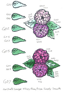
Here is a partially done example page. If you look at the blossoms (I think they're hydrangeas but I can't remember which flower I was drawing at the time) you'll see that I'm also looking at the V000, V01, V04, V05, V06, V09 Natural Blending Family. Each blossom is very different, yet they're all within the same color group. This is why you need swatches.

If I remember from math correctly, for 322 colors, if you are just blending 2 different colors each time then you'll have a possible 103,362 options. (formula: n(n-1). ) If you throw in a 3 color blend, then you have over 33 million combinations! (formula: n(n-1(n-2)). ) That's not factoring in different ink types, paper types, and all the other little things that go into your artwork. So don't feel like you have to write down every color/ink/paper combo out there, just the ones that you find useful.

Greens
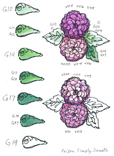
I needed to document the basic green family, so I started from the beginning, with G00. I know that Copic makes a G000, but it's too light for my scanner to pick up, so if you love that color don't feel that I'm leaving you out. Since I am trying to see color combos in Natural Blending groups for this page of greens I prepared it with blank spaces for color swatches on the side, then on the main image I mix up the colors on the side to see different combos and to get a feel for contrast.

Greens are actually pretty easy to find great looking combos. I hesitate to say that any two greens will look good together, but it's a safer bet that they will than guessing that any two pinks will work well with each other.

Since green is made of Yellow and Blue, you can add either of these and also find good green color combos. You can warm up your basic greens with Y, or YG. You can cool down your greens with BG or B. If you want to mute out your greens (turn them brown or gray) then throw in the opposite color, red.

You can see from one of the leaves on my example page I shadowed G85 with V99. Although those colors are totally different, I had used the purple in the blossom and I know that v99 is dark and that cool shadows have purple in them, so I knew that I could add a cool, deep shadow to my green leaf and it would work.

Also compare the greens from the G00 and G12 pages to the greens on the other two pages. Look at how much more vibrant colors from the 00's and 10's are. If youa re coloring leaves in the springtime then they will be more vibrant and warmer, like the 00's and 10's. If you are coloring something from the deep forest, an older plant, or something from late summer then you might want to reach for more muted greens like the G40, G80's or G90's.

When you jump from a base color of G02 to shadows of G99 you will start to see where some greens just don't quite work together. Why? Because G02 is a WARM, bright green. It has a lot more yellow in it. G99 is a COOL, dark green. When you add a warm and a cool it turns to gray/brown. the vibrancy of the G02 would get lost in the dull, muted G99. However, I might be able to get away with shadowing the G02 with a YG, or maybe adding a bit of warm gray, or... I think I have to test more colors first!

Contrast
I know I've discussed it before, but to make an image more eye-catching you need to add contrast. Look at each flower on this page. Which blossoms grab your attention first? Which seem more alive? You'll note that the blossoms which stand out and look most real are the ones with the largest color range.

Any element on these pages that has a color jump of more than 5 digits on the last number grabs your attention more than color combos that are only 2 or 3 digits off. Yet my darkest colors are not overwhelming the picture, rather, they are only for accenting the shadows. Do you see how all the little suggestions I've been giving you are starting to fit together?

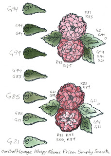
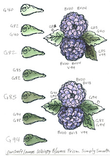
The flower with V000, V04, V09 has wonderful richness to it. The blossom with BV00, BV04, and BV09 also really pops off the page. If you look back to my post a couple weeks ago on the basic Rules of Good Design you will see that this contrast is part of M,B and V from DUMB-V. Because of the high contrast this is a more dominant image and a good way of coloring if the flower is your most important element in the picture. Your eyes move to the high contrast areas first. By having a larger range of colors you add varienty to an otherwise flat image.

You really need to experiment on your own, and keep updating your swatch book regularly. I'll try to show you more examples as I work through my book, but remember, colors will look different on a computer than they will in real life. Paper: Prism Simply Smooth, Image: Whispy Blooms from Our Craft Lounge. Ink: Memento Tuxedo Black

Wednesday, November 5, 2008

Shadows Part 7- Adding gray to colors

Today I'm adding more to our ongoing discussion about the nature of shadows. To see all parts so far, just click on the "shadows" label at the end of this post. If you didn't read yesterday's post or follow the link to the Gamblin Oil Paints video I really strongly recommend you do so now. I know color theory seems like kind of a drag, but it will help your artwork look better.

Yesterday when I talked about the tone of shadows, I want you to know, there is no right or wrong answer- either shadow works. Art is a matter of personal taste, so if it looks right to you then it's right. If you want to make things that "look right" all the time then go into math :)

About Shadows...
True shadows are about two shades darker of the base color. They are not black- you can still see the color underneath.

However, true shadows also add a hint of gray. Color is how much light is reflected back to the eye, so if some of that light is blocked by a shadow then the color must not be as vibrant.

This expands upon the Natural blending families rule (more so in some color families than others) but it is not quite as straight forward as following a sequence of numbers to do your shadows. Now you're thinking, why did you go through all that effort to teach us to pick markers in groups when we are now going to break those rules??

Look at the series Y11, Y13, Y15, Y17, Y19. All of these are super vibrant yellows. Yes you could color a shirt that would look shaded with these yellows but the difference in a Natural Blending group is the density of dye. Y11 has fewer yellow particles than Y15, and Y15 has fewer than Y19. For most blending groups it's a matter of dye density when you go from digit to digit (this is why you can usually layer a color twice to get it one shade darker)

In real life though, if I were wearing a yellow shirt and you were adding shadows you would be adding gray and denser dye particles. So, you can add believable shadows in a few ways:

1. Layer on a gray that would go with that color family. In this case Y11 could be shadowed with W's or T's, since all three families are warmish. Keep the last digits the same for light colors or 1-2 shades darker. Test layering the next yellow in the sequence only, layering a gray only, and then layering both for shadows. Which do you think looks better? Remember, it's YOUR artwork, so if you like the look then it works (there are no absolutes with art). By adding gray (W3) and some denser yellow particles from the same family (Y15) it looks more natural.

2. Add gray by moving deeper into the Copic color wheel (the deeper in, the more it gets gray). The next family in is the Y20's, a slightly more muted yellow family. Try layering Y23 or Y28 over your Y11. Now how does it look? For this I added the denser bright yellow (Y15), and then jumped to deep shadows from the next blending group (y28). See how much more vibrant the shadows are? This is because there are so many more yellow particles we add when going with this technique but our gray shift is subtle (from the 10's to the 20's).

My picture is still shadowed more than if I had stayed in the same blending group, but it looks more vibrant than just adding grays. Is is realistic? Not necessarily, since the shadows on a true pale yellow shirt wouldn't add this much orange, but it still looks good in my opinion. If you have enough colors try this on some of your own images. Stick to the same blending group for shadows on one, add shadows with grays to your second picture, then add shadows by jumping to the next blending group on yor third picture. (If you remember my earlier drawings of myself you'll see I look different. This is because I've had a haircut and I've been slowly loosing the baby fat I gained from my last pregnancy. I still haven't grown more fingers though :)

Color Spotlight: Yellows
Yellow is an interesting color in the Copic color world. See on the color wheel how there are no Y90's? The last family is Y30's, and those start moving toward orange. That's because Yellows, as they get more gray quickly turn into brownish colors. Add a hint of red and you're really turning brown or orange. So Y20's are shadows of Y10's, but Y30's are more neutral but they are also the blending group that would pull you into the next color family- YR. When you get into the darker YR's you then get closer to red. (YR07 or 09 and R08 are really close colors). Then you could jump into my post with a color spotlight on YR's.

When I talk about Natural blending families and how they get darker as you go in, 80% of the time this is true (blues, BV's, G's, and BG's are pretty good about following the rules). Some color families don't play by the rules because this is a flat chart for a 3 dimensional concept as I mentioned yesterday and the color wheel pulls you into the next color group as you change blending groups (this is the case on the first families in red, oranges, and yellows- the color wheel pulls Y's into the YR's into the early R's. E's (earth colors) really don't follow the rules because it's easy to take any R, YR, or Y and turn it into browns).

Shadowing with colors beyond the basics
In talking about layering gray over a color to make the shadows more believable, you can add lots of colors to create your shadow that would add denser particles and gray. After watching the color video, what is something you could add to yellow that would cancel it out or make it gray? On a color wheel, that would be the color's opposite or purple.

Many times in fine art you'll see pictures where the shadows have a life of their own, particularly in portraits. This is because the artist is shading their light yellow/peach skin colors with shadows of blue or purple to give the feel of gray without dulling down the vibrancy of their work by just adding neutral grays.

Also, remember that blues and purples are cool colors and shadows tend to be cooler areas on a picture. Here is the final illustration of me, where I used purple as my shadow color and blue to add some extra shadows on my skin. Note that I'm using very pale blues and purples. This allows the yellow to underlay the blue/purple tone and still be visible.

Image: Drawn with a 0.5mm Black Multiliner SP onto color laser copier paper.

Thursday, September 25, 2008

Color Spotlight: YR's, Coloring Pumpkins, part 2

When coloring a pumpkin your basic color is orange. Copic makes a nice range of oranges, or YR's so let's talk about how to get the most from your YR markers and how you can increase your contrast by breaking away from the color families.

YR: Yellow-Red
There really aren't that many YR markers, especially when you compare them to a color family like the blues. YR is a secondary color on your color wheel and is made from yellow and red dyes mixed together to achieve orange.

If we start with the first YR's, the YR00 family, we have a lot of colors to choose from. YR000, YR00, YR01, YR02, YR04, YR07, and YR09. For basic coloring I suggest keeping a 2-3 digit difference and you know that your colors will blend well together. However, if you remember back to my posts about contrast, our eyes are drawn to images with higher contrast- they're more interesting. My first two pumpkins are colored with only 2 colors. I used the maximum color difference that would still blend well (5 digits apart!), but both pumpkins look a little bland. The first one isn't bad, but the second pumpkin is not exciting.

How do I make it more lively?
Add another layer of color. 3 colors look much better. 4 colors look even better than 3, and the blending looks more natural. When possible, use more colors to get a smooth blend and more contrast.

Why doesn't the sequence look right?
I've had people complain that YR02 and YR04 are NOT good blends for each other- there's too much of a difference when you see their swatches next to each other. I disagree (but that's just me). There is a HUGE difference between the YR02 and the YR04, but if you layer the two and blend them then you'll see that they really do work together. This is true for many colors in other sequences that don't seem to follow the rules - layer them with their next closest colors and they look better.

Shadows for YR
If you don't have enough YR's to make your picture stand out more, this is where you layer colors from other families. The first thing to try is shadowing with Gray. Since YR's are warm colors, we can add Warm gray W5 for a shadow. It doesn't look too bad.

YR's and Red
If you have YR09 and R08 you'll see they are almost the same color. If you download the Copic color wheel you will see that R00's and R10's are orangish and would actually work well with YR00's (Although YR04 could be considered a true vibrant orange, you don't get a true Red until the R20's, R29 in particular). Since Reds are so dark compared to YR's (in general) you can easily shadow YR's with Red. If you do, you are not adding any gray so your colors remain intense.

YR's and E's
What happens if you add Warm Gray to Red? You get brown, or Earth colors. So, if you want to add a shadow to something orange and you don't want the shadow to be too intese, try adding a middle brown. This is like adding Red and Warm gray at the same time. As you get into the YR10's and 20's you see the color change so that YR14 and YR24 could almost be considered E's. Why? Because as you add gray (by increasing the middle digit) you are creating earth colors. (Some E colors are more orange than others, so experiment to find ones you like). Beyond the YR30's the last 4 or 5 YR's don't follow the same graying rule, just so you know.


Highlights for YR's and Yellow
Yellow is much lighter than reds. While you can shadow with Reds, if you want to break away from the YR's for your highlights you need to move into the Yellows. Look at how much more rich my pumpkin is just by adding nice sunny highlights. Then, look at what color you want your shadows. Red is more intense, brown is more earthy and natural. The last two pumpkins have the most color range from light to dark and therefore are the most interesting, though it's your call as to which one is better. This is why on yesterday's post I could color my pumpkins with a yellow, YR's, and an E and I knew it would work.

The key is, when you find a combo you like WRITE IT DOWN! Add it to your swatch book and then you'll remember what worked well for you. Image: drawn with a 0.5 mm multiliner Paper: Color laser copier paper.

Note: Most of the blending on this page was marker to marker on paper. When I added really dark colors, I feathered them in until I got the smooth blends. If you try my same colors know that I blended them a LOT to get what you see on the screen.

Tuesday, August 19, 2008

Color Spotlight: Y17

I've been meaning to do another color spotlight for a while and only now am I getting around to it. Please note: When I mention a color combo whatever color I put first is the color I put down as my base color, then I blend in the second color. So Y17 + E25, the E255 was layered over the Y17. Also, these colors on the screen are NOT accurate and are for comparison only.

Y17, Golden Yellow
Story behind Y17: This was among the first colors Japan created over 20 years ago. This is a very bright Yellow, hovering on orange. Because the yellows are so bright, there is very little color difference in this blending family, especially as you get darker. Y17 has a touch more orange to it than Y18 or Y19 in my opinion. To get a good shadow for Y17 you would have to jump to another blending group within the Y's (Y28 or Y38) or into another color family- YR or E

Available in these styles:
Copic, Sketch, Ciao, Wide

Natural Blend family:

Y11, Y13, Y15, Y17, Y18, Y19

Simple Blend: Highlight Y15 Midtone Y17 Shadow Y19

Similar colors, other families:
B16, R17, V17, E17, BV17, G17, YR16

Marianne’s Unusual Combos:
Y17 + E25, Y17+ YG25, YG21 + Y17

Advanced Color Rules for Y17*:
Complimentary: Y17/V09
Triad (simple 3 color combo): Y17, B05, RV29
Tetrad (simple 4 color combo): Y17, BG18, V09, YR09
Pentagram (simple 5 color combo):
Y17
, G19, B79, RV29, YR09
High Contrast: Y17, YR16, B37, B06, R89, R29
Compound: Y17, E37, E59, V06, R39, V09

*Advanced color rules are generated by Adobe Illustrator CS3 based on the digital representation of the Copic Color Spectrum set into a special color wheel. I generate these as suggestions for color combos to try when you are looking for a nice change, or you have a paper that matches this particular color and you want help picking other unusual colors to go with it.

The project I made for Y17: Summer Sunflowers
I had been waiting to spotlight this color until my sunflowers were in bloom, because that is the flower that instantly comes to mind when I think of Golden Yellow. Here I'm showing the original photo I based my drawing from, and then my artistic interpretation of it with the color Y17.

The evening I took this photo the sun was just about to go down, and the next few photos got dark quickly, so I am showing my drawing with a darker sky than the photo. I also drew the outlines very loose, so my coloring style is loose as well. Notice how things close up have more vibrant colors, while things off in the distance have less contrast, less detail, and muted colors. I chose to make the foliage and blossoms brighter than real life. Looking at it now, I think it still needs deeper shadows for more contrast. Good thing I can always go back into my picture and blend more colors, even if it's been sitting for a week.

Drawn with a Multiliner 0.05 on Color Laser Copier paper
Colors used: Y11, Y13, Y17, YR16, YG00, YG41, YG67
G14, G17, G28, G85, BG10, B04, B24, E35, E57, E59, 0, W3, W5

Friday, June 13, 2008

Color Spotlight: E33

Today is the last day to add a comment to Tuesday's post. Tonight at midnight I'll tally up the winner and post next week what the favorite paper/ink combos are.

Finally, I'm starting my Color Spotlight feature. Every week or so I'll showcase a different color and give ideas of color combos that will work with it. Please note: When I mention a color combo whatever color I put first is the color I put down as my base color, then I blend in the second color. So E33 + G85, the G85 was layered over the E33.


E33, Sand
Story behind E33: This was among the first colors Japan created over 20 years ago. This is a good, multipurpose middle/light warm brown, and one of our best-selling browns (that's not a skin color).
Available in these styles: Copic, Sketch, Ciao, Wide
Natural Blend family:
E30, E31, E33, E34, E35, E37, E39
Simple Blend:
Highlight E31 Midtone E33 Shadow E35
Similar colors, other families:
B34, BG32, RV32, Y32, R32, W3
Marianne’s Unusual Combos:
E33 + G85, E33+ V06, y23 + E33

Advanced Color Rules for E33*:
Complimentary: E33/B02
Triad (simple 3 color combo): E33, G24, V15
Tetrad (simple 4 color combo): E33, YG03, B02, FRV1
Pentagram (simple 5 color combo):
E33
, FY1, G03, V17, RV17
High Contrast: E33, E39, E77, G29, BG18
Compound: E33, E29, BV04, FV2, B79

*Advanced color rules are generated by Adobe Illustrator CS3 based on the digital representation of the Copic Color Spectrum set into a special color wheel. I generate these as suggestions for color combos to try when you are looking for a nice change, or you have a paper that matches this particular color and you want help picking other unusual colors to go with it.


The project I made for E33: Low Tide on the Oregon Coast
Sometimes I get tired of coloring other people's beautiful stamps, so here's a pic I drew to feature E33. I have always loved the coast, and it's hard for me to forget my Marine Biology teacher when I think of sand, so we get a vibrant low-tide drawing today. To show you how you can incorporate the swatches for E33, I tried to use mostly colors or color families found in the above rules, plus a couple extra that it's hard to live without, like the colorless blender and B000 :). These colors make the picture a bit brighter than a real beach scene, but that's OK. BTW, I compared the color E33 to sand from my son's sandbox. A more accurate sand color would be E43 with a little W3 layered over it to tone it down.


Water: B000, B02, BG10, BG13, BG18
Sand: E31, E33, E35, E37, C7 Sky: BG10
Rocks: E31, C3, C5 Mountains: E31, C3, BG18
Sea Stars & Urchins: RV17, V15, V17, YR61, YR65, E33
Seaweed: G24, G29 Mussels: C3, C5, C7
Anemones: YG03, YR61, V15
I used the colorless blender on almost everything