Friday, March 1, 2013

Sketches from my Demo

Pattern, Texture, and Depth of Field
I had so much fun at my demo yesterday! A lot of the students who purchase Copic markers at the University of Oregon are Architecture or Product Design students. They love seeing texture and patterns on buildings, objects, and foliage. When I demo at the bookstore, I have found that people love seeing me experiment with buildings and plants.

Here are two sketches I worked on while I was there. Sorry, the photos are from my phone, so they aren't that great.

This first drawing is actually a design sketch for some paintings that I am going to make for the Copic offices.I made this on some big scratch paper I was using for my demos.

This drawing is just a little bigger than a regular size sheet of paper. Since this was a concept sketch, I was worrying more about placement of objects instead of details, so all my lines are rough and I'm OK with that.

I don't remember all the colors I use when I demo, because people stop by and ask questions and I get sidetracked. But,  I know that the reds are R24 and R59, and that I used a lot of YR21, YR27, and E44 on the wall. The ground is C3 or C5, plus a bunch of other colors, and the plants are G28 and G82.


 I mocked up the walls with E43 and a scrap of washcloth dipped in colorless blender. Architecture students love seeing that technique!

The yellow-orange background texture was made with a couple layers of different YR's, and a quick scribble of warm grays.  Then I airbrushed some speckles of YR27 over the area. I then dripped colorless blender straight onto the colored area. For the smaller dots of blender I used my blender marker and dabbed it on.

Start to finish, this sketch took about an hour.
Depth of Field, Making things look near or far
My next drawing I spent a lot more time on, and I didn't finish. I'm guessing I spent about 3+ hours on this one already (minus interruptions). I wanted to work on how I render depth of field, or how to make things look farther away in a sketch. This is on a 9 x 12 Copic Sketchbook.

I worked with a lot of greens! I know I used YG11, YG41, G85, G28, G43, and G46. I probably used more, but I can't remember.

Although it is not done, what I want you to notice is that the leaves closest have high contrast- very light greens, mixed with shadows of G28 and C7. These are bigger and because of the contrast, they really appear to be closest. As I moved backwards in the sketch, notice how the contrast and level of detail gets less and less. The plants in the middle of the page have lost that lightest shade of green and the darkest shades as well. Move up even more and see how there is even less contrast and the colors are grayer, less vibrant.

The trees in the background are YG93, G85, and BG75. The lantern is made with warm grays, and the unfinished steps are an assortment of warm grays, and browns.

Notice on the steps as well, although they are not finished, the use of depth of field in my color choices and details. The bottom step has the most contrast, gradually getting less and less as you move up in the picture. I'll try to get this one finished sometime and show you how it all comes together.

Thursday, February 28, 2013

Demo Today!

I will be at the University of Oregon Bookstore on campus from 10 am to 5pm. Come visit me there!

Friday, February 15, 2013

Upcoming Events

Asian Celebration
This weekend I will be doing demos at the Oregon Asian Celebration, in Eugene OR. Visit their website for more details. I can be found in the Youth Art Room, from about 2:30 to 4:30 or so each day.

Proudly Oregon
Feb. 28th I will be demoing all day at the University of Oregon Bookstore, from 10am - 5pm at their Proudly Oregon event. this is a showcase of companies, artists, and products from the beutiful state of Oregon. Don't miss it! There will be food, prizes, and more.

Art Contest
Check out the Copic Marker blog for information on our annual art contest in conjunction with the City of Eugene.


10 Cities Only - New Color & Ink Workshops!

Are you ready to get inky? Brand new for 2013, our totally hands-on Copic Color & Ink Workshops are being offered in 10 exclusive locations.

Experience two consecutive days of coloring and creating. Learn more about coloring faces and hair, using the Copic airbrush system, doodling, and coloring on a variety of surfaces in these fun-filled workshops.

There are only eight remaining workshops this year:

Orlando, FL
Boston, MA
Calgary, AB
Toronto, ON
Chicago, IL
Indianapolis,IN
Portland, OR
Dallas, TX

Click to watch a video by workshop instructor Colleen Schaan:

Wednesday, February 13, 2013

When Pigs fly...

Basic coloring tutorial
I realized it has been a while since I posted a basic coloring tutorial, so I figured you would love to see a project I made earlier this week for a quick birthday card.

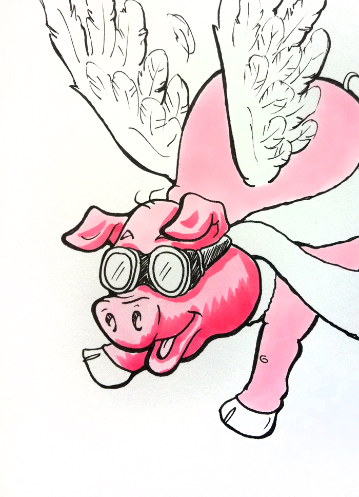
I drew this image onto Xpress It Blending card with a 0.2mm Multiliner SP. Then I got into coloring.

 I started by coloring the whole pig with a base of RV10. I used the brush end of the marker, and colored in circles, keeping all my edges wet so I didn't get streaking.

Be sure to keep clean scratch paper under your work at all times, even when coloring thicker cardstocks. 


Next, I feathered in another pink from the same Natural Blending Group, RV14. Just to remind you, Natural Blending groups are colors that share the same letters and first digit. So, the other colors in the natural blending group for RV10 would be RV11, RV13, RV14, RV17 and RV19.

Notice that I flicked color in, darkest/heaviest on the shadow edge, then lifted up as I went into the lighter color. This will make it much easier to blend in the next step.

I did NOT color the whole pig at this time, because it is easier to blend if you go back when the marker is still a little wet. If the layers dry, you can still blend, but it is easier to get smooth blends while layers are damp.


Next, I go back with the light pink, RV10 and blend. The more I wash over the dark pink, the more it blends. If I accidentally over blend and my dark pink seems to get lost, then I stop, let the colors dry a little, then I layer on more dark pink. Keep washing the light and dark together until you get the look you like.

Notice that I keep some shadows dark, and others I blend out more. The round, puffy cheek I blend, but the shadow under the goggles I keep with a crisp edge. This is because the shadow under the goggles is a cast shadow and has a crisp edge, whereas, the cheek is simply shaded to make it look round.


Once I get the two basic pinks as smooth as I like, then I add a hint of E04 for my darkest shadow. This does not follow the Natural Blending group.

I chose this color because this is a gray/brown pink color and makes a nice shadow. Shadows are not as bright as the main colors. There are may ways I could have made a grayer shadow: I could have used a gray marker, I could have used a grayer RV color, or I could have added the compliment of pink, which would have been a greenish color.

In other words, experiment! Find color combos you like, then try them and see if they are realistic. Then, write down the colors you used so you remember in the future.


Next, I added tones of other colors to get the pig to match my project. The pig will go onto a turquoise background, so I threw some pale greenish colors in the shadows (YG41). I also wanted to warm up the side of the pig that is closest to the light, so I added hints of Y11 to the highlight side of the pig. 


Close up, this looks rather odd. Trust me. It will look just fine on the finished project.

Once I get the colors looking right on his face, then I can color the rest of the pig using the same color scheme. Be sure to keep your shadows consistent! His shadow is on the right, on the underside, so as I color the rest of him, I need to keep all my darkest areas on the right/bottom areas.

Here is the final colored pig. You can see on his white feathers that I added W1 as a base, left the highlights mostly white, but threw in hints of Y11to make him seem like he's flying through sunlight.

In the shadows on the feathers, I added B12 and YG41. The scarf is colored with YG41, G82, and YG67, then I made it a little less vibrant by overlaying the warm gray marker.

Hooves are Y11, W1, and E04. Goggles are the same color as the wings. The leather is E13 and E04.

Remember how odd the green and yellow looked on the closeup of the face? Notice how it stops looking strange when you see the fully colored version.

Now look at the final card. The yellow and green almost seem to disappear, but the pig matches the background paper pretty well. I hope this basic rundown of my process helped. Have a great Valentine's Day!