Showing posts with label composition. Show all posts

Thursday, September 15, 2011

Color Spotlight & Certification class updates

Spotlight BG10:
Over at the Copic Blog, I just posted a new Color Spotlight on BG10. Check it out! Meanwhile, here is a little more info about the picture I drew.

Eye movement: This is the art I created for the BG10 Color Spotlight. I drew it with a 0.05 mm Gray multiliner. I used a gray multiliner because the focus color was so light, I didn't want to increase the contrast too much.

As it is, the darkest color in the picture is the boy's BG78 shorts. This gives a nice focal point, then his pale skin pulls your attention down to the water, out to his hands, and up to his face, which looks back at the water.

Because the colors are for the most part pale, the image is fairly restful. I wanted to convey the feel of lazy summer days and a quiet river. I think that the overall color combination and lack of harsh lines helps convey that feeling. To see which colors I used and where they came from, check out the full color spotlight over on the Copic Blog.

Upcoming North American Standard Certification classes
Although it seems that Summer just ended, there isn't much time left to register for Fall classes. December and January will have fewer classes, so if you have been hesitating to take a class, don't wait too long, as there might not be another class in your area until later in 2012.

Sept 18th Ottawa, Canada taught by Sherrie Siemens Open to Public
Sept 22nd Orlando, FL taught by Jenn Balcer FULL
Sept. 30 Portland ME taught by Lori Craig Cancelled

Oct. 13th Knoxville, TN taught by Colleen Schaan Open to Stores & Designers
Oct. 17th Sacramento, CA taught by Debbie Olson Open to Stores & Designers
Oct. 28th Portland, OR taught by Colleen Schaan Open to Stores & Designers

Nov. 5th Lansing, MI taught by Debbie Olson Open to Stores & Designers
Nov. 4th Honolulu, Hawaii taught by Marianne Walker Open to Public*
Nov. 5th Honolulu, Hawaii taught by Marianne Walker Open to Public*
*Note: There is a non-refundable deposit for Hawaii Classes

Intermediate Certification
Intermediate Papercrafting Certification classes are popular! These classes are open to ANYONE who has taken the standard Certification class, and who wants to learn how to color and design more like an artist.

Sept 17th Ottawa, Canada taught by Sherrie Siemens now accepting applications
Sept 22nd Orlando, FL taught by Colleen Schaan now accepting applications

Oct. 16th Sacramento, CA taught by Debbie Olson now accepting applications
Oct. 22nd Langley, BC taught by Sherrie Siemens now accepting applications
Oct. 29th Portland, OR taught by Colleen Schaan now accepting applications

Nov. 4th Lansing, MI taught by Debbie Olson now accepting applications
Nov. 6th Honolulu, Hawaii taught by Marianne Walker now accepting applications

To register for any of these classes or to download class info, please check our Certification page on the Copic Website. If you have any questions, please e-mail Nancy@copicmarker.com for details.

Tuesday, May 10, 2011

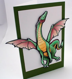
Strategic Coloring - Dragon Card

I know I haven't posted a tutorial in a while, but I did make a simple card for a dear friend here at the warehouse who was having a birthday this week.

While I don't have a step-by-step tutorial for this project, I will point out a bit of strategic coloring that I did while creating this card. For those of you who have taken the Intermediate Certification, you'll know what I'm getting at, when I talk about Strategic Coloring.

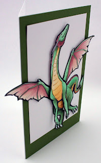
I drew this dragon as 4 pieces of cardstock, one part for the front, one for the hind end, and one each for the wings.The top layer is popped out with foam tape, then I used X-Press It Tape for adhering the rest of the dragon.

Strategic Coloring- Shadows
You'll notice that I didn't bother to blend my colors very smoothly. However, I did add darker spots all over the green. This is to simulate irregular dragon skin. Also, it is hard to exactly determine a light source, except that there is light coming from above. This is my artistic license. The dragon is flying in midair, so there is a lot of ambient light. You can tell he's dimensional, but I'm not distracting you with too many shadows.

What I want to point out is the dragon's green coloration. The main, light green I used is YG41, this is my base tone. I colored ALL green areas with a base of this color, so that all areas, no matter how I darken them, would still feel cohesive. Then, to add simple shadows, I worked in YG63. YG63 has more gray in it than YG41, so it both darkened and toned down the shadows. This makes the shadows seem to have more depth.

On the hind legs and tail, I worked in G85, as G85 is even less intense than the YG's- less yellow and more blue makes the color recede more. Finally, to pull in the color of the green border paper, I added G99 to the darkest shadow areas. Because I physically popped the front of the dragon off the page, that also adds natural shadows to any portion below it.

Part of the strategic coloring in this case is the yellow underbelly. See how the yellow pulls your eye right to the dragon's head? And then, the dragon is looking up, off the page. The first version I drew, the head was pointing back towards his body. However, I changed it.

Strategic Composition
Compositionally, having the head pointing back to the body would create more of a circle in the line of sight. Your eye would continue flowing around and around. However, the message I wanted to convey was freedom and flight. Therefore, having the head up, the wings spread out, and the dragon at a jaunty angle with wings and legs going off the edge of the white box creates more of a sense of freedom.

Also, I gave white space above the head. What this conveys to the viewer is a sense of possibilities- there is room for this dragon to continue flying, wherever his wings may take him.

The wings and tail help pull the viewer back into the dragon's belly, which then draws the eye back up the yellow belly, then to the head. From the head, the eye travels up, hits the dark green border, then flows back around the page back to the wings and tail, which continues the flow and makes the viewer look longer at the picture.

Physically having the dragon popping off the page also adds to the sense of breaking from the confines of the paper. I left his front arms unattached in any way- no extra dimensional tape or anything. This is because I want them to naturally flare out more, and to not lose the dynamic from that portion of the cast shadow.

Notice how simple this card is. The image is so strong and dominant, yet clean that I didn't need to add anything else to the card front. It works as it is. I liked this card so much that I had a hard time giving it to my friend, but since she loves dragons, I know that she loved getting this dragon card today as much as I enjoyed making it for her! May all your dreams take flight this week and I hope you get a little more insight as to how I choose colors and composition as well.

Other colors I used: E04 and YR30 for the wings. YR30, Y21, and E33 for the underbelly. Boo for white claws and horns. Assorted glitter pens to add sparkle to the shadows. To give you an idea of the size of this image, this is a full sheet of paper folded in half, so it is a very large card.

Friday, April 16, 2010

Friday Links and upcoming events

This weekend I will be helping in Phoenix at the Copic Certification. One of the other things I will be doing is a special workshop for the new Spellbinders Design team, however, I don't want you to feel left out of what I will be talking about.

Next week I will be at the grand opening celebration of the new Blick Art Store in Seattle, WA. I will be demoing on the 22nd, from about 2 to 5pm. Come join me for some prizes and to have your Copic questions answered.

Friday Art Links
Elements of Good Design
The first subject I'll discuss in Phoenix is based on this post I did last year on composition. Read through this post and I hope it inspires you to look at your projects a little differently.


The Meanings of Shapes
Then, to understand how shapes have an emotional feel to them in a composition, look at this that I complied from some different sources. If you are putting shapes together to convey a mood or emotion, think of how each shape adds a dynamic to the whole (think of flowers as big circles)

These concepts are arbitrary, so you can choose to agree with them or not.

Circles and Round shapes:

Tenderness - Love - Friendship - Care - Support - Protection - Affection - Compassion.


Squares, rectangles, pyramids:

Stability - Strength - Power - Balance - Reliability (BTW, Triangles on point do not convey these emotions)


Vertical shapes and lines:

Strength - Masculinity - Power - Aggression - Courage - Brutality - Dominate - Menacing


Horizontal lines:

Peace - Tranquillity - Feminine - Calm - Rest - Weak - Peaceful - Composed - Silent - Still


Soft curves:

Rhythm - Movement - Pleasure - Natural - Generosity - Femininity - Happiness


Sharp angled lines:

Explosive - Violent - Anger - Rapidity - Dynamic - Metal - Movement - Energy - Lively - Young


Fun Color Theory The last links I wanted to direct you toward are all about colors.

ColorMatters.com This is a fun site to just dig around in and find all sorts of interesting factoids on color. They discuss everything from Pink jail rooms to the Egyptians bathing in different colors of light.

For interactive color playing you can go to the Kuler website (requires flash plugin), where you can type in a word and it will pull up a color scheme. This is always handy if you need a new color idea for tired, old concepts.


I hope you all have a great weekend, and I'll see you in Phoenix and Seattle! Next week, stay tuned as I have some exciting news and a fun giveaway.

Thursday, July 9, 2009

Light from a candle

This is a continuation of my last post on shadows. Although this seems like a very simple picture, I'm labeling this advanced because of how much I'll be going in-depth about the image.

Light from a candle
I drew a really cute scene and I want to step you through the process I use for coloring it. At first glance the picture is very simple. However, we have a lot of complex things going on once we try to color it.

Light from a single source, or candle
The main light source in this artwork is a candle, which is very different than the sun. From my earlier post we know the following:
• Our shadows will all move in a circle out from that point of light
• Light farther away from the candle is softer and muted.
• Shadows close to the candle are strong.

Another couple rules I want to include in our list:
• Reflective/shiny surfaces pick up light from far away in the dark, even if they are in the darker areas of your image.
• In the dark, furry things don't show up as well because light has a harder time bouncing off their surface.
• Colors quickly lose intensity in the dark, so shadows will turn more gray than they would in strong sunlight.
• Things close to the light make bigger shadows than objects farther away (I'll talk about this later, not in this illustration)

Some new points to consider about candlelight:
• Candles throw a warm (yellow) glow over everything that they light up.
• Light from a candle flickers and wavers, so your shadows can be softer.
• The candle wax glows from the candlelight.
• Intensity of the candle light is an artistic choice, however, in real life, candles don't give much light.

This is by no means a complete list, but these are the most important things to keep in mind.

Wow. That's a lot of things to think about. Now you see why I consider this a complex image to color. Let's break this artwork down into smaller parts and tackle it over the course of a few days.

Shadow Study
The first place to start is with a shadow study. We have to look at the whole picture to get an idea of how it will work as a completed composition.

Instead of drawing lines where my light is coming from I am using concentric circles to show intensity. Things that are in the first circle are going to be brighter than the outer circles. How close you make your circles is an artistic choice. My circles are'nt perfect, but it gives you an idea.

I chose to make my circles pretty large and make the candle light brighter than real life so that we can see the cat on the floor better.

Notice that the teddy bear is in the arm opposite the candle and so it will mostly be in shadow. I am not going to talk about the spilled milk today, since that is a reflective surface I am going to cover it later.


Coloring the Boy
Here is the boy colored by himself. On his night shirt I used YG06 for the lightest areas, shadowed with YG17 (a little more gray) and I blended in G28 for the deepest green areas, with a touch of BG96. His cap is V12 and V17 along with the greens.

On his skin I used E01, and I shadowed it with E33. E33 is not what I would usually use for skin shadows, but remember, in the dark the skin loses it's color intensity, so it gets dull faster. On the deepest shadows I used a touch of E44. On his face, which is closest to the candle I left it white and added a yellow highlight.

The teddy bear is E33, E44, E29 and W7. The W7 I added to make the darkest areas grayer, as they would naturally be in the dark. His hair is Y02, YR24, and E33. The candle is Y02, C1, and BV23.

Highlights
I left most highlight areas close to the candle un-colored so that I could add a nice, strong yellow (y02). You can see from this diagram where I added highlights. Things farther away from the candle, like the bottom of his night-shirt, I just added the yellow over the base color. If you swipe a pale color over a darker color enough times it will push the darker color out of the way. I did add some faint yellow hints to his slippers, but that's optional.

Don't forget to color the candle and the highlights on the candle holder yellow as well, since this is a source of the glow. I may add yellow to the background behind the candle after I'm all done, but I'm not worrying about that at this point (I'm thinking of airbrushing the background).


Night Shirt
As you are coloring, keep referring back to your shadow study. Notice that the boy's shirt is long, and it passes through a couple of the light circles. This means that the shirt wil gradually get darker as it gets farther away from the candle, even though the front side is well-lit from the candle.

If you look at the shadows on his legs you will also see that they fall in line from the candle, so they are darkest under his night shirt and lightest on the front side, though they aren't as pale as the skin on his face where the candle light is strongest. I also did not give his legs any yellow highlights.

What really makes this picture work so far is the contrast. Although the background is still white, you can tell at this point that the candle is bright and the boy will likely be standing in a dark room. His side far away from the candle is dark and deeply shadowed, but everything close to the candle is bright and vibrant.

I'll try to finish this picture over the next few days. I hope this has given you some things to think about. Click here to go to part 2.

Tuesday, March 31, 2009

Shading on a Narrow flower

A long, narrow flower blossom is basically a cylinder, so let's adapt the shading that we discussed in the last post to shading a flower.

Lighting on a Narrow Blossom
I was Googling something and I came across a delicate little purple flower. In looking at it I saw that each blossom was long and narrow, much like the cylinders we were discussing earlier. So I decided to draw the bloom and we'll color it using what we learned before.

First, as with any of our artwork, we need to pick a light source. Once again, I drew a diagram of two blossoms to better understand my shadows.

Each bloom got a basic shadow on the far side from my light source. Then, where the top blossom shades the bottom flower there is an extra shadow. Next, we look at the inside of each bloom. Note that the cylinder is hollow. On the bottom bloom we know that it will be in deep shadow because all light is blocked and it is such a tiny area that no ambient light can work it's way in either. The top blossom is a little trickier. We need to imagine where the top petal shades inside, but the bottom petals still gather sunlight at full force.

When we apply this to our artwork you can see that the first layer of coloring defines basic shapes- Sky, stem, and flowers. There is no contrast yet and so there is nothing very interesting about this picture.

This cluster of blossoms gets a lot more complicated than my simple diagram above. Now I need to look at each blossom individually to find the shadows. A good place to start is with things we know will be deep shadows- flowers on the far side of the bloom, and then each cylinder individually.

As you can see from the second layer of shadows in BV13 I was able to define each bloom, but when put together they fit as a whole cluster. This is a lot more exciting than the flat colored area of the first layer. Note that I add my darker color in feathering strokes that follow the direction on each petal. If I were to go the opposite direction it wouldn't look right. The petals also have natural ridges in them that flow along their length, so if I have streaks I want them to accent natural elements.

It still doesn't look quite right because we haven't gone in with our final layer of shadows.

For my last layer of color I added V17. Again, I streaked it in same direction as the middle purple. I used much less V17 than I did BV13, but look at how much more exciting the flower is. Look at how deep the purple is in the center bloom. It is dark because we know that the flowe is a long tube and deep inside the tube light will be blocked, so this area gets my darkest purple. The yellow center sticks out into sunlight, so it stays bright. If it were deep inside then I would color it a shadowed yellow.

I could stop at this point and my bloom would look great. However, I'm a bit of a perfectionist. I want my colors to blend smoothly into each other, and I still have some shadows to touch up. My last step is to smooth and darken one last time. Following the direction on each petal I went in with BV000 and blended the light, middle, and dark together in a more natural way.

Blending without the Blender
On my final image I did not use any colorless blender. Why? Because my pale purple is already the shade I want my highlights. Since the whole flower is purple I can go back over any areas that need smoothing over with the BV000. This acts like my blender- it smooths all the purples together. However, it does not lighten up any areas so I am not fading my rich purples out to white. Use the blender only when you need to fade to white or a color is too dark.

After I smoothed all my colors together I went back with my middle purple, BV13, and I added some directional streaks back into each bloom. I also added a bit more V17 to deepen the darkest shadows one more time. Now my final cluster is richly colored and looks more alive.

I drew these little blue wildflowers with a 0.1mm multiliner onto color laser copier paper. I looked at about 10 different photos online to really get a feel for the look of these flowers before I tried to draw them. This way I'm not copying a specific photo, rather, I am creating a composition using elements I saw in many photos.

Saturday, March 14, 2009

Eye Movement

I just wanted to post real quick a diagram of eye movement as it relates to a composition. Review my post on DUMB-V for clarification of how this relates to your work.

Movement within a Composition
The human eye follows certain paths when looking at an object or composition. Straight lines are a natural guide- our eye wants to see where the line ends. Arrows and pointy things also lead our eye in the direction they're pointing.

When you have contrasting colors, or light areas with darker areas around them then these create pathways our eye wants to follow. Remember, contrast attracts us. If your visual pathway is a long strip of light then our eye follows the light line to... well, to whatever is at the end of the line.

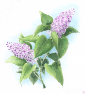
If we look at the lilacs from yesterday the highlights on the leaves pull our eye back into what is important- the two blooms.

Here I've diagrammed out the pathways. The blue arrows lead you to the top bloom, the pink arrows pull you to the bottom bloom.

Most of the visual paths are clear. Our eye follows them and goes where we want it to. However, note the spot where the small pink arrow above the bottom bloom aims down, then you have a strong blue arrow.

This is conflict. Our eye was following one path, not a very strong path, but then it got interrupted and is shown a much stronger path. What should I do?

In the future, I would probably color the far leaf with less highlight, since it's such a small area anyways. Then the visual pathway would not be cluttered. In this case, I don't mind very much because the conflict is small. The pink arrow is weak and the blue arrow is strong. A real conflict would be two strong elements colliding.

If two elements collide then you create a focal point. If that focal point isn't what you want important then you have a problem. Big circles break lines- there's no place for your eye to go once it hits a circle (think a bulls-eye). Small rows of circles become a repeating element and then become a path.

If two elements meet up and flow together then you are just reinforcing a path. If you follow the bottom most pink arrow - it pulls you to the bottom of the bottom bloom then you bump right into a strong blue arrow pulling you into the top bloom. This is good composition. Your eye ends up traveling the whole length of the piece.

Another visual pathway which I did not diagram out is the stem. See how it flows into each of the blooms. This is a much more subtle path, but a visual guide nonetheless. When you are working on a project you might want to figure out visual pathways. If there is a spot on your composition that does not help the pathway or it draws your eye away from what's important then consider how you can change the colors to lessen the conflict. I try to take these things into account when drawing my artwork in the first place so that coloring it in reinforces what my lines were guiding already.

I don't want you to over-think your work, but I'm just trying to help you understand how to make things look better. Have a great weekend!

Wednesday, March 11, 2009

Shadows Part 9 - Shadows in a Composition

Yesterday's post was a warm-up for today and tomorrow's image. I don't want to overwhelm you, but I will label this advanced because a full lilac branch is very complex. I'll try to break my steps down as easily as possible. I strongly suggest that if you did not follow my series on shadows last year that you read through them before tackling this tutorial (first parts 2, 3,)

Planning Shadows in a Complex Composition
At first glance we see a simple image, two lilac blooms among the leaves. We can color it very simply, with purple for the blooms and green for the leaves. Overall it would probably look fine, though it would be very flat. So we start looking at how to add shadows, then we see that this lilac bush is very complex and we get overwhelmed. How can we add shadows and not panic?

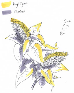
The first step when attacking something like this is to do a quick value study. I keep it to 3 values for simplicity sake: Highlight (yellow), midtone (nothing), and Shadow (gray). I choose my light source and I look at each element individually. On a rough copy of my artwork I plan where my lighting will be. Once I have a light source I go element by element. Things closest to the light will get highlights. Far sides will get shadows. The underside of leaves will be shadows, the tops will be highlighted. Then I can use this lighting reference as a map for coloring.

I could have chosen my light to come from the top left. Picture how the shadows would change: the tip of the top bloom would be very bright and the bottom bloom would have been shaded by the leaves. That would look cool, too.

But how/why did I chose where to put my light today? I strategically choose so that my viewer will be pulled into the image how I want them to...

Strategic Coloring
This means I am in control of the picture and I am choosing how to color it for a reason, not just picking colors and lighting at random. For a strategically colored composition I am choosing my lighting so the strongest contrast will fall on the most important elements of the image: the two large blooms. I want the sunlight to come from the side where both blooms will get the strongest sunlight and more of the less important elements (the background leaves) will be in shadow. If my light were coming from the top left then only the top blossom would be important and the other would be shadowed. It would look good, but not what I feel like today.

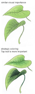
Leaves are green and can be either warm or cool. Yesterday I showed how the top leaf was warmer and brighter, while the bottom leaf was cooler and shaded. It's easy to tell that the top leaf is more important. If I had colored them both exactly the same then they would have had the same visual importance. This is not being in control of the artwork, this is just coloring in something.

If you remember back to some earlier discussions on shadows (part 6, 8) then you'll know that cool colors recede and warm colors are close. I want the most important things to feel close and I want my shadowed leaves on the far side of the branch to feel far away. Yesterday we knew that both leaves were on the same visual plane, meaning that they were equal distance from our eyes, except that one was above the other spatially. This is why both got the same YG undertone.

The final step of deepening shadows increases the visual importance when things are on the same visual plane. Huh? Read it a couple times. When you strategically darken the shadows on two things that are both the same distance from your eyes then you are using the shadows to tell your viewer what is important.

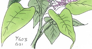
In this lilac branch we have leaves that are far away and the underside. I don't want those to feel like they are on the same spatial plane, so unlike the leaves yesterday I DON'T color them with a base of bright YG, I color them only with G21.

Already you can see from the base tone only that the leaves in front are more visually important and the branch and background are far away and not dominant. I haven't even added shadows yet.

This is where my smaller leaf color studies yesterday are important. I know that I'll be coloring each leaf using the YG03 family and G21/G28. Becasue the G21 and G28 are going to be used on both leaves in front and leaves in back then it's OK if I don't use the YG03 both in front and back, since the other colors will tie in the background leaves.

I know that I will want the blossoms to be most important, so the leaves around the blossoms should be the most interesting and the leaves away from the blossoms should fall away into the shadows. I will plan accordingly and have my brightest areas pull your eyes back into the blossoms, while background colors will have less contrast and have less YG03, more of the G28.
From my final image you can tell that the entire branch is well lit and on the sunny side of the bush. It's very balanced compositionally, and your eye flows through the whole.

If I were to have colored it so only the top bloom was well-lit then the movement and balance (M, B from DUMB-V) would be that all attention flowed to the tip of the top bloom. This would be totally appropriate if I had a focal something there, say a butterfly perched on the top bloom. I'd want the butterfly to be most important, so I'd have all colors pull your eye towards the butterfly. If I were to use the final lilac with other exterior elements in a layout then maybe I would want only one bloom important so it would pull your eye into that object.

I'll save the rest so I don't overwhelm you today. As a teaser of the final image I'll show you the backside, which looks more like watercolor and is just as beautiful as the front.

I drew my lilac with a 0.1 mm Copic multiliner onto Color laser copier paper and photocopied it before coloring it. Because the paper is so thin it takes very little ink to evenly soak the paper and the backside looks very rich and vibrant. You can easily see the final lighting and tell which leaves are close and important and which ones are in the back and complimenting the foreground elements.

Thursday, February 19, 2009

Basic Rules of Good Design

I'm here in lovely New Orleans, getting ready for my class tomorrow. As I am waiting for the blog to move I'll post some more things without supporting artwork or diagrams. I posted this to a group of stampers on SCS, but as I mention, I learned these rules of good composition as a graphic designer for newspaper layouts. I need to give credit to my 9th grade journalism teacher Mrs. Bigham if anything...These rules of thumb got me through design school and my journalism minor and I have yet to find anything as simple or concise when thinking of layout.

Anyways, I hope this helps you as you think of composition and how the parts make up the whole. It really has little to do with Copic, and more to do with good design. Eventually I will take each point and expand on it with artwork. Again, sorry I am directing this at stampers, but it is a key element of any creative composition- not just cardmaking.

A Summary of Good Design
To understand why you can instantly recognize a good card design yet you have no idea how to get there yourself you need to check out a book or two from the library on basic graphic design and layout. Our eyes and mind see it, but without RECOGNIZING what the good elements are we will never be able to re-produce it.

In my high school journalism class I was the graphic designer and in charge of making the whole paper look good. I would train each new batch of students on the elements of good design. We had a formulae that has never failed me, and it can be applied to both graphic design and fine art as well as in cardmaking: DUMB-V

First, Hold your card at arm's length and squint at it. Then you see the parts, not the details. Then go over each element of good design

D: Design. or overall design, format, size- the technical stuff

U: Unity. Do all the parts go together, not always match, but at least go together? This is why we care so much about color and patterns.

M: Movement. What is the first element that catches your eye? then where does your eye go from there? do you get lost and it all blends together? if the flow is wrong or the main thing doesn't stand out then it's poorly designed. Ribbon or stripes pull your eye in the direction they travel, so a ribbon should be strategically placed so that it pulls the eye into your most important element (then people tie a bow to really give a focal point).

Sentiments are read from left to right, so your eye naturally travels from left to right. when it reaches the right, it should be pulled back into the top of the card somehow, and from there, back into the middle, or in an endless loop. This makes you look longer at the card, and if you spent an hour making it you darn well want someone to look at it longer than 5 seconds!!
(see V.)

In scrapbooking, this is why you don't want your photos looking off the page, people follow the direction of eyes and if the eyes look right off the page then you lose your audience. Same with stamps of things that have eyes. If the art is looking in a direction, then try putting your sentiment in that direction. In a composition, the stamp is looking at something within itself.

Take for instance, the Hanna stamp where she is placing a star on top of a christmas tree. Hanna is looking at the star, her arm is out holding the star, then if you put the tree under her hand you have a loop Hanna, Arm, Star, tree, back to hanna. If you have no tree, then put your sentiment near the star, then your hanna pulls you into the sentiment. No tree, then you have one other element down in the empty space under the sentiment and next to hanna to balance the image. Don't make the last element too big or contrasty, this upsets the balance:

B: Balance. Each color, each bling, each patterned paper has a visual weight. Dark things are heavier than light. Contrasty patterns are stronger and heavier than subtle patterns. Your most important element usually stands out because it has the most contrast. When you add a ribbon that is the same color as your background paper the ribbon is lost because it has no weight of it's own. Too many high contrast papers and your image gets muddy and unbalanced. Start simple- one solid, one pattern, one bling or punch and one stamped image/sentiment. see how these work with each other. Bling, like a big ole sparkly something thrown on, will have a lot of weight- like a black hole it sucks your attention in and then you loose the important part of the card. That's why the little rows of tiny blings look so much better than one big, horking rhinestone.

In design, classy things are visually stable, conveying long lasting. So a classy sympathy card should be heavy on the bottom, since it's visually more stable. A fun, whimsical card can be light and airy, but slightly top heavy. Trendy, urban things tend towards heavy on top. this is a whole branch of study...

V: Variety. This is making it interesting. this is the bling, the ribbon, the pop-dots. This is what makes you want to keep looking. You will tread the fine line between variety and balance. The GOOD cardmakers have practiced enough that they can instinctively know what the balance is.

Beginners should err on the side of plain. A simple card always looks classy. Too many patterned cardstocks without understanding how they balance each other will just look tacky and busy. You can always dress up a plain card, but it's harder to mute out a bad one. For a rule of thumb, use only 3 elements- or elements in odd numbers. 3, 5, 7. But make only 3 elements important. Repeating elements, like 3 circles in a row, become one visual element because your eye groups them together. (I tend to have plain cards because clashing patterns and too much bling bug me- just like using too many different typefaces on one page of design).

As you can see, there is a lot to study. You can learn it on your own, you don't need a design degree, but the first step is recognizing what the parts are that add up to a good design. I hope this helps. Have a great week!