Showing posts with label shadows. Show all posts

Friday, November 11, 2011

Back in town

Whew! I am finally back in town. What a wonderful group of students I had in my 3 certifications in Hawaii. Those classes were a lot of fun, and I can't wait to go back and see all your smiling faces.

Yesterday I had the nice opportunity to demo at the University of Oregon's, 30th annual Tools of the Trade show. I look forward to this each year, as I always have a chance to draw and color something new each time. I showed you the piece I colored and drew last year, so I couldn't conclude the event without showing you one of the pieces I drew and colored yesterday. I hope you enjoy!

Outhouse
I drew this picture with a 0.03mm multiliner onto nice paper.

The base brown for the wood is E33 with YG91 and Warm Grays 3, 5, & 7. I added hints of E37 and E47 just to flesh out the color range.

The foliage is colored with G21, YG41, G24, G28, YG63, YG67, YG45, and BG99 and Warm Grays (for the darkest shadow areas).

The sky is airbrushed B41. The roof is cool grays blended with 0 and a tiny hint of BV23 and Y00.

Shadows on outhouse
For those of you who have been studying shadows on my blog, you can note that the outhouse is basically a cube. The light is coming from the left, and casting a shadow to the right. The foliage closest to the base of the outhouse on the shadow side is the darkest, and the shadows get really deep with the BG99. On areas where the vines creep in front of the shadows, you can see that I used YG41 as my base, but for shadow areas, I used G21/24 for the lightest area on those leaves. Also notice, under the tin roof, I added the deepest shadows right under the ridgeline.

I hope this gives you a little inspiration for the weekend. Have fun coloring!

Tuesday, August 2, 2011

Redwoods

I want to thank those of you who stopped by the city of Eugene, Summer in the City event. I had a great time sketching and seeing lots of different artists and styles.

Meanwhile, I recently returned from a vacation to the Redwoods in Northern California. Although it is only about 5 hrs. from where I live, I have not visited the giant trees since I was a kid. These quiet, tall giants grow dense & thick in the beautiful forests near the coast, and are a peaceful reminder of how big things can get if we leave them alone.

Coloring a Redwood Forest
Today I wanted to show you a quick drawing of the redwoods, and how I colored this simple, quiet scene. We have one tree in front, with a few trees behind, in the distance.


The overall tone of this image will be greens and browns, but remember, things in the distance have more blue, so I went ahead and colored everything behind the front tree with B41 and then colored tree trunks with C1. I'm not worrying too much if I go over the lines, since blue is a base color for green.


Next, I added a base tone of E31 to all trunks, front and back. The back trunks dimmed immediately from the layer of blue. The foreground trunk remained pure, but too vibrant, so I added W3 to neutralize it a bit, then streaked in E47 and hints of E04. The pink of the E04 helps make the front tree warmer.


To make the trunk appear rounded, I darkened the edges of the trunk more than the middle. Also notice, that you can begin to see shadows from the foliage on the trunk.

Next, I add the base tones on any green areas. First, I started with a base of YG11 on anything on the ground. Notice how the gray immediately tones down the YG11 in the background areas. Next, I added YG63 to any of the branches above. You'll notice that the YG63 on the front tree is brighter than the YG63 on the back trees. Again, it is because of the blue base. I added a bit more YG41 to any areas on the back trees that seemed too vibrant.

Without shadows, the foliage looks strange and flat. The last step in any of my works is to come back in and finish up my shadows. At this point, I darken the foliage on the front tree with YG97 and blend it in with YG63 and YG67. I added hints of YG11 to brighten up the strongest highlights.

The foliage on the ground was darkened with YG63, G85, and YG11.

Last, I added hints of trees even farther back. I lightly drew in some lines with a regular pencil then lightly brushed in E31 for trunks. For the foliage, I took the B41 and used tip-to-tip blending to lightly add touches of YG63 for the upper branches. Overall, I am pleased with how well this simple sketch came out. You can easily see the depth in the forest, and the strong contrast on the front tree really heightens the perception of depth for the whole picture.

Notice also that I did not leave any areas white. I did this on purpose. In this image, I wanted to really show the quiet, bold, stillness. This is to be a peaceful, resting image, not focusing on vibrant life. By eliminating white, I cut my levels of contrast for the whole picture. Instantly, the image feels calmer. For an example of how the picture changes when I add white, you need to jump to the tutorial on the Copic Blog. On that post, you can also download a free blank image of the redwoods to color on your own, so check it out!

Thanks for stopping by! I hope this inspires you to go color (or hug) a tree today.

Tuesday, May 10, 2011

Strategic Coloring - Dragon Card

I know I haven't posted a tutorial in a while, but I did make a simple card for a dear friend here at the warehouse who was having a birthday this week.

While I don't have a step-by-step tutorial for this project, I will point out a bit of strategic coloring that I did while creating this card. For those of you who have taken the Intermediate Certification, you'll know what I'm getting at, when I talk about Strategic Coloring.

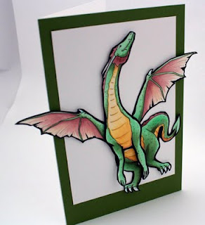
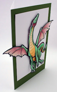
I drew this dragon as 4 pieces of cardstock, one part for the front, one for the hind end, and one each for the wings.The top layer is popped out with foam tape, then I used X-Press It Tape for adhering the rest of the dragon.

Strategic Coloring- Shadows
You'll notice that I didn't bother to blend my colors very smoothly. However, I did add darker spots all over the green. This is to simulate irregular dragon skin. Also, it is hard to exactly determine a light source, except that there is light coming from above. This is my artistic license. The dragon is flying in midair, so there is a lot of ambient light. You can tell he's dimensional, but I'm not distracting you with too many shadows.

What I want to point out is the dragon's green coloration. The main, light green I used is YG41, this is my base tone. I colored ALL green areas with a base of this color, so that all areas, no matter how I darken them, would still feel cohesive. Then, to add simple shadows, I worked in YG63. YG63 has more gray in it than YG41, so it both darkened and toned down the shadows. This makes the shadows seem to have more depth.

On the hind legs and tail, I worked in G85, as G85 is even less intense than the YG's- less yellow and more blue makes the color recede more. Finally, to pull in the color of the green border paper, I added G99 to the darkest shadow areas. Because I physically popped the front of the dragon off the page, that also adds natural shadows to any portion below it.

Part of the strategic coloring in this case is the yellow underbelly. See how the yellow pulls your eye right to the dragon's head? And then, the dragon is looking up, off the page. The first version I drew, the head was pointing back towards his body. However, I changed it.

Strategic Composition
Compositionally, having the head pointing back to the body would create more of a circle in the line of sight. Your eye would continue flowing around and around. However, the message I wanted to convey was freedom and flight. Therefore, having the head up, the wings spread out, and the dragon at a jaunty angle with wings and legs going off the edge of the white box creates more of a sense of freedom.

Also, I gave white space above the head. What this conveys to the viewer is a sense of possibilities- there is room for this dragon to continue flying, wherever his wings may take him.

The wings and tail help pull the viewer back into the dragon's belly, which then draws the eye back up the yellow belly, then to the head. From the head, the eye travels up, hits the dark green border, then flows back around the page back to the wings and tail, which continues the flow and makes the viewer look longer at the picture.

Physically having the dragon popping off the page also adds to the sense of breaking from the confines of the paper. I left his front arms unattached in any way- no extra dimensional tape or anything. This is because I want them to naturally flare out more, and to not lose the dynamic from that portion of the cast shadow.

Notice how simple this card is. The image is so strong and dominant, yet clean that I didn't need to add anything else to the card front. It works as it is. I liked this card so much that I had a hard time giving it to my friend, but since she loves dragons, I know that she loved getting this dragon card today as much as I enjoyed making it for her! May all your dreams take flight this week and I hope you get a little more insight as to how I choose colors and composition as well.

Other colors I used: E04 and YR30 for the wings. YR30, Y21, and E33 for the underbelly. Boo for white claws and horns. Assorted glitter pens to add sparkle to the shadows. To give you an idea of the size of this image, this is a full sheet of paper folded in half, so it is a very large card.

Wednesday, March 23, 2011

Shadows & Shading Blog Hop

Note: Commenting is now closed. Winner will be posted Monday. Thanks for commenting!!

Book Giveaway

The Shadows & Shading book is now available at many of your favorite retailers (sorry, we do not sell direct or else I could post a link), and so we wanted to offer a chance to WIN a copy for yourself.
Thursday the Copic Instructors in the US and Australia are doing a Blog Hop!!!

My new book, Shadows and Shading is great for beginners, either papercrafters or artists - this is the reference book you have been looking for to help you add shadows to give your projects more dimension. The book does not teach you to draw, rather to help you add shadow and shading. This is a wire-bound book that comes with 4 clear printed guides to help you add shadows properly on your own work. So far, the people who have read it love it! There's a lot to digest, so take it slow and read it often to let the concepts sink in.


Now, a Blog Hop wouldn't be as much fun without BLOG CANDY!!! Today or Tomorrow each of the blogs listed below will be posting an opportunity to win. One lucky commenter per blog, so you have lots of chances to win. That's right, simply leave a comment on this post and you'll be in with a chance to WIN this fabulous book!! You have until Sunday to leave a comment on my blog or any of the following blogs.

Here's the list of blogs you can comment on for your chance to win. Please note, this contest is only open to North American Residents on the North American blogs, and Australian Residents on the Australian blogs.


N
orth American Residents only:

Copicmarker Blog

Marianne Walker

Lori Craig

Sharon Harnist


Jenn Balcer

Jennie Black

Colleen Schaan

Bianca Mandity

Debbie Olson

Sherrie Siemens


If you live in the land down under, then you can win from one of the Australian Blogs:

CopicOz (Australia)

Kathy Jones (Australia)


Mandi-Lee Klinger (Australia)


Ok, Happy Hopping!!

Coloring Shadows Example - toy guitar
I don't know if I've shown this picture before on this blog, but it really does a nice job of showing a cast shadow. Cast shadows can be scary! You have to draw in a shape that isn't there. Aaack! However, it is worth it. Practice makes perfect, and the clear lighting placement guides included in the book are perfect for practicing without wasting paper.

Look at the first picture, without a cast-shadow shadow. While the object is beautifully rendered, it has no "place". It is a floating object without reference. This looks strange, because it is easy to see the dimensionality of the guitar and where the light is hitting it. The easiest way to "ground" our image is to add a cast shadow.

The shape of the shadow mimics the shape of the guitar. On this image, it is almost parallel. If you are worried you're not doing it right, you can take a second copy of the image, slide it over a bit, and trace it.

On this example you'll notice that my shadow is purple, not just gray. The shadow gets more gray as it gets farther from the eye. The shadow gets lighter under the neck because there is more ambient light.

Notice the neck and the top area with the tuning pegs. These are not colored a flat color, even though the light would hit those surfaces uniformly. By giving them slight color variation (lighter in the middle) it helps to add to the shine/dimensionality. The texture on the main body of the guitar was made with a colorless blender. This created the splotchy blended/washed out look you see.

I hope that you can come to see how much more life a shadow gives, have a wonderful creative journey, and good luck with the contest!

Tuesday, January 18, 2011

New Year Rabbits

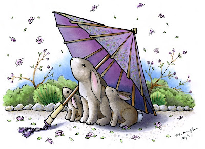
2011 is the Year of the Rabbit, and so I wanted to share with you a piece of art that I made to celebrate the New Year.
New Year Rabbits
At first glance you may think "No way could I color that image! It's way too complex!" I beg to differ. You could color this image, you just have to work at it, piece by piece, rather than getting overwhelmed by the whole. Someone once said, the way to eat an elephant is one bite at a time. So, let's look at the rabbits, and tackle them, step by step.

When coloring a tricky image that you might mess up on, color the hardest part first. That way, if you really mess up, you won't have to go back and color the rest of the picture again. Remember, the only thing you're wasting is a piece of paper, so don't be afraid to experiment!

I started by drawing lightly with a pencil the main scene, then I traced the pencil work with Copic Multiliners using a TracePad light table. I photocopied the line work so I could color it many different ways. Here is one of my colored versions. I used about 30 different markers on this illustration, which I forgot to write down, but I will mention as many colors as I remember. Also, I did not take step-by-step scans as I went along, so I'm just going to explain how I colored each section. Click on the image to enlarge it.

Here is my cute little rabbit family, waiting under the umbrella during a shower of blossoms.

There are a few details I want you to notice. On the rabbits, you can see that I used a Warm gray color range, however, I accented this with a hint of E31 in the shadows. The Copic warm grays are very brownish, and throwing in a hint of a very pale brown really brings out the brown tones even more.

Scribbling texture
I started by laying my W0 and W1 over all the brown areas, then scribbled in the darker tones. Scribbling gave me the slight furry texture, without having to worry about using a rag soaked in blender and messing up the background area. When I had finished adding darker colors, I went back and scribbled in with the light color. This subtly washed the tones together, making them softer and less harsh.

This scribbling is the same process I used on the bushes in the background, and also on the umbrella (discussed below). The ground was simply the same tones used in the rabbits dotted onto the pebbled path. The rocks were scribbled mostly with cool grays, then I dabbed on my blender to add texture.

To get the white tail and bellies on the rabbits to stand out more, I shaded them with Cool Grays. Notice how white the little bunny's tail looks, even though it is in the shadow and is colored gray. Then I threw in a hint of RV00 and RV21 to the ears.

Umbrella
The most tricky area on this image was actually NOT the bunnies, they are merely the focal point. The trickiest area is the shading on the umbrella. I can't tell you how many times I went over the umbrella to get the shadows correct.

When working on shadows, start light! I would carefully layer colors darker and darker to finally build up the tone I wanted. I had to be careful not to go too dark, as I didn't want to lose the color of the umbrella.

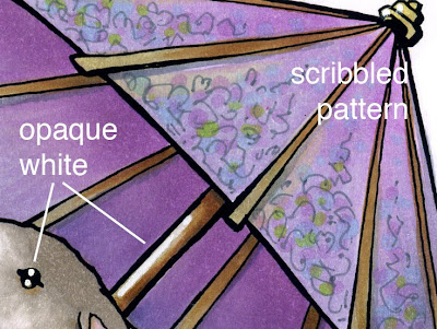
I used a wide range of V's, BV's and grays to build up the tone on the umbrella. Then, I used the same brown and gray families from the bunnies to color the wood on the umbrella. I used a gray multiliner to scribble a pattern onto the umbrella, then I dotted on pale blues, yellows, greens, and browns. From a distance, this looks like a complex pattern, but up close, you can see that it really is just scribbles and dots. The reason I used the gray multiliner was because it would remain crisp, no matter which colors I layered over the top.

Choices in shading
Notice the shadow on the ground. Where the shadow is close to objects- like the bunnies or the handle, I made it crisp and dark. However, I did not want the focus to go to my shadows, so I trailed them off, and faded them. This gives the illusion of bright sunlight (crisp dark shadows) but the viewer is not distracted by too much shadow. This was my own artistic choice, where I followed rules of shadows...up to a point. Then I chose to ignore them for the sake of my work.

Last, I picked out the highlights on the eyes and made the handle of the umbrella shiny with some Opaque white and a very fine paintbrush. My finished work is about 9" by 6 1/2" and took a couple hours to color.

Saturday, January 8, 2011

Copic New Products part 2

Here's the second sneak peek of new products you can find in the Copic Booth at Winter CHA. Don't forget to leave a comment on yesterday's post to be entered for a special prize drawing.
Shadows & Shading: A beginner's guide to lighting placement,
book by Marianne Walker

This little project has been keeping me very busy this winter! This is much of the reason why I haven't been posting as much. I know that many of you read my blog and print it out. You are constantly asking "When will you make a book, so I don't have to print things out?!?"

I have been listening!
I took the fundamentals of coloring with shadows and have compiled them in this simple to use reference book. This book is for beginners, and applies to anyone who colors, from papercrafters to artists. You do not need to know how to draw to add shadows like a professional artist! This guide easily steps you through how to correctly add shadows and make your coloring look more dimensional. The wire-bound book comes with 4 clear printed guides to help you add shadows properly on your own work, without all the frustration and guess-work. This book will be available in March, though you can get a sneak peek at CHA.

If you want to attend a hands-on workshop that teaches these same concepts as they relate only to papercrafting, then register for the Intermediate Certification nearest you! Our team decided after the first Intermediate class in Chicago that people need to have access to more information about shadows and shading, as there is only so much time in the day to teach so many things besides shading.

This book does not teach how to draw, just where to add shadows and highlights when coloring. I am making it appropriate for both fine-art as well as papercrafters. As you can see from the simple sketch above, the shadows make all the difference. You can see and touch these objects- they look alive and dynamic. That is the power of contrast and shadows. I can't tell people enough- add more contrast into your work! This book is not Copic specific either, rather, it is for any coloring medium.

Why did I write this? Because I know many of you never had a chance to take art classes in school. Or, you took an art class, but didn't understand what the teacher was explaining. My goal is to help you feel comfortable with art techniques, even if you don't consider yourself an artist.

So, look for the finalized book in March, and see a prototype in our booth at CHA. Meanwhile, go leave a comment on yesterday's post to win a prize of a new swatchbook.

Wednesday, December 1, 2010

Shadow Color & Certification

I wanted to share something that was recently shared with me by Ken O'Connell, the president of Imagination International, Inc. (Copic USA) and one of my former art professors.
He was recently in a bookstore, saw this book, and wanted to share this tidbit on lighting and shadows and snowmen, as we have been spending so much time on this blog discussing light and shadows, and many of you have seen my snowman coloring tutorial at the end of a Certification class. Sometimes it helps to hear a concept a couple different ways, from different people, so, from Ken...

Color in light and dark
The first mistake most people make in shading light and dark areas of an image is to think the light areas are white or whiter and the dark areas are black or blacker. This is rarely the case. Both Light and Shadows have color. Look closely. It is easier to see it in the light as it allows us to see the color better than dark shadows, but if you lighten the shadows you can see it clearly.

Basically Sunlight is yellowish and shadows are bluish. Why? Because the sun lightens ares that it shines on and the blue sky illuminates the shaded areas that block the sun. Sometimes the surface for a shadow has color and that combines with the shadow color to mix another color. Grass in the sun will be yellow green and grass in the shade will be blue green. The deeper the shade the deeper the blue color.

So light sources are often warm and shaded areas often cool but, the opposite is also true. In snow at night the moon light is quite blue and often the shadows are warm, especially if there are street lights to lighten up the shadows.

If you go to a bookstore this season, look a the children's book SNOWMEN AT NIGHT by Caralyn Buehner. It features lots of illustrations of snow people in moonlight with shadows of warm orange. It shows the light source of the moon (bluish) as well as the street lamps (yellowish). These two sources of light play a role in the light and shadow on the color of the snow, which we always think of as just white....

We will try to post more of Ken's discussion on light and shadow on the official Copic website blog sometime in the future.

Upcoming Papercrafting Certifications
2010 is winding to a close, and I want to thank everyone who attended a certification this year. We had a total of 52 classes in North America! Wow! Which means, that we are gearing up for a busy 2011, with more Intermediate classes and we are trying to hold Certifications in cities that have not had classes yet. Keep looking for more classes opening in the next month in your area. Remember, if you want to take the Intermediate class you need to take the standard certification first.

Standard Certification Classes 2011
Jan. 16 Phoenix AZ taught by Jennie Black Open to Stores & Designers
Jan. 28 Los Angeles, CA (CHA) taught by Jennie Black Open to Stores & Designers


Intermediate Certification Classes 2011
Jan. 27 Los Angeles, CA (CHA) taught by Debbie Olson & Sherrie Siemens subject to approved application

Click here for applications and class details (time/location/fees) for each session.

Upcoming Events
I will be teaching workshops this Saturday, Dec. 4th at Art Supply Warehouse in Westminster, CA. For teenagers, I will be offering a How to Draw Manga class, then for anyone who wants to attend I will be teaching a coloring class. Both classes require preregistration through the store, as space is limited. As this class is being held at an art store I will be focusing the discussion on art papers and inking supplies, though papercrafters are welcome to attend. Friday afternoon, Dec. 3rd, I may also be doing in-store demos, if time permits.

I hope to see you there!

Sunday, February 28, 2010

Shadows, Part 15- Casting shadows on round objects

Thank you for all the well-wishes for my birthday. I had a nice, relaxed birthday surrounded by good friends and food, and some really beautiful cards made by our design team members. Here is the continuation of yesterday's post on shading cubes. Since this is a little trickier I am putting an advanced label on it.
Coloring Cubes Part 2

Crisp vs. Diffused Light
One thing I want to point out is that I don't usually color my shadows as crisply as we are in these posts because I prefer to have softer edges, or diffused lighting, on shadows. Anywhere you have sharp contrast your eye immediately goes there. When I am coloring an object I don't want people to focus on the shadows, rather, I want them to just think about the shape of things.

Choosing where to place your shadows is an artistic choice. Just because something does cast a shadow does not mean that you HAVE to make it realistic, or strong. Way back when I first started teaching about shadows on this blog I purposefully worked with diffused lighting. This means all my shadows have soft edges. However, when you start working on more realistic compositions, such as these lilacs 1, 2 from a while ago you can see that it is important to have variety in your shadows to make the image more believable.


Casting Shadows on Round Objects
Thus far we have discussed coloring a few shapes of objects- cylinders, spheres, cubes, and we have talked about casting shadows that match the shape of each object. A while ago I discussed how shadows overlap, but now that we have talked more about cast shadows I wanted to cover it some more.

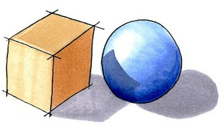
In this example we have a sphere sitting right next to our cube from yesterday. When we have a strong cast shadow from the cube we know that it has to interact with this sphere. However, a sphere is trickier to place a shadow on than the flat ground.

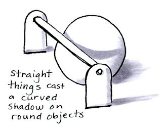
Shadows that are cast onto a rounded shape will wrap around the shape. If you look at this simple drawing you can see that a straight line will cast a curved shadow on our sphere.

Here is also an example of artistic choice in my shadows. I purposefully made the ground shadows in this image diffused because I don't want you thinking about the ground shadows, I just wanted you to see the concept of the rounded shadow on the sphere.

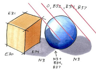
Let's apply this concept to the cube and sphere. This is where it gets tricky and we have to guess a little.

I started by drawing the shadow under the sphere, as this was much easier to tell where it was going. Next, I place the shadow under the cube, Except for the sphere.

I found the spot on my sphere where the light gets blocked at the same angle as the shadow cast from the sphere (red lines). You can easily see in this diagram where the light is hitting first. I chose to have the point of the cube in from the edge of the sphere a little bit. Then I guessed how the edge of the shadow would curve around from there. This can be tricky unless you have an example to look at. For our purposes guessing is good enough.

You can see, once I erase all my notes, how the final pair look with crisp shadows. It may not be exact, but it is good enough for our purposes. Now let's adapt this shadow to our final image.

The present I showed yesterday was adapted from a larger composition of gifts. Each object in the composition casts it's own unique shadows. You can see from this progression how I started with the simple shadows then gradually added more until they look more believable. Click on the image to enlarge.

Final Image: Drawn with a 0.25 mm Multiliner SP onto color laser copier paper. B32, B34, B37, B79, YG41, G21, G28, Y11, Y18, E34, E39, RV21, R22, RV29, N1, N, N5, BG10, 0. Details on the red gift were drawn with a 0.1 mm gray multiliner.

Saturday, February 27, 2010

Shadows, Part 14 Coloring Cubes, part 1

I am finally back from Germany and getting caught up with all that I haven't done in a while. Next week I'll post updates on certification classes, but for now I wanted to post another tutorial, as I think everyone has been waiting for more examples of how to shadow.

This will have two parts, as it would be a very long post otherwise. If you have not followed along with my posts about shadows and shading, you should probably start by clicking here, then scroll back to the first post.

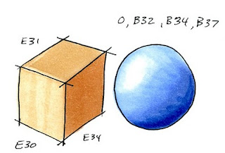
Basic Shadows from a Cube
This is probably easier than talking about shadows on a round object, but I realized that I haven't covered this yet in all my shadow posts. A cube is a simple, flat shape, so the coloring can be simple, or, it can get very complex.

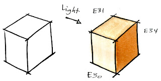
Remember, light travels in a straight line. Any object which blocks the light will block it in a straight line.

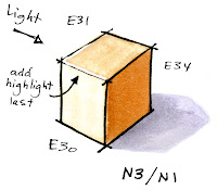
The side of a cube that is closest to the light will be the lightest. However, we need to show a slight color difference between the top and the side. The front is colored only a tiny bit lighter than the top, just to show that the light is strongest from the front.

Next, we need to think about the shadow the box casts on the ground. If you remember from this post on cast shadows, the object will cast a shadow shaped like itself. The corner points out, so we have a pointed shadow.

The edges closest to the front will catch the light more, so we add a little bit of Opaque white or a white colored pencil along the front edge. In real life, our shape would not have black lines defining the edges, so this strong highlight along the edges becomes very important.

Here is the final example of how I applied coloring shadows onto a birthday present. Today is my 30th birthday, and already I have been given some very nice gifts, so this tutorial is my Thank You!!

It is easy to see where the light is coming from in this picture. On the edge closest to the light I left a lot of areas white. With the deep blues and greens the image appears to be more dimensional, since I have a full range of contrast (contrast, part 1, 2, 3)

Notice how I softened the far edge on the cast shadow, since I really don't want people to focus on the shadow. I also made sure that the bow left a shadow as well. This can be tricky, so don't overthink it, just make a couple of lumps and a thin shadow that could represent the ribbon end.

Image: Drawn with a 0.25 mm Multiliner SP onto color laser copier paper. Sketch markers used: YG41, G21, G28, B32, B34, B37, N1, N3, Blender

Monday, November 23, 2009

Shadows Part 13 - Shading & Cast Shadows

Someone in a recent class asked me why I had soft blends in some areas when I color and crisp lines on my shadows in other areas. This got me thinking that I haven't really explained the difference clearly enough between shading and adding cast shadows.

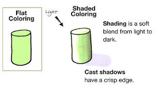
Flat Coloring
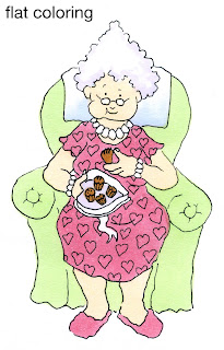
The first thing that people notice about images colored with Copic markers is how smooth everything looks. By coloring in small circles and evenly soaking your paper you can finally get a flat area to look perfectly flat.

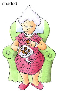
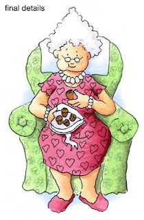
This also gets boring real quick because we know that the world is not flat. This Granny image is from the new release over at Our Craft Lounge. She looks pretty lifeless with plain, flat coloring. I used R83, YR000, YG11, E35, B41, and BV31. I like Granny because she is a character who is very much alive and has personality - NOT destined to be flat her whole life (especially with all those chocolates she's eating).


Shaded Coloring
When we want things to look more alive we add shadows. If you look at the whole list of shadow posts you can see all my directions over the last year or so about adding shadows. I have tried to simplify shadows as much as possible, so don't get overwhelmed if you think you can't do it, just scroll to the beginning and start there.

If you look at this simple diagram you can see the difference between something flat and something with volume and substance.

When Shading, the first step is to pick our light source. In this case, it is coming from the upper left corner. I leave my green cylinder (YG11) white on the side closest to the light and faded in BG93 to create the shading. Because this object is rounded my shading from light to dark is smooth.

Here is Granny with simple shading added. She looks much more alive than she did at first. I added R85 & R89 to the R83, E11 to her skin, and BG93 to the chair. I smoothed darker colors in by layering light-dark-light, so an area like her skin would have been colored YR000 + E11 + YRooo. So far, all of these are smooth blends from light to dark.

I think she's still missing something, though.

Cast Shadows
If you look back at the shading diagram you'll see the volume of the cylinder has left a shadow on the ground, or a Cast Shadow.

On a cast shadow you see the edges are crisp, with no soft shading. This is because the light is blocked in a straight line by the hard edges of the object. This adds to the illusion of volume and we can really feel that our object has substance. However, this is a simple object.

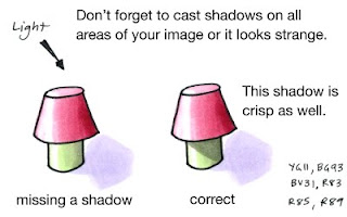
The world is made up of much more complex shapes and objects than the cylinder. If we add a top to our shape then the shadow changes as well.

Look at the first "lamp" in my diagram. The shadow it leaves on the ground mimics the shape that we know the object would have in real life. So we have the cast shadow of the whole image.

But look at where the "shade" overlaps the base. There needs to be a shadow here as well because the top is blocking light on the ground AND on the base.

The shadow the top casts will have hard edge because it is blocking the light in a straight line. By adding the darker shadow on the green area we can really get feel for the dimension this "lamp" has.

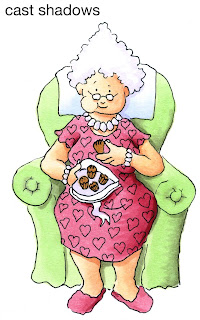
Let's look at Granny again.

Her dress hangs over her legs, so let's cast a Crisp shadow on her legs. Her head sticks out over her neck, so she gets a shadow there, too. Don't forget the chair, as Granny is blocking the light that is hitting the chair, so those will be crisp shadows as well. Her hair casts a shadow, as does her box of chocolates.

By deepening the shadows and making some crisp while leaving the basic shading smooth you can really get a sense of granny's volume. Look at how much more dynamic her legs are in particular (you never thought of granny's legs as being dynamic, did you?)


Here is my final Granny. I used a gray multiliner 0.05mm to add scribble flowers to the upholstery and I added a hint of B41 to the ground and behind the chair just to give her a bit more life. I hope this helps you in your coloring. Have a great week, and enjoy eating your own sweets. Don't forget to check out the other fun stamp sets in the new release from Our Craft Lounge!

Monday, July 13, 2009

Light from a candle- part 2

Here is the second part of my advanced post on coloring light from a candle. This time I'm coloring the kitten and the jar of milk.

Kitten
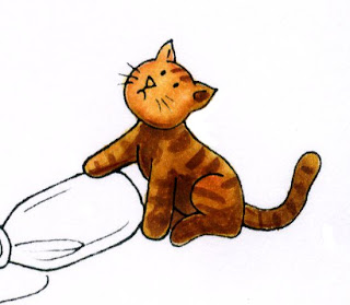
Coloring the kitten is pretty easy. I started with a base of YR31, added shadows with YR24, and added the stripes with E37. I also darkened the shadow areas with E37. Note that his face and the paw are the lightest parts since they are on the side closest to the candle. When I add a final background I may darken him up a bit (especially his tail) but for now I like his colors.

Bottle & Milk
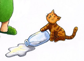
Coloring the bottle and milk are the tricky parts. The bottle and milk are colored with B32, colorless blender, C1, C3, and a hint of Y11. Once I add the background I will add some glints of light with my opaque white.

First, I colored the bottle with B32. I colored only the edges and then I faded it out with the colorless blender (see these posts on coloring a glass of water, part 1, part 2). This makes the edges strong blue yet clear looking in the middle. At this point I would add a pale version of whatever my background color is to the inside of the bottle so you could see the floor through it. However, since I haven't chosen a background yet I will just hold off adding any color until later.

You can note that I am also trying to make the bottle darker than it would be in a bright light. I added hints of C3 to the base of the bottle and as a shadow under the kitten's paw so you can see the shape of the bottle better.

The liquid inside is NOT transparent however, it is milk, so it needs to remain white. To keep it white and to make sure you know it is not the glass jar I shadowed the liquid with my cool grays. I did this both to the milk on the floor as well as the bottle. With a white background the milk looks a little dark, but remember, our background will be dark, so having the milk kind of dark is OK.

You can see that I added some pale yellow highlights to both the milk and the bottle. This is the candlelight reflecting, so it stays yellow, but it is not as strong a yellow as the highlights on his face and arm. Once again, after I add my background I will add some white in with my opaque white to really get the shiny things to look shinier.

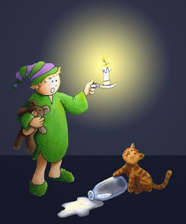
The final artwork now looks like this, where the boy and the cat are both lighted correctly and ready for a background.

Background
I keep mentioning how I am picturing the background. Here is a quick mock-up that I made in photoshop as a way of planning how my final background will look. I haven't made my background yet in real life, but I want you to get an idea of how it will change once I airbrush it. I will need to make masks and carefully plan my airbrushing. Using Photoshop is a cheater way of seeing how it will look without doing all the work (or making a mistake on something I just worked so hard on). Hopefully this week I will have a chance to show you how to actually make this background with the airbrush system.

Thursday, July 9, 2009

Light from a candle

This is a continuation of my last post on shadows. Although this seems like a very simple picture, I'm labeling this advanced because of how much I'll be going in-depth about the image.

Light from a candle
I drew a really cute scene and I want to step you through the process I use for coloring it. At first glance the picture is very simple. However, we have a lot of complex things going on once we try to color it.

Light from a single source, or candle
The main light source in this artwork is a candle, which is very different than the sun. From my earlier post we know the following:
• Our shadows will all move in a circle out from that point of light
• Light farther away from the candle is softer and muted.
• Shadows close to the candle are strong.

Another couple rules I want to include in our list:
• Reflective/shiny surfaces pick up light from far away in the dark, even if they are in the darker areas of your image.
• In the dark, furry things don't show up as well because light has a harder time bouncing off their surface.
• Colors quickly lose intensity in the dark, so shadows will turn more gray than they would in strong sunlight.
• Things close to the light make bigger shadows than objects farther away (I'll talk about this later, not in this illustration)

Some new points to consider about candlelight:
• Candles throw a warm (yellow) glow over everything that they light up.
• Light from a candle flickers and wavers, so your shadows can be softer.
• The candle wax glows from the candlelight.
• Intensity of the candle light is an artistic choice, however, in real life, candles don't give much light.

This is by no means a complete list, but these are the most important things to keep in mind.

Wow. That's a lot of things to think about. Now you see why I consider this a complex image to color. Let's break this artwork down into smaller parts and tackle it over the course of a few days.

Shadow Study
The first place to start is with a shadow study. We have to look at the whole picture to get an idea of how it will work as a completed composition.

Instead of drawing lines where my light is coming from I am using concentric circles to show intensity. Things that are in the first circle are going to be brighter than the outer circles. How close you make your circles is an artistic choice. My circles are'nt perfect, but it gives you an idea.

I chose to make my circles pretty large and make the candle light brighter than real life so that we can see the cat on the floor better.

Notice that the teddy bear is in the arm opposite the candle and so it will mostly be in shadow. I am not going to talk about the spilled milk today, since that is a reflective surface I am going to cover it later.


Coloring the Boy
Here is the boy colored by himself. On his night shirt I used YG06 for the lightest areas, shadowed with YG17 (a little more gray) and I blended in G28 for the deepest green areas, with a touch of BG96. His cap is V12 and V17 along with the greens.

On his skin I used E01, and I shadowed it with E33. E33 is not what I would usually use for skin shadows, but remember, in the dark the skin loses it's color intensity, so it gets dull faster. On the deepest shadows I used a touch of E44. On his face, which is closest to the candle I left it white and added a yellow highlight.

The teddy bear is E33, E44, E29 and W7. The W7 I added to make the darkest areas grayer, as they would naturally be in the dark. His hair is Y02, YR24, and E33. The candle is Y02, C1, and BV23.

Highlights
I left most highlight areas close to the candle un-colored so that I could add a nice, strong yellow (y02). You can see from this diagram where I added highlights. Things farther away from the candle, like the bottom of his night-shirt, I just added the yellow over the base color. If you swipe a pale color over a darker color enough times it will push the darker color out of the way. I did add some faint yellow hints to his slippers, but that's optional.

Don't forget to color the candle and the highlights on the candle holder yellow as well, since this is a source of the glow. I may add yellow to the background behind the candle after I'm all done, but I'm not worrying about that at this point (I'm thinking of airbrushing the background).


Night Shirt
As you are coloring, keep referring back to your shadow study. Notice that the boy's shirt is long, and it passes through a couple of the light circles. This means that the shirt wil gradually get darker as it gets farther away from the candle, even though the front side is well-lit from the candle.

If you look at the shadows on his legs you will also see that they fall in line from the candle, so they are darkest under his night shirt and lightest on the front side, though they aren't as pale as the skin on his face where the candle light is strongest. I also did not give his legs any yellow highlights.

What really makes this picture work so far is the contrast. Although the background is still white, you can tell at this point that the candle is bright and the boy will likely be standing in a dark room. His side far away from the candle is dark and deeply shadowed, but everything close to the candle is bright and vibrant.
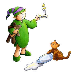
I'll try to finish this picture over the next few days. I hope this has given you some things to think about. Click here to go to part 2.