Tuesday, May 19, 2009

Going To Portland

I'm on my way up to Portland today and will be gone until Thursday. Meanwhile, I'm still supposed to avoid posting but I have some announcements and a cute card to share.

Certification
The class in Portland, OR tomorrow is closed, so if you are trying to get in, it's too late, sorry. Likewise, Smithville, OH is closed.

Applications have gone out for:
Salt Lake City, UT June 11
Belmont, NH June 14th
Durham, NC June 28th
Orlando, FL July 27th
If you need an application and class info, please call.

Get on my mailing list for any other certification classes I have mentioned in the future, including a class held mid-August in San Diego, CA.

Dots in the Sky
Here is a card I made for a dear friend who lives far away. I just wanted to point out a quick element on the card.

If you look at the sky around the mailbox you'll see that I made little tiny dots. The reason I did this was to break up the plainness of the sky and tie my central image into the speckled/airbrushed background paper. It also vaguely hints at bugs flying around and you can picture a nice, hazy summer morning.

I challenge you to break it up a bit. Don't always color things realistically- add little repeating elements and textures to tie in different elements

Colors: I can't remember, sorry. Paper: Neenah Classic Crest Solar White, Reminisce Patterned paper Stamp: Garden Thoughts, Our Craft Lounge Ink: Memento by Tsukineko Other: White ribbon, clear rhinestones altered with B97

Friday, May 15, 2009

e-mail problems

If anyone tried to send me an e-mail in the last two days it got bounced back to you. That problem should be fixed now, so if you have questions or applications for upcoming certifications that you have not heard back from, please try e-mailing me again.

Thank you for your patience!

Wednesday, May 13, 2009

down for repairs...

You may have noticed that the Copic Website is down for repairs. I am also holding off on blogging since part of the repairs involve this blog. My e-mail is also sketchy right now so please be patient if I don't respond right away. Sorry!!

However, I am looking at having a Certification class in San Diego, CA sometime during the 3rd week August. Please sign up to our mailing list on the sidebar to get notified when I have a date for that location.

Here's some nice, old artwork to enjoy as you wait for more tutorial posts. The scales were made dot by dot with the tip of a Copic Colorless blender. I don't think I've shared this before, so enjoy. Thanks for your patience!

Monday, May 11, 2009

Catching up on a Monday

Time to catch up on a few points of interest and update you on Certification classes. I want to share things that appeal both to stampers as well as general artists, so hopefully you will find something of interest in my links today.

Copic Creations Challenge
The fabulous papercrafters over at Copic Creations are challenging you to make a Copic-colored card with purple flowers or Lilacs. Hop over there and submit your creation- you still have a few days left to win their prize.

Pen Addict Copic Contest
Check out this great Copic Contest hosted by my friend at The Pen Addict. He's got a creative contest going where you send him proof that you use Copics and you can win a cool bag of Copics. He also does nice reviews of pens and fine writing papers/sketchbooks. So if you like finding the best pen for your buck you should check out his site.

Illustration Friday
This week's topic is Hierarchy. Check out some of the other illustrations artists have submitted.

Anime Expo
Copic will be sponsoring this year's Anime Expo. If you love Manga and Anime and you live in So. Cal I strongly suggest you go, if only to people watch! Look for my workshops, we'll have some guest artists from Japan, and tons of cool, new stuff just for the comic artists out there. We will be easy to find, since our booth will be one of the first ones you see when you enter the vendor hall. Check us out for some great marker deals and one-on-one help.

My workshops fill up fast, so plan on showing up early to get a good seat where you can see. Perfect for beginner artists or people looking for different ways to use their markers. I'll have more details as we get closer to July.

Anime Expo runs July 2-5th this year at the L.A. Convention Center. Tickets are available from the Anime Expo website.

Upcoming Copic Certifications for Papercrafting
If you need an application for any of the upcoming classes please send me an e-mail at office1@copicmarker.com For more details about certification you cn visit the Copic website certification info page.

We still have a few spaces at the class this Sunday in Rockland, MA taught by Sally Lynn.

The Portland, OR class that I will be teaching on the 20th is open to the public. If you wish to attend please return your application right away to Kris: orders@copicmarker.com

The Smithville, OH class on May 31st is full. We have other East-coast locations coming up, so let us know where you are interested in attending and we'll get you registered for those.

Register now for Winnipeg, Manitoba taught by Sherrie Siemens on June 6th. This class is now Open to the Public, so let us know if you need an application. If you have returned an application but have not heard back from Kris yet, please send her an e-mail to make sure you are registered correctly.

Applications have gone out for the following classes- send me an e-mail if you did not get an application:
Salt Lake City, UT June 11th, taught by Marianne
Belmont, NH June 14th, taught by Sally Lynn
Durham, NC June 28th taught by Sally Lynn

Please get on my mailing list for July classes, August classes in Calgary & Edmonton, or for the Summer CHA class in Orlando. Use the form on the blog sidebar to get on my mailing list.

Also, we are still a couple weeks behind in updating the instructors links on the Copic Website. Please be patient if you took a class in April and your name is not up yet. Thank you :)

Have a great week!

Thursday, May 7, 2009

Fine Art Papers & A quick ATC

This week my office companion is at the National Art Materials Trade Association (NAMTA) wholesale show. It's been a while since I have gone to that show. I love going because it's like walking into a candy store for Art Supplies. Best of all, I can talk to real pros from each company, my counterparts, who work for the companies they love and use their products in their own artwork. It's not open to the public, but if any of you have gone to CHA and walked through the fine-art vendor area you get a small taste of NAMTA.

Anyways, I have had a lot of artists bug me about fine art papers that are good for working with Copic markers, so I want to do a few reviews as time goes on (for you fine artists, currently my favorite paper is the Copic Sketchbook paper, followed by the Borden & Riley Paris Bleedproof Paper for Pens or the Aquabee Manga Artist Pad).

Playing with Fine-Art Papers
A while ago, I picked up this pack of paper from the Strathmore booth. They have some fabulous people working with them, and I have always loved Strathmore papers for my art projects in college.

Anyways, I was cleaning a drawer and I found this assorted pack for Artist Trading Cards (ATC's) and figured I should begin experimenting with some of the papers.

Most of the papers in this pack are too absorbent to color on in the same way I suggest working your markers on thinner cardstock like the Neenah Classic Crest 80# or other popular stamping papers. However, you can still color on them, just be aware of feathering and sucking your marker dry if you try to soak the paper. You really can color on anything you want, but each paper type needs to be treated differently to get the best results for that unique surface (just like the coloring I did on vellum was totally different than the coloring I do on regular cardstock).

Personal coloring habits also change your preception of a paper, so don't take my word as the final say - you need to try it for yourself. There are 7 different papers to play with in this pack, so I'll try to give feedback as I play with them all.

Strathmore Acrylic - Heavyweight Linen-Finish paper for Acrylic Painting
The first paper that caught my eye was the Acrylic. This is 246 lb. paper with a nice linen-finish texture. It's meant for Acrylic painting, which is why it's so heavy and it is absorbent. It had such a nice weight and was so inviting to touch that I knew I had to use it.

On my final ATC the Acrylic is the base card stock. If I were to just draw on it and color with single smooth strokes or give it quick, even coloring it worked fine. Once you try to do more complex special effects or blending it doesn't keep your ink where you want it to go or it uses too much ink.

Knowing this, I ended up with a couple bottles of various ink that I dripped on and then layered stuff from there (the top illustration of the man is made on Neenah Classic Crest). BTW, when I dripped the ink on it bled through the back and looks pretty neat.

The ink was nice and vibrant (before I added lots of dark blues) and I love how the paper sucked up the ink and accented the texture of the paper. For mixed media this paper is great- nice and heavy so I could punch holes in it and string my twine through with ease.

My conclusion?
Great for vibrant colors or mixed media, not good for detailed marker illustration with complex coloring. Love the texture, just be aware that if you are working with the tiny 0.03mm Multiliner be careful how much pressure you give the pen, as the texture is rough and uneven. You need a very light hand, but too light a hand will cause the pen to be uneven and too heavy a hand will damage the point. Otherwise, it doesn't have little fibers that will pull up, so in that sense it is a very clean surfaced paper. I think I would use this paper if I were doing colored-pencil over evenly colored marker areas, as the texture would really make the pencils pop!

Has anyone else tried this paper with your markers? Please leave your feedback!

Wednesday, May 6, 2009

"Painting" on Vellum with markers

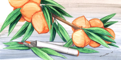
I promised a few days ago to post the step-by-step on my new blog header. I am calling this "Painting" on Vellum because it is more like painting than working with the markers on regular paper. I'll step you through my entire process so you can get a feel for how I illustrate.

Background
I began with a pencil sketch of some peaches based on a few photos I looked at on the internet. I decided to go with clusters of peaches still on the branch, rather than peaches on a flat surface. Then I quickly outlined the main lines with a multiliner and erased my pencil.

You'll note that the image is reversed from the finished work. This is because I am coloring the back-side of the vellum from what I want the final to be. My colors look more intense on the reverse and more streaky. On my final work the colors look more washed together because I scanned the front of the vellum. (If you are doing this technique you don't have to do it reversed).

Next, I taped my Vellum to the background paper so the image wouldn't shift.

When working on vellum I like to do the largest areas first, in this case the main background color-wash. I added a few streaks of W3 and W1 in the top of the image and I added B97 and W1 to the bottom for my background colors. I then took my sketch colorless blender and washed the colors back and forth in long, even strokes. I was OK with this being streaky since I wanted my final to look more paint-like than usual.

Notice how I am not worrying about going over the lines into my leaves or peaches. I clean this up next. I grabbed my juiciest colorless blender and erased all the areas I didn't want colored yet.

On the larger areas I used the chisel nib to erase. I start in the middle of an area I want clean and I swipe up any marker on the vellum. It gets picked up onto the tip of the colorless blender, so I have to scribble it off onto scratch paper or a paper towel. Otherwise I would just be smearing the colors around more.

Slowly but surely I erase any areas that I need clean. I use the fine point on my smallest detail areas last. Now I am ready to add color.

Leaves
I want my leaves to be fairly bright green, so my base green is G14. The natural shadow for G14 is G16 and then I need a really deep, dark shadow for the most contrast so for the darkest areas I use G99. Remember, working on vellum is more like painting, so I know that although my first strokes of G99 look all wrong next to the brighter G16 once I go back over them with the G14 then it all looks good together.

I also tend to work dark to light when blending on vellum. I add my deep G99 shadows, streak in some G16, then go back with my G14 and in smooth strokes I blend all 3 together. I work in the direction of each leaf along it's spine so that any streaks I may have will flow naturally together.

Now my colors seem to have flattened out and smoothed together. If you lose too much contrast just add more dark back in. The beauty of Vellum is you can erase completely, so a mistake is never permanent. I also will be deepening my shadows later, so I'm not worried that I lost my darkest G99.

Note how I am making sure that leaves far away are darker than the leaves in front. Always be aware of your shadows so you don't have a big shadow problem when you are done. On a larger illustration like this I strongly suggest doing a shadow study first.

On the bright green leaves in the foreground I got the shadow simply by layering the G14 twice. You get much more color range from a single marker on vellum than you do on regular paper. You'll also see some slight veins in the leaves. After I colored the smooth main color on each leaf I went back in with my middle green, or G16, and lightly drew in the veins- not too much, it more of the hint of veins.

Last I add E55, E59, and E49 for the branch. Again, streak in the direction that the wood grows for it to look most natural.

If you look at this comparison you will see how the side I am coloring on looks richer and darker, but it also looks too crisp for the effect I want. By flipping it over you get just a bit more softness and the colors look smoother (also, the camera picks up the gloss on the colored side more than the matte finish on the reverse).

It is all a matter of personal taste, so don't think you HAVE to do it the way I do.

Now our picture is really starting to take shape. Looking back now it might have been easier to do my peaches first and erased the leaves back out. Oh well, maybe next time.

Peaches
Just like on the leaves, I added my deepest shadows first with the YR07 and E99. I blended these together in curved strokes (to mimic the curved peach surface) with a little E97 and mostly E95. On paper these colors would be way too dark, but on vellum you get more subtleties out of your middle/dark colors.

On the side of the peach closest to the light I removed extra color with the colorless blender. Sometimes when you layer too many colors on vellum you get a bad build-up of excess color. It's a good idea to clean it up as you work so you aren't muddying your blends.

Keep your strokes as minimal as possible if you want to avoid streaks. Again, I wanted a more paint-like look so I don't mind the streaks like I usually would.

After I colored and blended each peach I added my final layer of deepest shadow with a E19.

You might be confused why I'm mixing E's and YR's on my peaches. On vellum, most of my YR markers were too light, so I had to go darker than usual. If you darken a Y or a YR too much then you end up getting browns, or E's. The color families in the E's that I am working with are very reddish- The E90's are all orange browns and the E10's are reddish.

Last, I color the markers with T5 and T6 washed together with the blender. The only other color I used is the R59 for the tip of the red marker.

Adding darker shadows
When I finished working the back side I flipped over my picture. I want to deepen some shadows that were lost, but I also want to keep my lighting and shadows consistent. So from the front side, or the un-colored side of the vellum, I added shadows under the markers and on the leaves with B97, the same blue that I used on my background. This pulls all my colors together and it cools down my shadows.

Here is my final artwork again, scanned and color-corrected (much better than the in-progress photos). All the little subtleties came together and make a good whole. I see a whole bunch of problems with this art, but I know that I will always be my own hardest judge. I hope this helps you get a good idea of how you can also get a "painted" look with your markers on vellum.
Monday, May 4, 2009

Blog candy winner

Thanks to everyone who participated in the Our Craft Lounge blog hop this weekend! As an artist I appreciate reading everyone's feedback to see which illustrations catch your eye the most. I always appreciate critical feedback as well, or else I won't improve in my work.

Out of 157 comments, the winner of this patriotic stamp set from my blog is:

Random.org

Random Integer Generator

Here are your random numbers:

18 

Timestamp: 2009-05-04 08:01:12 UTC

Number 18, is Marisa, a new blogger (good luck with blogging!). Marisa's comment was:

I might even be able

to make that star! Thanks for the tip.

Marisa, you need to send me an e-mail with your address so we can get that out to you. Again, I want to thank everyone for their comments and feedback.

Certification for Papercrafting
Just a little update on June Certification classes. July classes are still up in the air, but I should have details soon.

Applications have gone out for the following June Classes:
June 6th, Winnipeg, Canada taught by Sherrie Siemens
June 14th, Belmont NH taught by Sally Lynn MacDonald
June 28th, Durham NC taught by Sally Lynn MacDonald
Please send me an e-mail if you still need an application.

Applications will go out today for:
June 11th Salt Lake City, UT taught by Marianne Walker
Please send me an e-mail if you haven't registered for our mailing list via the sign in form on my sidebar. I will also be doing in-store visits and make 'n takes on this trip on June 12 & 13, so come and visit- locations TBA.

Also, All May classes are now open to the public. Please send me an e-mail if you need an application:
May 17th, Rockland, MA (Sally Lynn)
May 20th, Portland, OR (Marianne)
May 31st, Smithville, OH (Sally Lynn)

New Blog Header
You may have noticed that I made a new blog header. I'll post the step-by-step later this week, but just so you know- these peaches were drawn on vellum which is why they have a very paint-like feel.

I love the unique qualities of working on vellum and how it is so forgiving as far as erasing. It's like the layering ability of oil paint with the feel of watercolor and the ease of marker. I also like it because I tend to draw black & white outlines and fill them in, whereas the vellum is transparent so I can draw my guidelines on another sheet and trace through to do my final coloring.