Showing posts with label mixed media. Show all posts

Monday, May 7, 2012

Copics and Acrylic Paint

Marker and Paint
I had a few questions come up this week, and I figured a quick blog post should answer those questions.

With the growing popularity of mixed media, people love using their markers on many different surfaces and with many different mediums. Invariably, people ask me about using their Copic Markers with Acrylic paint. I really don't recommend it, and let me show you why.

Here is the test sheet that I made. I am working on Canson Canvas Paper. I used Golden Paints, Gesso and Titanium White. I made marker swatches both under the paint and over dried paint.


First, I put R59 on the paper and let it dry for a while, to make sure it was not wet at all. I then applied a nice thick coat of Gesso and White paint. I brushed back and forth a couple times.

You can see that the red bled and was picked up and pulled around.

Then I let the paint dry all morning. I took the same marker and colored over the dry paint. The single layer of marker over the paint was fine. It did not mess up my tip, but the color also streaked on the surface of the paint.

Next, I took the red and colored over a spot of paint. I colored many layers in one spot, coloring back and forth. This re-activated the paint, and it got thick and gummy. The paint then clogged my marker nib.

Acrylic paint gets into the pores and now my nib will not allow the color to flow very well. This nib will need to be replaced before I use it on projects again, or else it will streak and possibly leave a bit of acrylic residue that will affect any other markers I use with it.

Now, Reds are the most intense dye, and I wanted to make sure that I was not just getting a result of the dye. So, I took a streak of black, let it dry, then put a single thick smudge of white paint over it. I did not brush back and forth at all. When I first applied the paint, it was pure white and pristine. After sitting for a few minutes, this is what soaked through.

The acrylic paint re-activated the dye and pulled it through the thick layers of paint.

So, if you are wanting to use Copics with Acrylic, be extra careful! Know that the dye will bleed through, and if you color directly onto dry paint you might clog your nibs. Be careful with multiliners over paint as well, as those nibs also run the risk of being clogged from the paint.

Good luck with your work!


Monday, December 27, 2010

Faux Tea-dyed flowers

Searching in my blog
Before I jump into today's tutorial I just wanted to explain something about this blog. I have tons of things archived over the last few years. You can approach this site by starting at the beginning, back in June of 2008 and reading through, or you can search topic by topic.

People occasionally ask me how to search through my blog. To search by topic, just type a word in the search bar up at the top of this blog. This will limit your search to only things on my blog.

If you are looking for information on a specific product line, then you can search using the glossary in the left sidebar. I hope this helps you find some hidden tutorials that you may have forgotten.

Faux Tea-dyed flowers
I made my own Christmas cards this year, and since I had to make so many, I kept the design VERY simple. It takes too long to color a cute little image on that many cards, so instead I used some hand-dyed paper flowers. You can use this same effect on wide ribbon to make it look tea-dyed as well.

These flowers are very easy to make with Copic markers, and look really cool when you are done. Before you start, be sure to have plenty of clean scratch paper under your work, as this gets messy.

First, take your paper flower and scribble on it with a middle/dark color. For this flower, I used R59. The final color will be both lighter and darker than this color, so test a few colors to find the one that will end up matching your project the best.


Next, you need to add a lot of colorless blender. I like using an empty water-brush that has been filled with colorless blender. If you don't have a water-brush, then you can accomplish the same thing by dipping your colorless blender straight into the big refill bottle, then dripping the blender on. This will make the flower very wet and make the inks flow around similarly to if you were actually dying the flower.


Wherever you drip the blender, the color on the flower will start to bleed away from that area.

If you drip in the middle first then the color will run out to the petals more. If you drip a small drop onto each petal then it will push the color out to the edges of each petal. The second flower was soaked evenly all over, see how the colors muted more and ran together more? If you like this look then go for it.

Once you get the look you want, let the flower dry completely before touching it. If you have a drop of ink on your finger and touch the wet flower, then it will pick up that color. If there is color on the scratch paper under the flower it could pick up that ink as well.

Here are some variations on the effect. The small pink/purple flower has a nice 2 tone feel, with purple added to the edges only, pink in the middle, then blended from the middle out. The little brown flower was the same, just with one color. The larger flower was scribbled more randomly so the white spots are more irregular.

Here is one of my finished, simple Christmas cards. I hope this has given you some ideas. Tomorrow I'll post about upcoming Certification classes. Next week we have some exciting announcements for 2011, so stay tuned!

Wednesday, July 22, 2009

Scrapbook Memories - Dan Album

Some of you have commented that you saw me on Scrapbook Memories recently, episode 1408. If you didn't see the episode then I will step you through the main project I altered: a mini wooden scrapbook for my brother, Dan.

I made a number of other little things for that show, but today I'll step you through how I altered this album.

First, a little backstory...
Last Fall I was teaching a certification class in Kansas City with a couple of dear friends - Lori Craig and Sharon Harnist. They found out that the next week I was going to be filmed for a TV show and they wondered what project was I going to make... um... project?... well, it's for a scrapbooking show, so obviously I was going to make a scrapbook, right?

"Marianne, have you ever made a scrapbook before?" they asked me. Hey, that's a really good question! Have I ever made a scrapbook...not exactly...I mean, I've made a few odd pages, but no, never a scrapbook as they envision it (when I make books I do it on the computer and I create finished books for publication, not "scrapbooks")... so I guess the answer is NO. But I know what techniques I want to show on the TV!

After much head shaking and tsk-tsk's they took me to my first scrapbook workshop with Melissa Frances, where we made her cancer-survivor Remember Matchbook. With Lori on one side and Sharon on the other I couldn't help but succeed (though my methods were a little odd to them). And then, Ta Da! Project made. Now I was ready! I had taken my first scrapbooking class and I had two great mentors at my side, TV was waiting!

So with much giggling, we gathered our supplies and headed back to our hotel room and Lori and Sharon proceeded to teach me how to make a great scrapbook. Here is the process we used to create my fabulous scrapbook (in-progress photos by Sharon Harnist, finished photos by Marianne).

Dan Album
We made the main album and prepared embellishments in Kansas City, then when I got back to Oregon I added the photos and final touch-ups, leaving a few spots open to color during the show.

Originally we were going to make a family reunion album, but after I got to adding the final photos I changed it to an album just for my brother, Dan.

Cover
We started with a wood album and covered it with patriotic papers to create a theme of antique Americana. Each page was covered, then we used a dark brown marker to tone the edges of the wood so it was all dark. Where we added paper and had to punch out the holes for ribbon we touched up the white of the paper with appropriate markers.

The bit of twine we used to tie the red ribbon onto the large tag was colored with Copics. You can see how we took the metal star and colored it red, then I added dark purple flecks with the airbrush ssytem to give it variation. The wood flourish was wood colored until we airbrushed it red.

Here is the final cover that I created when I got home, complete with chipboard letters that were originally light green, but I airbrushed them blue to match the album. You can also see we added some small star shaped embellishments. Each of these was colored red with the markers to match the album better. I love how the markers can tie in many different elements that wouldn't match usually, but with some minor color adjustments it all works in the end.

Inside page 1
You can't tell, but the tan paper with small stars was originally white with small stars. I used an E31 or E33 wide marker and colored the whole paper to match our antique theme.

The star on the next page was also white paper colored with a wide marker in wavy stripes to create interesting journaling lines. Writing was done with a Garnet Spica pen and multiliners. You can see on the holes how they needed to be touched up before we assembled the binding.

This page went through a couple revisions. Compare the in-progress shot to the final page. I added a few more tags, each started as white and I added marker to tone it to match my paper. All twine was originally white and I changed it to match. The metal stars were also colored with red markers and airbrushed to match. I printed my photos to fit the background papers we had placed.

The last page of this mini album incorporates elements we already made from the cover and first page. Colored wood flourish, colored foil stars, colored clear star embellishments, white tags colored brown and more.

You can see in these photos the color of the twine before I altered it to be tan. I also distressed the star on this page so it was more aged looking to match the photos of my brother's dirty old cars.

It was great to get my brother's reaction when he saw the final album. When I had called his wife to get photos my brother was picturing a cute, flowery scrapbook and he was sure he wouldn't like it. When he saw my manly tribute to his dogs and rusty cars he was very pleased. He had no idea that scrapbooks could be so cool.

It is doubly cool to think that his album was shown on TV (more from the show tomorrow)...


Supplies Used for Dan Album:
  • Sketch markers, assorted colors, Wide marker, Airbrush System and Spica Glitter Pens: Copic
  • Beyond the page Tag Album, Occasion Planner, Wood Flourishes by Kaiser Craft
  • Blue Awning Chipboard Alphabet, K&Co
  • Red Ribbon, May Arts
  • Star shaped Crystal Stickers, Star Metals Stickers: Mark Richards
  • Freedom Collection Paper & Stickers by Reminisce
  • Wizard Die Cut Machine, Star Netabilities, Rectangle Nestabilities and Copper Foil: Spellbinders
  • Memento Potter’s Clay stamp pad, Tsukineko

Tuesday, May 26, 2009

Blogsiversary Prizes & Coloring on Fabric

I'm back from a great, busy weekend~I want to thank everyone who left comments on my Memorial Day / Blogsiversary Prize giveaway.

The winner for my prize was chosen from Random.org
#297 is Dawn

Congratulations Dawn! Her comment was:

OMG love the camo card. I have been on my son'g ship and it is a real humbling experience. Wish everyone gets to visit a ship at least once in their lifetime.

Dawn, I know you will get a lot of good use out of this set for your cardmaking and scrapbooking. Enjoy those stamps and markers!

Now, on to more prizes!

For today's prize opportunity you need to check out our next design team member, Sally Lynn MacDonald and see what cool prize she's giving away. Leave a comment for your chance to win, then check back for the next blog prize opportunities all week long.

Meanwhile, I have a few questions that have come up recently about using Copic Markers on Fabric. I may have posted something similar in the past, but I want to bring up these points again since they seem to be coming up right now:

Copic On Fabric
People ask me frequently if you can use Copic markers on fabric. The answer is YES! They look great on fabric. A few things to consider:

1. Red inks will bleed when washed, so either use colors besides red (or brown since it has red in it) or only work on projects that won't be washed.

2. No need to heat-set, the markers are permanent

3. The markers will bleed out as you color with them since fabric is so absorbent. To avoid this just heat up the fabric before coloring and the alcohol will evaporate quicker, causing less bleed.

4. For a fine line you can use Copic Multiliners, however, those do need to be heat-set.

5. Don't airbrush on fabrics, since the dye doesn't soak down into the fibers enough.

6. ALWAYS work with scratch paper under your fabric.

When Stamping on Fabric to be colored with Copics:
Try using Brilliance Ink, Heat-set for best results. Sherrie Siemens has done many projects on fabric with Copic markers, so check out her blog for more examples.

Otherwise, enjoy playing with Copics on fabric! I have a couple pairs of jeans I've drawn on and I love how the markers look.The photo above is from a scrap of white cloth that dyed with Copic inks, then I went in with the colorless blender and added drops and swirls in for texture. I made this about 4 years ago, so I don't know what colors I used, regular cotton fabric (though any fabric works).

Thursday, May 7, 2009

Fine Art Papers & A quick ATC

This week my office companion is at the National Art Materials Trade Association (NAMTA) wholesale show. It's been a while since I have gone to that show. I love going because it's like walking into a candy store for Art Supplies. Best of all, I can talk to real pros from each company, my counterparts, who work for the companies they love and use their products in their own artwork. It's not open to the public, but if any of you have gone to CHA and walked through the fine-art vendor area you get a small taste of NAMTA.

Anyways, I have had a lot of artists bug me about fine art papers that are good for working with Copic markers, so I want to do a few reviews as time goes on (for you fine artists, currently my favorite paper is the Copic Sketchbook paper, followed by the Borden & Riley Paris Bleedproof Paper for Pens or the Aquabee Manga Artist Pad).

Playing with Fine-Art Papers
A while ago, I picked up this pack of paper from the Strathmore booth. They have some fabulous people working with them, and I have always loved Strathmore papers for my art projects in college.

Anyways, I was cleaning a drawer and I found this assorted pack for Artist Trading Cards (ATC's) and figured I should begin experimenting with some of the papers.

Most of the papers in this pack are too absorbent to color on in the same way I suggest working your markers on thinner cardstock like the Neenah Classic Crest 80# or other popular stamping papers. However, you can still color on them, just be aware of feathering and sucking your marker dry if you try to soak the paper. You really can color on anything you want, but each paper type needs to be treated differently to get the best results for that unique surface (just like the coloring I did on vellum was totally different than the coloring I do on regular cardstock).

Personal coloring habits also change your preception of a paper, so don't take my word as the final say - you need to try it for yourself. There are 7 different papers to play with in this pack, so I'll try to give feedback as I play with them all.

Strathmore Acrylic - Heavyweight Linen-Finish paper for Acrylic Painting
The first paper that caught my eye was the Acrylic. This is 246 lb. paper with a nice linen-finish texture. It's meant for Acrylic painting, which is why it's so heavy and it is absorbent. It had such a nice weight and was so inviting to touch that I knew I had to use it.

On my final ATC the Acrylic is the base card stock. If I were to just draw on it and color with single smooth strokes or give it quick, even coloring it worked fine. Once you try to do more complex special effects or blending it doesn't keep your ink where you want it to go or it uses too much ink.

Knowing this, I ended up with a couple bottles of various ink that I dripped on and then layered stuff from there (the top illustration of the man is made on Neenah Classic Crest). BTW, when I dripped the ink on it bled through the back and looks pretty neat.

The ink was nice and vibrant (before I added lots of dark blues) and I love how the paper sucked up the ink and accented the texture of the paper. For mixed media this paper is great- nice and heavy so I could punch holes in it and string my twine through with ease.

My conclusion?
Great for vibrant colors or mixed media, not good for detailed marker illustration with complex coloring. Love the texture, just be aware that if you are working with the tiny 0.03mm Multiliner be careful how much pressure you give the pen, as the texture is rough and uneven. You need a very light hand, but too light a hand will cause the pen to be uneven and too heavy a hand will damage the point. Otherwise, it doesn't have little fibers that will pull up, so in that sense it is a very clean surfaced paper. I think I would use this paper if I were doing colored-pencil over evenly colored marker areas, as the texture would really make the pencils pop!

Has anyone else tried this paper with your markers? Please leave your feedback!

Monday, April 6, 2009

Airbrushed Easter Egg

I have to admit that I was planning on making decorated eggs this weekend, but things came up, as things do, and I ate the eggs I was going to decorate. However, here is a photo from an egg I made last year. Later this week I'll try to post some of this year's creations.

Airbrushed Easter Egg
If you have an airbrush this is easy to make.

1. Top of the egg, airbrushed with the chisel end of a sketch Y08 marker.
2. Middle of egg airbrushed with YG06
3. Bottom of egg airbrushed with BG34

4. Doddle flowers on egg with the Super Brush nib in RV25

5. Using the Super-brush nib in the airbrush system, spray larger speckles of the RV25 lightly over the whole surface. Practice the light speckling spray before you spray the egg!

Here are some eggs that Sharon Harnist made last year using stickers as a mask. I love it!

Ellen Hutson tried stamping onto here eggs last year and then airbrushed them. These are fun and simple also.

If you don't have an airbrush, don't worry! You can evenly color your egg with your favorite basic egg coloring kit, then once it's dry, add your doodles with the brush. You can add speckles by lightly coloring the fibers on an old rag and dabbing them on for texture.

If you would like to show off your Copic Easter Eggs, please add a link here. Thanks for sharing!

Wednesday, April 1, 2009

A little Art Journaling

I have been working on my art journaling recently and I wanted to post a piece I made this week. This is most of a 12 x 12 scrapbook page, which didn't quite fit on my scanner, but taking a photo would have lost the details.

I wanted to make something that would use up a lot of the random scraps that I have been collecting and what better way than showing it off with some creative Journaling and doodling. Years ago, when we first brought Copics in Tracy Moore found our products and loved them. I strongly suggest you go check out Tracy's work and get some great inspirations

Altered-Art Journaling With Copic
Journaling is a great way to explore altering objects and playing with your products in ways you wouldn't usually explore if you were giving it away or had a sweet little card to make for someone. It's a very relaxing, freeform means of expression that I challenge each of you to try sometime. It's low-key and exploratory. I was just reading a report by a leading Japanese researcher who was explaining that art exercises more of your brain waves than other, passive activities and helps keep you alert as you age. I think sometimes I just need to be more alert in the afternoon, let alone old age. Having a journal/doodle page is a great way to do this.

I won't list everything that I used, but I used a smattering of almost all Copic products to get my final results-

Backgrounds- Made with Wide markers and dripped inks, added blobs of hand-sanitizer for color variation.

Journaling- Copic Multiliners in sizes 0.05mm - 0.5mm, Atyou Spica Glitter Pens, Colored Multiliner SP, Drawing Pen F01, fine point on Copic original

Altered materials- Die-cut metal with inks dabbed on, plastic with color airbrushed on or directly colored. Tissue paper colored and doodled on with Sketch or Multiliners, Rhinestones colored with inks, Ribbon colored with inks, chipboard letter airbrushed.

Stamps- I colored directly onto my stamps and then stamped quickly for immediate results, rather than dampening the paper. The red fish/blob was made from a stamp colored with a wide red marker then I spritzed on colorless blender to re-wet it.

Mixed Media
A quick reminder about working with altered surfaces. When working with mixed media, like paints or colored pencils, do all your marker first then add your extras later. This protects your marker tips from picking up the solvents or particles of your media and ruining your marker tips. Or, add color with the airbrush. Since the tip does not touch the surface then it won't get damaged. Test any guache, gel mediums, or spray on solvents to make sure they won't cause your marker to bleed. Anything with Alcohol will react and cause the marker to run.

Coloring Onto Silk with Spica pens
I added dark purple blobs onto the pink silk flower with my Spica Glitter pen (the flower was white when I first got it but a little marker took care of that). The ink will run with the flow of the fabric- it spreads very fast. However, the glitter doesn't spread as much and it pools right at the point where you touch the fabric. Knowing this, use a very light touch and move the pen quickly so that the glitter spreads around but the

Lightfastness
Copic Marker inks are a dye, so if you are going to be exposing your work to harsh light you'll want to protect it from UV rays. The Multiliners and Spica pens are archival, acid free, and lightfast pigments. These will do fine when exposed to strong lights.

I hope this gives you a little jolt of something out of the ordinary to spark your creativity today. Have a great week!

Tuesday, March 17, 2009

Making drops of dew

What a rainy week we've had so far! However, this part of Oregon is considered a temperate rainforest, so we're bound to have our share of rain. In thinking about rain and St. Patrick's Day, I figured now is a good time to bring up wet things. Wet, like a morning rain shower leaving tiny drops on a field of shamrocks.

Adding Dew Drops
You can add drops of rain and dew to any colored area, and I'll step you through that today. What you want to do is color your picture entirely with Copics then with a few little extras we can add drops of water. This is perfect for pictures of spring flowers or on leaves, rocks, or whatever else is out there getting wet.

I started with a rough drawing of clover I made with a 0.05mm Multiliner. I photocopied my line work onto color laser copier paper because I know that I get the crispest special effects on this paper, even crisper than on Neenah. For this technique you will get the best results on paper that has crisp colored edges like the PTI, Neenah, Borden & Riley Marker paper, and such. Georgia Pacific is too soft. onto added two of the same base greens that we were working with last week: G21 and YG03. Background got G21 and the middle layer of clover got YG03. The top layer of shamrocks I want much brighter so I colored them in with YG01.

I darkened the shaded areas with G24 and I darkened the bright yellow green with YG06, a darker bright yellow green. (Be aware that the colors on the screen are highly inaccurate).

I added the deepest shadows with G07 lightly feathered into each leaf, stroking from the middle out. The little jagged edges of the feathering I kept so the whole picture looked more leaf-like.

Next, let the whole thing dry really well. This helps make the special effects crisp. Then I add "drops" first with my colorless blender. I pick spots that I want drops and I just touch the blender there until the color moves out of the way.

To get a stronger "drop" I let it dry then do it again in the same spot. This pushes more color out of the way.

Then, at the top of the drop, I add a glint of white with the Opaque white. Don't go crazy adding drops everywhere, just a few strategically placed ones. I got crazy on the shamrocks on the picture because I wanted a really wet field. A few large drops are probably enough. Drops tend to pool along the edges or ridges on a leaf, so most of my drops are on the outer edges. On small drops I did not add glints of white with the Opaque white, rather, I used a white prismacolor pencil. This gives more subtle highlights. For the darkest underside on some of teh drops I added a tiny line/shadow with a 0.1 mm Olive Multiliner.

If you look at each of the top leaves you will also see lighter "squiggles". This mimics the pattern found on clover and it is just a quick scribble from the white colored pencil. I wish this camera would have picked up the color better, since in real life this picture is much more vibrant and bright.

May the luck of the Irish be with you this day!

On an unrelated note I just wanted to mention that the Savage, MD Copic Certification class on April 5th taught by Sally Lynn MacDonald is now open to the public (if you visit her blog you'll see a list of upcoming Copic classes). I have a few spaces left in my Monday class in Buffalo, NY as well. If you need to apply for either of these clases please send an e-mail to Kris at orders@copicmarker.com Also, if you are interested in Canadian classes there will be many coming up in June and July, so sign up on our mailing list using the form on my sidebar or the form on the Copic website.

I will be out of town until Thursday the 26th, so I won't be responding to e-mails as quickly as usual. Also, my blog posts will be a bit more sporadic, but know that I still care about you.

Tuesday, March 3, 2009

Clear Embossing Powder

I wanted to give a big Thank You this week to everyone who sent birthday greetings and who helped out at last week's class in Pensacola. What better way to say thank you than with a simple Thank You technique comparison.

Clear Embossing Powder
A lot of stampers have talked about using clear embossing powder to protect your stamp lines from Copic inks. I've never done an official test before, so I figured now was a good time to run a comparison. To get the strongest effect I decided to just drip inks on and see what worked. I used VersaFine ink, Ranger Super-Fine Embossing Powder, and some Paper Reflections Creative Tags. I used G82, Y13, and Colorless blender inks, the stamp is "Thank You" from Flourishes.

On each tag I stamped, then I dripped on a little G82, lots of Y13, then spritzed on a LOT of colorless blender using my Mist It! from Inspired Crafts. I wanted to be sure that each tag was about as soaked as possible. Also, by working on regular tags, not glossy tags you can see how the inks dyed the paper in a softer pattern- the ink soaked both the front and the back and is not just sitting and pooling on the surface of the glossy paper.

If you look at the photo you can see a distinct difference. The top example is a winner. After heat embossing the clear powder the "Thank You" stayed crisp and clean, the embossing was sharp and shiny, and the results were good.

The next tag I just heat-set it. I heated it about as long as I did on the embossed tag. However, with all the ink I poured on the image did not hold up very well. This is drastic, since most people coloring would not soak the line as much as I did, but I wanted to be sure that my results were consistent.

The last one is a total failure. Heat setting protected the ink slightly but without heat-setting you lose all the stamped lines. This blurry mess is pretty bad. Good thing I didn't touch the marker tip to this ink or else it would have stained the pale yellow marker and made it look bad.

As a final comparison I stamped with my favorite Memento Ink. I noticed instantly that the stamp line wasn't as crisp as the VersaFine. After letting it dry for a minute or so I submitted it to the same test as the others. It held up really well. A couple of areas that had thicker lines bled a little bit, but I think that if I had let it dry longer that would have not been a problem. I consider this ink a winner.

Each of you should run a test like this on your favorite inks, papers and with different embossing powders. Just becuase it worked well for me doesn't guarantee that it will work perfectly for your situation.

Colored Embossing Powders
I do not have any colored embossing powders so I couldn't test myself, but I have had comments from many people who have tried colored powders and the colored powders get eaten up by the alcohol inks. Something about the coloring in the powder does not like alcohol. Clear has no pigmentation so it doesn't bleed or dissolve.

Again, test your inks and your papers to see if it works for you or not. Keep it in your example book so you don't forget. I hope this helps you as you experiment on your own, have a great day!

Friday, January 30, 2009

Coloring On Wood

I think my head is finally getting back in the swing of things after the frantic days of CHA. Here is a quick, very simple tutorial. A couple months ago I showed how to color something to make it look like wood, here I am coloring on wood to make it look like wood. Since Copic markers are alcohol based, they work on many surfaces that water-based would not look as clean on.

Wood tag project
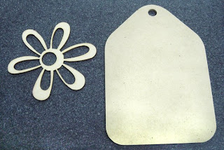
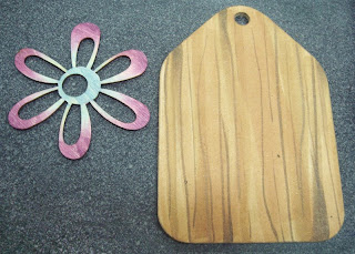
Large wood tag by Kaiser crafts: E33 Wide, E55, E44. I started by coloring the background with my wide E33.

I was streaky because I wanted it to look like wood grain. Then I added some streaks of E55 and last, some darker tones with E44. I was careful to keep all my streaks in the same direction, but also uneven (Look at my post on coloring wood for a stepped-out diagram of how to color wooden-looking things).

Note that I used a little less of each darker tone, so that the overall effect is one of wood. You should test your browns since each blending family will feel a little different, but they don't always follow the rule of thumb about adding grays as you jump from one family to the next (like from the 40's to the 50's). In this case, the E44 has more gray than the E55, so it seems darker on the project. By adding E44 last it kept the edges on those thin streaks crisp. If I added the dark first it would soften my crisp lines when I added the lighter colors. I darkened the edge of the whole piece with the E44 so it matched the flower better.

Wood Flower by Kaiser crafts: B34, V06. Since this wasn't made of bits of ground-up wood like the tag it absorbed the color different. The marker dyes flowed more with the grain of the wood, while the other piece stayed fairly crisp and clean.

Chipboard Letter, K & Co: Colored with V06, RV29. This started out a light blue, so all I needed to do was add purple to get it to match the flower, then I had to tone the purple more pink with an RV29. I wiped off dense color with a wadded tissue soaked in blender.

Colors change on different Surfaces
People are always asking me to match Copic colors to specific things, papers, inks etc. I must say that this is very difficult, even under the best of circumstances. Anything you color on will pick up color in a unique way.

On this project, the little chipboard letter picked up color very differently than the Wood flower. I used the same purple on the letter that I did on the flower. Not the same looking though! I had to dab in a bit of RV29 to tone the purple so it was more pink/purple like the wood showed, since the glossy paper of the letter and the absorbent wood flower take in color in different ways.

Real wood versus fibers will also pick up the dyes differently. My purple is stronger on the flower than it would be on the other piece of wood. It really depends on what each item is made from.

When you make a personal color chart, use the paper YOU use most often. If you print it out on a different paper some colors may not look the same, especially on thicker cardstocks. Keep this in mind when matching colors across media as well. You won't get it exact without some trial and error.

My final background paper layer is some tracing vellum that I wrinkled up and colored with the bue and purple markers again to get a spotty, grunged-up look that is more see-through in real-life. The big green glass bead is one that I stole from a vase here in my office. I thought it nicely added to the piece. I haven't glued the whole thing in place yet, since I'm still debating wether to add more bling or not. One part of me says "leave good enough alone" the other half of me says "go for it! add more stuff!" we'll see which wins out. Have a great weekend!

Wednesday, January 21, 2009

CHA 2009

Tomorrow I take off for sunny California and CHA. If you're coming, you can find us at the show in Booth 4147. Come and meet the fabulous Trudee Sauer and Sherrie Siemens demoing in our booth most days, then on Monday Sally Lynn MacDonald will be visiting us and on Wednesday you can meet Michelle White from Paper Tales down in sunny San Diego.

As a bit of a sneak peek I want to share a new release you'll be able to see in our booth. I'll give you some big hints, but let me just say that we are all eagerly awaiting some yummy things to try at CHA. I won't spill the beans entirely, but here is a quick card I made with our new goodies. If you can't guess then you'll just have to wait for me to tell you in a few days what is in store.

Here is my quick final project. I used a wide E33 marker to scribble the background paper then used an E31 to tone the white areas to a nice, soft brown. This took all of about 15 seconds to make! Then, I colored the plain white ribbon with E57. I love how easy it is to get my ribbon to perfectly match whatever I'm working on with just a quick swipe. The added stiffness from the dye makes my bows so crisp and clean as well.

I chose these colors to match my new secret. Then I drew the chocolates and sentiment with a 0.03 multiliner and colored them in with E33, E57 and B21, each color picked to match our new secret, which worked perfectly when added over the top. Last, I popped up the main artwork with dimensional tape. I hope you enjoy!

We'll be looking forward to seeing everyone at CHA, and for those of you who can't come, I'll really try to post some photos of the booth, so stay tuned.

For those of you who are waiting to get into the Certification classes being held in the next few months, please be patient. As we get details hammered out we will e-mail you the applications and class specs. Meanwhile, have a great week and be looking for some great papercrafting previews from Copic!