Showing posts with label paper. Show all posts

Monday, May 17, 2010

Back from Australia

I think I'm finally getting caught up after my trip to Australia. Before I get caught up in other updates I wanted to share a few things from our Fabulous trip to Australia. Lori posted some great photos on her blog as well.
Paper in Australia
One of the first questions I get from people in other countries always seems to be "What is a good paper?" I had a couple e-mails bugging me about paper types for the land down under. If you live in Australia and have been looking for a good paper to use with Copic markers, then you are in luck!

Lori and I tested X-Press It's Copic Blending Card and we fell in love. If you are familiar with Neenah, this paper blends much like Neenah, but bleeds less and you can put more layers of color on the paper before it gets oversoaked. It's only available in Australia and New Zealand, so if you live down there be sure to check it out.

Image: Drawn with a 0.1mm Multiliner on X-Press It Blending Card. Colors used: E31,E00, E33, E35, E13, BG10, E27, E29, E000, E11, E04, R32, R29, R59, Y38, Y11, W1

Certifications In Australia
Part of the reason Lori and I went to Australia was to train the new regional instructors for Australia and New Zealand. Before I go any further, I need to remind you that any Certification classes held outside of North America are exclusively coordinated by the Copic Distributor for that country. Since Australia now has a program up and running, any inquiries we get about certification from someone in Australia or New Zealand will be forwarded to that distributor.

Congrats to the new Certification team in Australia! Pictured in the photo, from Left to right: Jacqui (Distributor), Debra James, Kathy Jones, Mandi Klinger, and Jonny (Distributor). We had a fabulous time training them, and I urge you to go visit their blogs and get inspired by their fabulous designs. They are all very talented, fun, inspiring ladies. Our hosts, Jacqui and Jonny were wonderful and so sweet (and they kept feeding my sweet-tooth). I can't wait to go back to Australia sometime to color with everyone once again!

Upcoming Certifications in Australia-
There are lots of classes and events coming up this year in Australia From Brisbane to Perth, so for more info on upcoming classes please visit the Australian Copic Events listings here. I know that you will have a great experience taking a class from any of these fabulous ladies. There is so much great information available, and you can be assured that they are teaching the same official certification program that we have here in North America.

Whew! OK, now that I've had a chance to unwind from Australia, tomorrow I'll post updates on all classes we have coming up on this continent. Have a great week!

Thursday, May 7, 2009

Fine Art Papers & A quick ATC

This week my office companion is at the National Art Materials Trade Association (NAMTA) wholesale show. It's been a while since I have gone to that show. I love going because it's like walking into a candy store for Art Supplies. Best of all, I can talk to real pros from each company, my counterparts, who work for the companies they love and use their products in their own artwork. It's not open to the public, but if any of you have gone to CHA and walked through the fine-art vendor area you get a small taste of NAMTA.

Anyways, I have had a lot of artists bug me about fine art papers that are good for working with Copic markers, so I want to do a few reviews as time goes on (for you fine artists, currently my favorite paper is the Copic Sketchbook paper, followed by the Borden & Riley Paris Bleedproof Paper for Pens or the Aquabee Manga Artist Pad).

Playing with Fine-Art Papers
A while ago, I picked up this pack of paper from the Strathmore booth. They have some fabulous people working with them, and I have always loved Strathmore papers for my art projects in college.

Anyways, I was cleaning a drawer and I found this assorted pack for Artist Trading Cards (ATC's) and figured I should begin experimenting with some of the papers.

Most of the papers in this pack are too absorbent to color on in the same way I suggest working your markers on thinner cardstock like the Neenah Classic Crest 80# or other popular stamping papers. However, you can still color on them, just be aware of feathering and sucking your marker dry if you try to soak the paper. You really can color on anything you want, but each paper type needs to be treated differently to get the best results for that unique surface (just like the coloring I did on vellum was totally different than the coloring I do on regular cardstock).

Personal coloring habits also change your preception of a paper, so don't take my word as the final say - you need to try it for yourself. There are 7 different papers to play with in this pack, so I'll try to give feedback as I play with them all.

Strathmore Acrylic - Heavyweight Linen-Finish paper for Acrylic Painting
The first paper that caught my eye was the Acrylic. This is 246 lb. paper with a nice linen-finish texture. It's meant for Acrylic painting, which is why it's so heavy and it is absorbent. It had such a nice weight and was so inviting to touch that I knew I had to use it.

On my final ATC the Acrylic is the base card stock. If I were to just draw on it and color with single smooth strokes or give it quick, even coloring it worked fine. Once you try to do more complex special effects or blending it doesn't keep your ink where you want it to go or it uses too much ink.

Knowing this, I ended up with a couple bottles of various ink that I dripped on and then layered stuff from there (the top illustration of the man is made on Neenah Classic Crest). BTW, when I dripped the ink on it bled through the back and looks pretty neat.

The ink was nice and vibrant (before I added lots of dark blues) and I love how the paper sucked up the ink and accented the texture of the paper. For mixed media this paper is great- nice and heavy so I could punch holes in it and string my twine through with ease.

My conclusion?
Great for vibrant colors or mixed media, not good for detailed marker illustration with complex coloring. Love the texture, just be aware that if you are working with the tiny 0.03mm Multiliner be careful how much pressure you give the pen, as the texture is rough and uneven. You need a very light hand, but too light a hand will cause the pen to be uneven and too heavy a hand will damage the point. Otherwise, it doesn't have little fibers that will pull up, so in that sense it is a very clean surfaced paper. I think I would use this paper if I were doing colored-pencil over evenly colored marker areas, as the texture would really make the pencils pop!

Has anyone else tried this paper with your markers? Please leave your feedback!

Thursday, February 12, 2009

Stamping papers and Inks

I have not been posting much because soon this blog will be moving to the Copic Website, and I don't want to give more work to myself in the switch. That being said, I have been waiting for too long to post this info. Once I move locations I will elaborate on each point, with photos AND I'll have a great blog candy (trust me, there is some FABULOUS blog candy to go with this info). Until then, this is for people who want to know the best cardstock and inks for stamping. I posted this on SCS, but I think everyone should have access to this info. For fine artists, your paper comparison and blog candy will be about a month after the stamping (this also will be some GREAT goodies, so be patient).

Cardstock for Stamping
For people who want the BEST results for stamping then coloring with Copic, these are the cardstocks that consistently keep popping up as being good:

Georgia Pacific (a little soft for my taste, but use less ink and it won't feather as much)
PaperTrey Ink (PTI) This is a thick paper. To get an image even looking on the front side takes more ink. Because it is thick paper it might not soak all the way through. This is OK, as long as the frontside looks even.
Gina K 80# Good, clean, very smooth bright paper. Takes less ink to evenly soak compared to heavier stock.
Gina K 120# Like the PTI, this is a thick paper. The marker colors very evenly, but like the PTI, it might not soak all the way through
Neenah Classic Crest 80# this is thinner than PTI or Gina K. Not as smooth as Gina K. 80 # but still very nice (my personal favorite since it's what we print on at work so I can steal it from the printer )
Copic Stamping Illustration Paper this is a new paper released at CHA. It is thin (like 50#) and slightly off-white. Takes very little ink to evenly color, then you layer it with your favorite cardstocks
Prism Simply Smooth this is VERY smooth. color may not evenly go through the back. Color shows up vibrant and smooth but blending is a little different than on other papers (you really have to try it to understand. People either swear by it or swear at it)

So, does this mean that there aren't other good papers? No. You need to test each of your papers and find which one works for you, which one matches your coloring style. Sometimes you have to slow down when coloring so you don't oversoak the paper. On Neenah or the new Copic paper it's easy to put too much marker down and then it feathers out beyond the line. with practice you learn how much or how little marker to use.

Can you use Copics on cheap paper? Yes, if it works for you then go for it. I've done some great work on cheap copier paper (not even color copier paper), I just need to be aware of how much the marker will bleed and feather, then compensate for it.

However, the shortlist of BAD papers includes: Watercolor, SU! (SU! is intended for blending water-based markers so Copics are tricky on this paper), and stampers should not get fine-art Marker paper (it's too thin for your use and you can't fix mistakes).

Inks for stamping
I must confess, I have not tried all of these, but these are some of the favorites out there. You need to test your own inks to see what works for you.

Best (IMO)
Memento, Tsukineko My favorite, and the favorite of many around here. No heatsetting, works great on most cardstocks, dries quickly.
Brilliance, Tsukineko Many people like this because the black is richer than the brilliance, however, it needs to be heatset. You can use this on fabric, heat-set it, then color it with your Copics and it works great.
AMuse No heatsetting, dries quickly, nice rich black

Good
Memories Dye Ink This needs to REALLY be dry. stamp a few days in advance, heat set it a long time, whatever it takes, but some people love it.
Palette Noir Hybrid Ink I haven't used it much, but heat-set it is what I've heard
Ranger I personally have had some good results, while other times this feathered out and got a yellow halo around the line (even heatset), so I don't use it.

BAD!!!
Staz On. Just don't use it. It will stain your marker tips and bleed.
SU! This is meant for water-based products and won't work

This being said, if you don't touch the stamped line then you will never have problems with any ink. Granted, it's much harder to blend without touching the stamped line and I'm sure you won't make mistakes, but to each his own.

You need to try these inks with your papers to find what works for you. Each paper/ink combo will react differently. When you find a combo that works for you, stick with it! It can be tricky switching paper types, particularly for newbies, and frustrating if you choose the wrong ones. For newbies, read what people are saying on this thread. Some combos will keep popping up (Like Gina K. and Memento, or PTI and Memento, or Heat-set brilliance and Neenah), so that's a good place to start for the least frustrating experience.

If you have any other inks or papers you like, please add to the comments here, so that when I do move to the new location I can make my comparisons more complete. The last time we did this survey we got these results.

Tuesday, January 6, 2009

Glossy Carstock, Part 4 - Blending like watercolors

Brushing Ink on Glossy Paper with a Blender
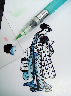
This is a technique that I like because it looks just like watercolors, but it's on glossy paper and dries very quickly. You can use this technique on regular paper as well. This is a quick project, but it gives a nice look.

How it works is that I stamped this beautiful Kodomo image, Fanning Lady, with Memento Tuxedo Black ink onto glossy cardstock and let it sit and dry for a while (make sure it's dry! heat-set it if you need to). Then, with a dark blue marker (B99) I dabbed a spot of color onto a piece of acrylic. This is my palette. I took a watercolor brush that you can fill with liquid and I filled it with Copic Colorless blender. Now I've got a super juicy watercolor brush that works with Copics.

Remember back to my earlier posts on blending with glossy paper, once you put a color down, you can't really lighten it up when you are working with Copics. You also couldn't get one dark blue marker to look so light. With this technique you can apply lots of levels of thin color and build up a darker shade with natural blends and it won't give you streaks and ugly dye edges like you would see when using the marker directly on the paper.

Watercoloring with Copics has made me better with regular watercolors. When I turn in artwork to galleries I usually wtercolor it. I was never good at watercolors untill I started coloring with Copics.

Why would I use a brush filled with blender, isn't a Sketch or Ciao colorless blender good enough? The blender markers aren't juicy enough for applying ink in this manner. They dry too quickly for it to really look like watercolors. With this blender-filled brush however, I can squeeze out extra blender as I need it to get the smoothest, juiciest flow of ink. On glossy paper it doesn't take much since it will start to blob and spread, but it's a look you can't get on glossy paper with watercolors alone. This is also a great way to color vellum smoothly. This technique works best with dark colors.

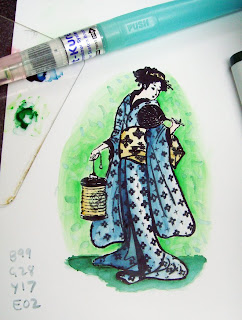
Here is my final image. It looks like I used a lot more colors than I actually did because of the nature of laying down lots of thin ink layers. I used B99, E02, G28, Y17, and YG09. I hope you get a chance to try this technique, not just on glossy paper. This would work well on SU! paper as well as watercolor paper or any papers that Copic markers may not regularly work on.

Saturday, December 27, 2008

Glossy cardstock part 3, blending

I hope everyone has had a chance to recover from a long and busy Christmas week. My life gets so frantic it's hard to sit down and mellow with my markers. However, here is the continuation of my discussion on glossy cardstock.

Not all glossy papers are created equal
What I am showing you is a glossy paper that doesn't work very well, in my opinion. Some will work better, and some will work more like vellum with your markers. Some glossy papers you might prefer coloring on and some you might never want to look at again.

Don't avoid it until you've tried it.

Blending on Glossy paper
Here are my blending experiments on glossy. You'll have to dig through my archives for June/July '08 to see the comparison techniques on absorbent cardstock.

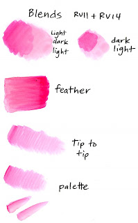
As you can see, starting with the light color, adding dark, then going back with your light marker doesn't really work on this paper. You still see the edges on the dark colored blob. Likewise, starting with dark and adding light doesn't work.

Feather blending looks a little better, but it's still pretty streaky. Also, you quickly run the risk of adding too much ink and creating blobby edges with ink buildup. Not very pretty.

Tip-to-tip blending and palette blending look much better. This is also good for the tiny areas you color in, so maybe this is going to be your best bet for smooth blending when working on glossy papers. Keep practicing to tell how much darker ink you have on your light marker tip until you get the look you are craving.


Colorless Blender on Glossy
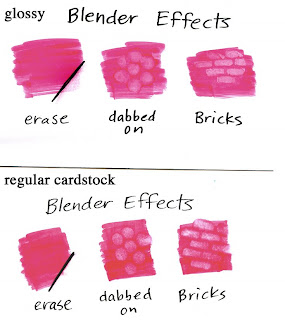
The colorless blender does not work the same on glossy paper as it does on regular cardstock. Look at my comparison here between glossy and regular paper. I strongly suggest that you compare the two for yourself side-by-side to see the subtlties, since my scanner makes the glossy look better than it does in real life.

First of all, it won't erase. The ink has no-where to suck into, so it doesn't go anywhere. It also leaves a residue in the fibers which, because they are coated they won't go away.

Special effects look different. Look at the blobbing and the bricks. You can see how the color pushes out of the way on the regular paper, but on the glossy it just gets lighter. It doesn't stand out quite as much, but the edges are crsiper than they are on regular paper. You might like one better than another.

Personally, losing the ability to erase makes glossy paper unappealing to me. This is a basic blender technique that is way too useful, so I'm not a big fan of glossy (I make a LOT of mistakes and I rely on my blender to make those mistakes go away).

The blender is a good tool for removing heavy ink buildups even if it won't erase completely on glossy, but it also discolors the area around it slightly and can cause even more little ridges like the ones you were trying to remove in the first place. Use it carefully as a removing tool but be careful since a little goes a long way. Also remember to clean the tip really well after using it with glossy paper.

Try other colorless blender techniques on your own- Nasty Rag techniques will still give you good results. If you are dabbing blender on, test to see how juicy to add your blender, since it will spread more on glossy.

Dirty Blender tip
Glossy paper makes the tip of your blender dirty very quickly because the ink doesn't soak into the paper, it just gets on your blender tip. Keep a piece of absorbent paper as scratch paper to clean off the tip frequently (you can't clean it off on glossy- the glossy won't soak the color off). Don't put your blender away dirty! the next time you come to use it the color will have diffused throughout the pen and might not be clear anymore.

Test each and all of your papers before you decide whether it's a winner or not. This is not to say that one is better than another, rather, each will feel different and you will like the way one works better than another. The way I test a paper that is absorbent is posted here. This doesn't work on glossy papers. Glossy you'll want to test a little differently, since you won't have feathering problems.

To test glossy paper
1. Evenly color a blob (see glossy paper part 2). Does it seem to streak more than other glossy papers? If you can tell a difference then maybe this will be a deciding factor.

2. How well does it blend? Make swatches like I did above to try it out. Test each blending method before you make a decision.

3. How does the colorless blender work on it? Again, try making swatches just like I did to see if you like the way it works.

4. Always test your markers and inks on a new paper. This is accomplished in the same way as you would on regular cardstock, since it's the line bleeding that we're worried about, not the paper fibers spreading the ink.

Whatever paper you choose to work with, the key is practice. The more you practice techniques on that paper, the more it will look good to you. Don't give up. If someone else shows you great results on the same papers and inks that you're using ask them how they got that look.

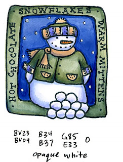
For my final example today I've colored this adorable little snowman stamp by Lockhart Stamp Co. I used Memento Tuxedo black ink on glossy cardstock. I used a lot of palette blending for the tiny details, and used the colorless blender to remove excess ink buildup. For the stars (or snowflakes) in the sky I waited until I was totally done and added opaque white. I don't like how crisp the edges are and how unforgiving this paper is, but with practice you still can get beautiful results on glossy.

Monday, December 22, 2008

Glossy Cardstock, part 2 - Smooth Coloring

As I suspected, some of you had more questions about what kind of glossy cardstock I was using, and yours doesn't seem to work and you can't blend, etc. Don't worry! I'll explain. Just remember, glossy paper is NOT as easy to use as regular cardstock, so you won't get the same results you do with regular cardstock.

Glossy Papers
First of all, I am using a regular glossy paper that we print on at work. We have 3 weights that we use, and for simplicity I'll say thin, thick, and coated cardstock. It doesn't matter which type I'm using, it's the fact that it's glossy. No, it's not Alcohol Marker Paper, like the Copic paper or the Bienfang Graphics 360; rather it is glossy paper, sort of like what magazines are printed on but just a little thicker.

Glossy photo papers should work, though some have a thin coating that the markers "eat" through. If you start coloring and it seems like a layer of something is peeling off or getting mucked up, then you probably shouldn't use that paper. Test a small area before coloring a larger piece.

Before I get into blends, I want to make sure that we have smooth coloring down first, so today we'll talk about getting smooth colors on glossy paper. Glossy paper is very unforgiving. If you make a mistake and go outside the line you can't fix your mistakes with the colorless blender. Sorry, doesn't work. You get one shot to color correctly and that's it. At least on vellum you can erase your mistakes. As someone commented, their paper seemed to dry too fast. Yes, the glossy paper dries very quickly and doesn't give you time to blend smoothly or erase, rather it just adds another layer of color and looks bad.

Smooth Coloring on Glossy paper
The best advice I can give you to get smooth coloring is to don't lift up your marker from the paper and color fairly quickly. Any time you lift up the marker you will get streaks. Color in small circles, color back and forth, whichever way works best for you, just don't lift up the tip of your marker.

When I lift up on each stroke do you see how streaky the colored area gets? Even in that short motion the paper had a chance to dry and the marker streaks. Don't worry about soaking through the paper, glossy doesn't work that way.

I do like the effect you get from dabbing color on, it has a nice mottled feel.

As for layering, it is really easy to color a second or third time and get your base color darker. Notice I'm not getting any blends. With glossy paper you will have a much easier time getting crisp shading lines, not smooth blends (more on blends later).

No matter how you look at it though, glossy paper is NOT the same as regular cardstock. I was getting best results from the brush end of a Sketch/Ciao for these examples. With the broad end of a Copic it's a little harder to avoid streaks. The fine point is great for smooth, tiny little details however. I do like how crisp and clean my Memento ink stamps onto coated or glossy cardstock- it's very rich, deep, and clean, even on the tiny details like the example in my last post.

Stampin' Up Paper
SU! Whisper White cardstock is a hybrid paper. It is a coated paper intended for water-based coloring media (markers) so it doesn't pill up when colored on with SU! markers. When using Copics on SU! paper you will get better results if you treat it like a glossy cardstock, NOT a regular cardstock. This is why I have said before that you shouldn't use SU! paper with your Copics. If you color in the ways I have been teaching for regular cardstock then it just won't work very well. Some people use it for coloring with Copics and they get great results. Now that I've explained why it doesn't work as well or how to get it to work better maybe you can get it to work better in your projects (let me know how it goes).

For my final artwork today, I am working on thin, regular glossy cardstock (I don't rememebr what brand or the exact weight). I used Memento Tuxedo Black ink and let it dry well. Image is from GCS Artstamps, Daisies.

Saturday, December 20, 2008

Glossy Cardstock, part 1

So far in this blog I have mostly worked on absorbent cardstock. Why? Because in my opinion it has the most options and gives you the most flexibility in coloring. Is absorbent cardstock the BEST? No. Each paper type has its own weaknesses and each colors vary differently.

Today I want to start talking about another kind of cardstock and all the fun things you can do with it. This is not to say that it's better or worse than other cardstocks, rather there are diferent ways of using it and you will ge t very different results than you would on other papers.

Glossy Cardstock Intro
Before we get into techniques, here are some things to keep in mind about Glossy paper (this is not vellum! I already talked about working on vellum and it's different).

1. Glossy paper is coated so ink has nowhere to go. You can't pile up layers of color and expect them to smoothly blend like on other paper types.

2. Glossy is coated so colors don't soak through. No checking how well you've done on the backside, sorry.

3. It picks up less ink to color evenly. See the example. Less ink means lighter colors, less ink also means your marker lasts longer without needing to be refilled.

4. Test your outline ink well. You might not be able to use a Multiliner to fix lines, or your stamping inks might need to dry longer. Heat set it, let it wait for a while before coloring, try lots of different papers as well. Some papers will work better than others.

5. The colorless blender will not work the same on glossy as it will on other papers. Any blending will be very different.

6. Less is more when it comes to coloring. Ink will pool up and blob or streak very differently than on other paper.

7. Glossy paper is fun to do ink effects on.

Ponder these first few points for a while, then I'll talk about how to get good results on glossy. For my comparison today I used the stamp Dr. Pea-Nut from Our Craft Lounge. I colored him first on glossy paper, the second time I colored him on some regular absorbent paper. Notice how very different each color looks between the two images and how layering the same color shows up so much more on the glossy than it does on the other paper. Stamped with Memento Tuxedo black ink (let it dry well on glossy).

Wednesday, October 8, 2008

Vellum and Coloring Sunsets

Sorry about the lack of posts recently, but I am on a much-needed vacation after a long and busy weekend down in Savannah GA, and teaching the class in Charleston, SC last week. I did so many presentations in Savannah that I lost my voice half-way through Friday and only now am I really getting to feeling like my old self, just in time for flying to Kansas City tonite.

I have been visiting here in South Carolina, the Palmetto State. On their state flag is a Palmetto, and my brother explained to me that a long time ago they were under cannon attack but their fort was made out of Palmetto logs, which were so flexible the cannon balls bounced right off the logs and kept the fort safe.

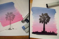
Since we can't grow palm trees in Oregon, I always like drawing them when I visit warm places- such a change from our evergreens and other trees in the Pacific Northwest. The other night we saw a gorgeous sunset, and I figured you would like to see a fun technique for making your own sunsets with Copic markers on tracing paper or vellum.

What is special about vellum?
Vellum is a coated paper that Copic markers don't get absorbed into. There are different quality vellums, and you'll want to test each one to see what works best. The best vellum will allow you to completely erase your marker work, without leaving any speckling (you'll see what I mean in a bit). Vellum or tracing papers are transparent, giving you two surfaces where your coloring will show up- either the front or the back. You can't layer and blend on vellum in the same way you can on more absorbent papers or cardstocks, but you can still get some really neat effects.

Vellum/tracing paper is used by Architects for their artwork a lot for the reasons I mention. They can photocopy or trace their line work, add color from both sides, and get very painterly effects on it. Papercrafters like to stamp on one side of the vellum and color from the backside, since it won't mess up your stamped lines.

Blending on Vellum
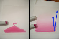
First, I start with a piece of Tracing paper or Vellum (I'm actually using heavyweight tracing vellum for this picture). I add my first color RV19 on the front of the paper, squiggling from the bottom up. See how I leave a little tail of color? This is important for blending.

Next, I come in with my blender marker. Look at the blue arrow- I go as wide as my base color, starting just beyond the tail coloring in horizontal swipes just like the pink. I evenly but quickly work my way down into the colored area and then just as evenly and quickly work my way back out, until all the pink disappears. This will take some practice, but with effort it will look cool. Try not to re-work the same spot too many times or you will add streaks back in.

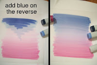
Now my pink looks nice, let's add the dark blue sky. If I add it straight over the pink, it will mess up my pretty blend from pink to light, so I'm going to add the blues on the reverse. B34 is too light and B39 is too dark, so I put both of them down, again leaving a tail.

Just like before, I come in with my blender, evenly coloring in horizontal swipes from beyond the tail and bouncing back out. Look how my pink and my blue fade into each other from different sides of the paper and they didn't add streaks or mess each other up.

Now it's time to add my palm tree. I drew a palm on another piece of paper and with my black marker I trace the outline onto my vellum. It doesn't really matter which side of the vellum you trace onto, just try to color evenly or you'll see streaks.

My sunset looks really neat, but all my edges are uneven and look bad. If I don't want to trim off the edges or hide them then how can I fix those ugly edges?

This is where the really cool part of vellums and tracing papers come in. Remember how I said that on good vellums you can erase? Now I can come back in with my blender marker and erase the edges until they are clean. I pick up the color with my blender and scribble it off onto clean scratch paper. This step works best with a nice juicy blender marker. I have to clean from both sides to get the blue, pink, and black all nice and square. If I had done my sky on one side and the tree on the other then I could have used the blender to erase any mistakes I made on the tree. As it is, if I try to fix the tree I would mess up the blue layer.

Here is my finished piece. This winter it will help me remember a warm, sunny place as I sit in the rain wishing for sunshine. If you haven't already signed up on Saturday's post for the neat marker prize you should do so now. If you've sent me an e-mail and I haven't got back to you don't worry, I'll be getting caught up on those soon. For those of you meeting me in Kansas City you don't need any additional supplies (I have confirmation that my boxes of markers and goodies arrived safe and sound). You can bring your favorite stamps and a few embellishments to alter if you wish, but otherwise everything is provided. Have a great week!

Monday, July 14, 2008

Alcohol Marker Papers

Tonite I'm in Milwaukee doing a free event, tomorrow I'm doing Copic Certification, then Chicago and CHA starting Wednesday. Whoo Hoo! This is a busy, crafty week. I may be a little short on posts this week since I'm so busy, but bear with me.

We've talked about the best matte cardstock and heavy papers for using with Copics, but what about all the other papers out there? Aren't there special marker papers made just for using with markers? Yes. There are many types, but these react very differently than the steps I stated earlier for testing good papers. These are probably not the best for papercrafters, but are good for professional designers, architects, car designers, etc.

Marker Papers are usually thin, very smooth, coated papers that have little or no bleed through when used with alcohol markers. What this means is that ink is floating on the surface, unlike matte cardstock where we want the ink to soak the whole paper and we use slow, even, saturating techniques. Marker papers use a lot less ink, and a few quick, smooth strokes will evenly color an area. If you start heavily layering colors onto marker paper it really has no-where to go, so it streaks and pools. It really looks bad, so with marker paper, less is more. It's kinda hard to see in the photo, but the colors show up different as well.

When working on a coated Marker Paper remember that your ink lines need to dry very throughly BEFORE you color over them. Since marker papers are coated the ink has less to soak into and will get picked up and smeared around much easier. See the bottom small green circle- it smeared. I also tried to fix the mistakes where it was colored out of the line and it just doesn't work as well.

The special effects I have shown with the colorless blender do NOT work the same on coated marker papers, in fact, many of them don't work at all, so be aware. See how subtle the bricks are on the marker paper compared to the other cardstock. The colors in the top circle don't want to blend as well either.

Marker papers also tend to be thin- thin enough to trace through, yet they prevent bleeding onto the page beneath. Designers love these papers because they can trace their artwork and still do a rendering while referring to their original sketch.

Some common types of coated marker papers are the Copic Alcohol Marker Pad, which was designed by the Germans for professional design, Bienfang Graphics 360, Pro Art Marker Paper (most fine-art paper companies make their own version of Marker Paper), and the Copic PM Pad which has a slightly rougher surface so you can use chalk pastels with your completed marker rendering (Pastel/Marker Pad). Here is a list of some of the different marker papers available.

Notes:
• Copic Sketchbooks are a cardstock, not a coated marker paper, therefore they will bleed.

• Manga Illustration Paper comes in two types, Natural White, which is a matte cardstock and Pure White, which is a bleedproof marker paper. Don't confuse the two!

Image: Hole punch I drew a few years ago on PM paper. Notice how streaky the shadow is- I couldn't blend it out like I usually do on cardstock or non-coated papers.

Monday, June 16, 2008

Stamping Paper and Ink Results

We had 324 people submit replies to the question What paper/ink? by the time that I tallied all the stats. I want to thank all of you for your helpful comments. Below are the results, type by type:

Paper - 292 Votes for what works
Papertrey Ink Stamper’s Select: 97 33.2%
Georgia Pacific Cardstock: 72 24.7%
Stampin Up! Whisper White: 36 12.3%
Neenah Classic Crest Solar White: 30 10.3%
Curious Cryogen White: 10 3.4%
Close to My Heart white Daisy: 6 2%
Poison Ivy: 5 1.7%
Bazzil White: 4 1.4 %
Canson Fan Boy, Staples Coverstock, Wasau White: 3 (less than 1% each)
California Paper Goods, Watercolor, Xerox Cardstock, MatteKote: 2 (less than 1% each)
Aquabee Manga Pad, AMuse, Making Memories, Paper Accents Pearlized, Xpedx, PaperRocks 110 #, Paper Cuts, Solarcrest White, Professional Cartooning Pad, Mango, Hobby Lobby Paper Studio, Strathmore Smooth Bristol, WinWorld, Ampad, Hammermill Color Copy Cover, Copic Sketchbook: 1 (less than 1% each)

Papertrey Ink Stamper's Select: This was by far the most popular paper for working with Copics. This is a very high quality, heavy cardstock with good blendability.
Georgia Pacific Cardstock: This inexpensive cardstock is easy to find, with decent blending qualities.
SU! Whisper White: Many of you voted for this paper, although it is not a matte cardstock. It is coated, and some of the comments noted that it is good for single-layer coloring, but not as good for blending.
Neenah Classic Crest Solar White: This cardstock is not as easy to find, but it is a good, high quality cardstock. I use this kind the most, because we also use it for printing on in the office.


Inks - 235 votes for what works
Brilliance: 72 30.6 %
Ranger Adirondack: 49 20.8%
Palette Noir: 46 19.6%
Memento: 24 10.2%
StazOn: 16 6.8%
Versafine: 13 5.5 %
Ranger Distress Ink: 4 1.7 %
Ancient Page: 3 1.3 %
Palette Ink by Stewart Superior: 2 (less than 1%)
Cougar Opaque, Archival Ink/Michael’s, SU! Classic Black, SU! Chocolate Chip, Close to My Heart, Versamark (embossed): 1 (less than 1%)

Brilliance: Almost everyone who suggested this ink said to heat-set it
Ranger Adirondack: This ink was intended not to smear with alcohol inks
Palette Noir: Heat-set it
Memento: Those of you who have tried this new ink love it, since you don't have to heat-set it
StazOn: Many of you who have tried this ink admit that you are beginners, or haven't experimented much, you also suggest heat-setting
Versafine: Heat-set


What doesn’t work, or found something better:
Paper
Stampin Up! Whisper White: 7
Georgia Pacific: 2
Bazzil, SU! Confetti White, Curious Cryogen White, Close To My Heart, Christine’s CC Designs White:1
Inks
StazOn: 4
Stampin Up! Dye Ink: 2
Brilliance, Adirondack, Memento, Encore:1

If you ever get a new type of ink or cardstock remember to try the steps I outlined to find out if these will work for you. Note that some inks work better on some cardstocks than others, so test BOTH the paper and the ink.

Certification- Tomorrow I'll be leaving for Seattle. These classes will be a blast! I am so looking forward to meeting all of you fun stampers and hopefully I'll be able to share some useful things with you. I will try to keep updates on future Certification Classes posted regularly, so keep watching. I found a forum on SCS started by people attending my classes- everyone is so excited!


Tuesday, June 10, 2008

Cardstock Testing, and a bit about Copic


I've promised for a while that I would talk about good papers for coloring on and good inks to use, so finally here I go. Today is cardstock and tomorrow is inks. But I need your help. Let me know your favorite paper and inks to use with Copic markers. Leave a comment on today's post with either what has worked or what hasn't worked, or why you like Copics. All this feedback will help everyone before they get more frustrated. On Friday, at 11:59 (or so) I will pick a winner from the comments for our neato Blog candy. Next Monday I'll publish the favorites.

Blog Prize: A Copic Sketchbook and a cute, zippered pouch filled with an assortment of Copic markers & pens.

A little bit about Copic- Copic markers were developed about 25 years ago in Japan for fine artists, designers, and comic artists (Japanese comics are called Manga). These are professional grade markers designed to last forever (unless you run over the marker with your car). These markers have been in the U.S. for almost 10 years. When we first brought them across the ocean it was to a happy crowd of mostly teenagers who followed Japanese Manga. Slowly the fine art stores and schools figured out what the rest of the world had discovered- that Copic markers made amazing artwork. About 2 years ago the stamping/papercrafting audience found these markers and fell in love.

All that means that when I talk about things on this post I will be sharing tidbits with an appeal to lots of different end-users, from Stampers to Architects, 'cause who knows who out there in blogland is reading.


What makes a good marker paper?
Copic markers, if you haven't noticed, aren't like the cheap rainbow markers you would get as a kid (you know, 36 markers for $3, wow, what a deal!). They can make beautiful work if all the parts are working together, meaning your paper works with your ink, works with your marker. 95% of the people out there are using the markers on paper (the other ones are writing on autoparts, airbrushing teddybears, making fishing lures and crazy stuff like that), so about 95% of you are dying to know what paper is best.

Alcohol markers have a few important qualities we can't forget-
1. They bleed through almost any paper that isn't coated or is a special marker paper
2. They tend to feather easily (feathering is when you color up to a line but the ink keeps flowing beyond the line)
3. They blend better on some papers than others
4. They give better special effects on some papers than others

Papers come in many types, but for simplicity I'm going to start with cardstock, since many of you following this blog are stampers.
Qualities of good cardstock
Bright white*, smooth surface, tight paper fibers, good blendability, good special effects
*it really could be any color, but it's easiest to judge on white

I'm going to show you how I test a good matte cardstock (not glossy or coated), then I want you to go through your papers and tell us which ones work best. You may want to try this on a paper that lots of people have already recommended so you see how the marker should work. Remember to work with clean scratch paper under ANY paper type, even if it is a special marker paper- you never know what will bleed.

1. Take a pencil and draw a circle about a half-inch across - we use a pencil so we don't get hung up on ink types yet, we'll talk about those in the future.

2. With a middle/light colored marker color in the circle a little slower than usual - this allows us to clearly see the pencil line but also it saturates the color more when you go slower. Color right up to the line, not over it.

Does the ink seep past the pencil line? No- Proceed to step 3. Yes- if you think it's too much feathering you can stop and try another paper. If you are testing a paper that other people have said works great then you might be coloring too slowly. See step 3 to check.

3. Flip it over- Does the ink seem even where you colored? Yes- then you're doing an accurate job of "real life" testing. No- it may be an extra thick paperstock, or it might be that you need to try soaking the paper more to get an accurate read. Some thick cardstocks have a secret clay coating, so inks won't make it through the paper. Some clay coated papers leave a slight residue on your marker tip that isn't good, so try to avoid clay coated papers.

4. Take a second color, slightly darker than the first and layer it in Do this while the first color is still a little damp. Again, don't go over the line. Does it feather out now? Think if this is a picture that you're coloring and you're blending in a couple colors. Any feathering will be magnified. No Feathering or if you are comfortable with it go to step 5. Yes, there's a lot of feathering- you might consider a different paper.

5. Go back over the darker color a few times with the first color. How well did those colors blend into each other? You might want to try this with a few different color combos on the same paper to make sure it's not just your color choices that are messing you up. If the the second color just sits there, no matter how much you soak it and it won't blend then this isn't the best choice for blending (watercolor paper does this- it works beautifully, right up until you try to get a blend with this technique- see the example- it just won't blend).
If it seems to blend well then go to step 6.

6. Take a colorless blender to a dry, colored spot on the paper. Touch straight down, hold it for a second and repeat in a few places. Where the lighter area meets the color, is it really subtle and soft, with very little definition? This is a great paper, but you'll have a hard time getting special effects. If it gives you a clean, crisp line where the light meets dark then congratulations! Your paper passes all my rigorous standards.

Paper is also a matter of what you are comfortable with. Many good cardstocks will fail one of these areas, but if you're still happy with the results it gives you, then this is the right paper for you. My favorite, easily available cardstock is the Neenah Classic Crest Solar White. However, even this doesn't give me quite as crisp a results as I like from my Copic Sketchbook. Trouble is, the Copic Sketchbook is bound together, and it's not a vibrant a white, so it looks a little strange when turned into a card.

For Fine Artists and illustrators who like to work on heavy, smooth papers you should test different Bristol papers. I tested one while preparing this post and it failed miserably. I have used some that work very well however. For Comic arts, I suggest the Manga Illustration Paper Natural White (Copic). Canson makes some nice FanBoy Comic Papers, but I find these a little soft for effects and their surface is not as smooth as I like for inking, though you can use them on a light table.

I have not personally tried all the other paperstocks out there that people recommend using with Copics, but now that you know what to look for, YOU can judge if they are good or not, or what quality in them is lacking. Then leave a comment today to get entered in the blog candy drawing on Friday. Next week I'll talk about some other paper types, I just don't want to confuse anyone by posting it here.