Showing posts with label mixed-media. Show all posts

Friday, February 13, 2015

Be My Inchie!

Welcome to the Colorful Copic & ART SQUARES blog hop!  
You are in for treat today as Copic pairs up with the ever popular Art Squares by Inchie Arts.  There are so many things to love about this pairing! 

Did you know: 
  • Art Squares are the perfect canvas for creating small-format art!
  • They come in 6 sizes (1 inch, 1.5 inch, 2 inch, 3 inch, 4 inch, and ATC).
  • Art Squares come in 7 colors (black, dark gray, light gray, kraft, dark cream, light cream and white).
  • They are perfect for wet or dry mediums.  
  • Copic markers and inks look amazingly vibrant and deliciously rich on Art Squares!
  • Copic multiliners glide smoothly across the surface.
  • Work on the “top” or toothy side for the best results. 
  • You can mix and match your mediums! No warping, bending or curling.  

You can find more information about both Copic products and Inchie Art Squares at the links below. 


Our teaching and design teams have been challenged to put marker (or ink) to these precision-cut matboard surfaces and see what happens!  (You are not going to BELIEVE these samples… trust me - they rock!)


Hop along with these talented designers as they show you some more interesting and exciting ways to pair up two great products!  

Thursday, April 21, 2011

Copic Mixed-Media Workshop

Copic Ink and Art Workshop is coming up soon!

June 4th, Indianapolis, IN, taught by Colleen Schaan and Bianca Mandity

Applications and information went out yesterday for the upcoming workshop. If you did not get an application, then you can download one here.

We have been getting a LOT of inquiries about this program! This class is the first one we are offering, and if we see good response, then we will look at future workshops. These classes will not be offered as frequently as Certification Classes, so if one comes up in your area then we encourage you to attend. Register early, as space is limited. Class fills on a first-come, first-serve basis.

No Pre-requisites required!! Come and make some beautiful mixed-media creations in this project and technique-based class. I hope to see you there! If you have any questions, please send Nancy an email. nancy@copicmarker.com

Thursday, January 8, 2009

Coloring onto stamps, part 1 - Watercolor look

I know many stampers out there wonder if they can color directly onto their stamps with Copic Markers. Can you do it? will it work? will it ruin your stamp? My answer is, YES you can color directly onto your stamp, and here's how.

Coloring onto stamps with Copics, Fake Watercolor Look-
First of all, I want you to know that years ago, when we first heard that stampers were using Copic markers this is what we thought they were doing with them- coloring onto their stamps and stamping things. NOT stamping things then coloring them in. So I would color onto my stamps and then stamp with them to get some neat colored images. Then someone told me that this was bad for my stamps, so I stopped admitting that I did this, then someone else said it was OK on your stamps, so then everything was OK.

One of the challenges of working with Copics directly onto rubber is that the alcohol in the ink evaporates too quickly to color then stamp with. That ink is not going to be affected by water like traditional stamp inks would be, so if you breathe, or "huff" on it to re-wet the ink, it just won't work. So how do we get the ink damp to stamp?

You'll see in my photo I have a Mist-It by Inspired Crafts. I have mine filled with Copic Colorless blender solution, NOT water. I simply color onto the stamp with whatever colors I want to use (in this case I used R59, R29, and YG99). I gently misted the stamp and then stamped my image. Now it looks like I watercolored the picture, but it's all Copics.

Note: Rubbing alcohol will work for this technique, however on some colors it alters the dye and changes the fianl color, so test it first.

This is a serendipity kind of effect, since too much mist and the image gets all blobby, too little mist and the paper doesn't pick up the ink evenly. I had to stamp about 5 or 6 times to get this one to look the way I wanted it to. Also, this works best on solid-area stamps, like the Flourishes Spring Ephemerals stamp that you see here.

Will it ruin my stamp?
This is where people start debating. Alcohol can be harsh on rubber- it dries it out and makes it brittle. My answer is that if you clean your stamp after each use it won't be a problem. Solvent based inks like StazOn or using your stamps with bleach are just as bad for them. That being said, many people won't use their stamps with solvents or with Bleach since those can be hard on your stamps. Gina K. posted this technique shortly after taking the Copic Certification class, where we covered this technique, so read this tutorial and it's comments on SplitcoastStampers if you want more details. Like I mentioned, I have some stamps that are 4 or 5 years old that I had been doing this to, and they are fine. To clean them, just mist them again to get the final residue off, then use a regular stamp cleaner with a stamp conditioner in it if you are concerned.

Here is the final card I made with this technique. The darker green paper was actually more of an olive colored paper by Prism and I colored over both it and the plain ribbon with the darker green, G28. Then I added dabs and drips of colorless blender over the colored areas to really weather it out. The textured brown paper is also from Prism, I lightly colored it with E31 to bring out the texture then "watercolored" E37 onto it for the darker blotches.

Tuesday, January 6, 2009

Glossy Carstock, Part 4 - Blending like watercolors

Brushing Ink on Glossy Paper with a Blender
This is a technique that I like because it looks just like watercolors, but it's on glossy paper and dries very quickly. You can use this technique on regular paper as well. This is a quick project, but it gives a nice look.

How it works is that I stamped this beautiful Kodomo image, Fanning Lady, with Memento Tuxedo Black ink onto glossy cardstock and let it sit and dry for a while (make sure it's dry! heat-set it if you need to). Then, with a dark blue marker (B99) I dabbed a spot of color onto a piece of acrylic. This is my palette. I took a watercolor brush that you can fill with liquid and I filled it with Copic Colorless blender. Now I've got a super juicy watercolor brush that works with Copics.

Remember back to my earlier posts on blending with glossy paper, once you put a color down, you can't really lighten it up when you are working with Copics. You also couldn't get one dark blue marker to look so light. With this technique you can apply lots of levels of thin color and build up a darker shade with natural blends and it won't give you streaks and ugly dye edges like you would see when using the marker directly on the paper.

Watercoloring with Copics has made me better with regular watercolors. When I turn in artwork to galleries I usually wtercolor it. I was never good at watercolors untill I started coloring with Copics.

Why would I use a brush filled with blender, isn't a Sketch or Ciao colorless blender good enough? The blender markers aren't juicy enough for applying ink in this manner. They dry too quickly for it to really look like watercolors. With this blender-filled brush however, I can squeeze out extra blender as I need it to get the smoothest, juiciest flow of ink. On glossy paper it doesn't take much since it will start to blob and spread, but it's a look you can't get on glossy paper with watercolors alone. This is also a great way to color vellum smoothly. This technique works best with dark colors.

Here is my final image. It looks like I used a lot more colors than I actually did because of the nature of laying down lots of thin ink layers. I used B99, E02, G28, Y17, and YG09. I hope you get a chance to try this technique, not just on glossy paper. This would work well on SU! paper as well as watercolor paper or any papers that Copic markers may not regularly work on.

Wednesday, December 17, 2008

Using colored pencils to lighten areas

A couple weeks ago I mentioned in a post that most people pick Copic colors that are too dark to start. Instead of investing in a whole new pile of Copics (which will probably happen anyways since the markers are so addictive) here is a way to get more from what you already have.

Adding Light with Colored Pencils
For today's technique we are working opposite of a technique I shared back in August for using colored pencils with Copic markers. For that post I was working with light marker colors and adding dark colored pencil, for today's technique we're going to be using dark marker and light colored pencil.

Colored pencil is a wax that leaves an opaque residue behind when you are working with it. Colored pencils look better on a paper that has a slight tooth to it, since this helps pull the color off the paper, so today I'm working on a rough textured paper (sorry, I don't know what brand).

Remember: Always use the pencil LAST. Otherwise the wax clogs your marker tip.

If you have a dark colored area you can overlay a lighter colored pencil and cover up the darker color, to some extent (it's hard to get back to pure white, rather, you can get close with a white pencil). This is handy when you are in a small area and you colored it too dark, but pulling the extra color out with your colorless blender would leave a bigger mess than you had in the first place. Just add a dab of light pencil and you're good to go.

One nice thing about colored pencil is that you can overlay lighter colors that normally you would have a hard time blending back into a dark area with marker. If you look at my example you can see that I added a few different tones of pencil over my dark red and each came out feeling a little different.

For my final example today, I'm working with the stamp set Poppy Patch by Flourishes. Notice in the first example you can only get so much color variation from a YG67 and a R59. Both colors are dark and they make the poppy seem flat. I like that even on this textured paper the marker looks smooth and clean, but having dark colors is a bummer.

If you add a bit of light colored pencil you can quickly and easily bring back some of the highlights and make the image not so blah and dark. It changes the tone of the poppy to more of an orange, rather than a deep red. The texture on the paper also adds to the feel of the artwork. It reminds people that these were colored by hand and not generated on a computer.

Tuesday, November 25, 2008

Working with the 0.03 multiliner

This week here in America is Thanksgiving. There are many things I'm thankful for in this world, but I'd have to say that besides my family, I am happy to work for a company that has high quality art supplies that I love using every day. They feed my creativity. This month, 8 years ago I first met with the fearless leaders here at Copic and made a brochure for them. So in honor of my Anniversary of working at Copic and because I want to share with everyone I am offering a prize. Post a comment on today's blog and you will win a Multiliner 0.03, and also get a chance to win other fun Copic products.

0.03 mm Multiliner
One of the unique tools Copic makes is the finest point sized inking pen in the world, the 0.03 mm Multiliners or Multiliner SP's. If you've ever tried them, they take a very delicate hand. These are a high-quality art supply that is a joy to use.

As you can see from this comparison, this is one fine line. Look at how chunky the 0.3 pen looks compared to the fine delicacy of the 0.03. These are not for the heavy handed artist.

So what should they be used for?
I use them for fine cross hatching or drawing hair.

Stampers use them for adding details to stamped images.

Calligraphers use them for micro-writing competitions.

What you probably shouldn't use them for: Writing a check (my husband figured that one out for me). If you have a heavy hand and break even the strongest of tips, then this pen should be avoided. If you are heavy handed and want a fine pen then go for the 0.1 mm or 0.2 mm pens.

Prizes
What do you use these tiny pens for? What would you use it for if you had one? Leave a comment with your answer. The winner of this blog candy will receive a free Multiliner 0.03 with some other neat goodies, so leave your comment with e-mail address on today's post and we'll draw a winner on Friday!

For the final image today I drew on this little, mini domino with the 0.03 mm Multiliner. Once I'm done, I need to heat set it, then ideally coat it with something to seal in the multiliner. As you can see from the penny, this is one tiny little piece of work (can you solve the maze?). Happy Turkey week! Marianne

Note: Congrats to V! She figured out the trick to my tiny maze - it goes in one side and out the same side. Mazes are one of my favorite things to draw, and I like to make them a little different each time.

Friday, October 31, 2008

Airbrushing Part 8, Masking

Happy Halloween! Finally, I'm going to finish up talking about airbrushing and next week we can move on to some new topics. I can't complete my discussion on airbrushing without talking about masking techniques.

One of the problems with the Copic Airbrush System is that for any kind of crisp edge you need to mask your image in some way so the spray goes only where you want it to go. So far I've already shown you a few different masks, but here is a rundown of some common mask types and ideas for using masks.

Different Mask types
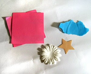
1. Paper. This can be as simple as holding a torn piece of paper in place with your finger, or cutting out detailed shapes in paper and spraying around them. Whichever route you go, you'll want to make sure that your edges are securely held to the paper or else you'll get the spray creeping under the edge of your artwork. Sometimes I'll hold the paper in place with removable tape, sticky putty (that blue sticky stuff you use to hold paper to the wall), or I'll just use my fingers.

A lot of stampers like to cut out a mask from one of their stamps and keep the mask stuck to the top of their wood stamps so every time they use that stamp they have the mask right there with it to airbrush their background.

For crisper edges with paper- Spray straight down over the paper or aim your spray so it sprays from the paper out to your surface so your air isn't aimed up under the edge.

Pro: Easy
Con: Air wants to creep under so adhere it well

2. Adhesive Papers & tapes
This includes everything from standard masking or painting tape to low-tack stickers and sticky notes. You can buy tapes usually on a roll (like 6" wide Eclipse Tape by Judikins), or sheets of low tack adhesive. You can even put down a few sticky-notes to make crisp straight lines without much fuss. This is a good alternative to regular paper, but always test the surface you're sticking to so you don't ruin your artwork. Common masking tape was developed for painters to be removable, but on softer papers it will remove fibers so test each brand and see what works best for your surface
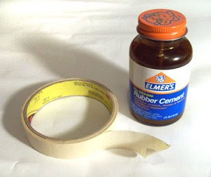
Pro: Easy, prevents air from sneaking under the mask better
Con: Test the different adhesives on your surface so you don't ruin your work.

3. Masking Liquids
This includes liquid frisket, rubber cement, etc. I really liked how Plaza Arts' website explains this stuff, so I'm just going to quote it:

Watercolorists traditionally paint whites by leaving the white of the paper. To do so, these areas need to be protected from being painted inadvertently. This means you must plan ahead for where those areas are going to be and take care not to paint over them by mistake. An easier way to handle this is to mask them with pieces of tape or masking fluids. Masking fluid (sometimes referred to as liquid frisket) can be applied with an old, worn-out brush (never a quality, or new brush) to those areas that are to be protected then allowed to dry. Once the surrounding area is finished being painted, the masking fluid can be removed to once again expose the white of the paper underneath. To remove the mask, rub it gently with a clean dry finger or rubber cement pickup.

So frisket was created for masking watercolors, but it works for airbrushing as well. Again, test it on your surface and make sure you can easily remove it.

Pro: Apply it exactly where you need it
Con: You have to let it dry and test each surface

4. Masking with Objects
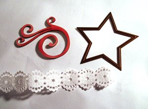
I've already shown you some examples of masking with objects using the fall leaves and the Spellbinders dies. Doilies, die cuts, lace, punches, gravel, leaves, ... basically anything you're willing to spray over to get a pattern will work. You have the same challenges as plain paper in keeping your edges down to prevent overspray. Some objects, like the metal dies, can be cleaned afterwards with hand sanitizer. Other objects will just get sprayed on and sprayed on and, you get the idea. Whatever you mask with be sure it's something you're OK with getting dirty.

Pro: Fun & easy to get neat shapes
Con: stick it down well so it doesn't blow all over the place.


5. Wax Masking
I already talked about this a couple weeks ago, so go look up Part 1 and Part 2. You can also buy kits for making Ukranian Eggs that have a special heated wax applicator that gives you super-fine lines. I've never used them but the concept seems simple enough.

Pro: easy
Con: doesn't work on every surface

There are many ways to mask, and some I know I haven't mentioned but this is a good list to get started with. Now that we've talked about how to mask, let's see how to effectively use a mask. Color Sequence is very important. As the frisket quote mentions, we need to plan what areas we are leaving white, what areas we color first then cover up, and what will be darkest or lightest. This is the part that will take more practice and I don't think I'll get into spray sequence much today because I want to show something else.
Airbrushing With Rubber Cement
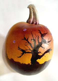
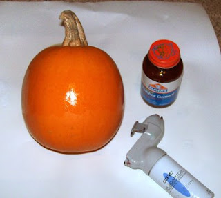
For my project today I'm going to airbrush a pumpkin.This is a pretty small pumpkin, but it's the one my son picked from the field, so I've got to decorate it, even if it's a little small for cutting. I want to have grass and a creepy tree in silhouette, with a sky that fades to orange (from the pumpkin). I want the line between grass and orange sky to be nice and crisp. If I drew straight on the pumpkin with my markers it would be streaky, so I need to airbrush to get the even coverage I want (notice that I'm working over a large piece of scratch paper to protect my carpet from getting sprayed).
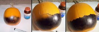

First, I masked the sky line with some rubber cement (you can't see it). I let it dry completely then I sprayed my grass with a black 100. Then I carefully rubbed away the rubber cement to get my clean sky/grass transition. This part was super easy- I just had to make sure that my cement completely covered the area that might be sprayed and had to wait for it to dry completely.
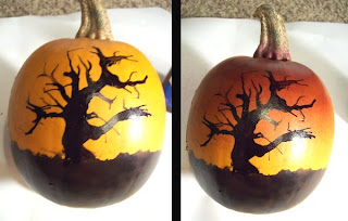
Next, I dripped on some black refill ink and blew it around carefully with a little straw (this part took much longer to get the correct). On a pumpkin, if you make a mistake just clean it up with hand sanitizer and some tissues (I must have gone through half a box of tissue and my fingers look like Dalmatians now). However, after much care and practice I got a twisted tree shape that's a little bigger than I hoped, but my pumpkin is tiny, and the drops are large for this scale.

Then, with a V09 I added my fading dark sky. I sprayed in long even strokes across the horizon of the pumpkin. I did a light layer first then I came back with the same color and added a few more layers at the top to darken it up.

Last, I added some little sticker crystal stars in the sky. They started out clear, but that was too bright so I toned them down with the same V09 that I airbrushed the sky with. I wish the pumpkin were a little bigger so the curve isn't getting in the way of a good picture. Oh well, my son will love his pumpkin. Have a Happy Halloween, All Saint's Day, and DĆ­a De Los Muertos!

Thursday, October 23, 2008

Airbrushing Part 4, Sketch markers

Sketch markers are the most popular style of Copic markers not only for their wide variety of colors, but also for their ability to airbrush. Unlike the original Copic marker, Sketch markers will give you two different airbrush spray patterns. This simple variety helps make your airbrushed areas look a bit more exciting, as if airbrushing wasn't exciting enough.

Basic Airbrushing
Once you have set up your ABS, insert either a Sketch or Copic marker's chisel end into the air grip. Make sure the point is up (see photo) for the best spray pattern. Push it until you feel it snap into place. Now you are ready to go. (Later I'll get into troubleshooting your spraying patterns, but today I want to cover fun stuff).

Here I'm picturing the ABS-2 that I mentioned yesterday, shown with a Copic marker inserted properly. Also note how they are holding the unit with the pointer finger activating the spray button, and the hand wrapped around the aircan, or for the other set-ups it would be around the air adaptor (This is an old photo that Japan gave me years ago, and I just noticed that the person in the photo seems to be either missing a finger, or they have a spare finger hidden behind the air grip- ETA: now I look at it this morning and the finger is there- weird).

The marker will spray slightly in front of where ever you think it will spray, so unlike the photo, aim STRAIGHT DOWN until you feel comfortable with where the spray is hitting your surface (I've been sprayed a few times by people wondering where their spray is going since they're not aiming down).

Airbrushing with Sketch Markers
Many people have asked me "Why does the Sketch marker even come with a chisel end? I like the brush, but the chisel is useless." This is because these people have gotten used to the smooth coloring and blending with the brush and now the streaky, chunky chisel marks don't seem as nice. It's really hard to fill in a large smooth area with the chisel (or the brush) without a lot of effort and ink.

This is where airbrushing comes in handy.

If you look at the comparison on the left, the medium broad, chisel nib allows you to smoothly airbrush. This is great for filling in backgrounds, adding soft color blends, or coating irregular shaped objects. The chisel end disperses the spray in a very uniform, fine-particle way (if you are using the original Copic markers, then the spray patterns are almost identical between the Sketch chisel and the Copic Chisel).

Note that when you compare the marker drawn straight onto the paper and the airbrushed examples, the airbrushing is a shade or so lighter than the marker would normally be. Especially on pale colors you will see that the airbrushing is very light, sometimes you won't even be able to see it at all (I had to increase the contrast on my scan to get the light blue to show up better here). Keep this in mind and try to airbrush with darker colors for more vibrancy.

Sketch markers, unlike Copic original markers have two ends that work in the airbrush. The chisel end gives smooth, predictable spray patterns, but turn it around and the Super-brush nib gives you a larger, irregular speckle pattern. This is more apparent on darker colors, or if you are spraying very lightly. The results are not as predictable however, and I strongly suggest testing and practicing to see what pressure and which colors will give you the best results. Juicy markers will give you better speckles as well.

Look at this pale blue masked example. The stars were created from Spellbinders Nestabilities Star dies placed on the paper. The stars on the left are from the chisel, the star on the right is from the brush end. Either way looks good, but like I say, the chisel is easier to get a predictable even coverage, while I had to work a little harder to find the perfect spray on the brush.

Used in conjunction with the even coating from the chisel nib, and you can achieve a neat duo-tone effect.

Here is a copper die-cut star from the same Spellbinders dies I've been using to mask with. At first glance the star looks like a nice dark red. Clock on it to see up-close and you'll see that it's not flat red, rather I added darker speckles of purple to darken up the vibrant R29. This helps add to the antique feel. The nice thing about airbrushing on metal is that if you don't like it, just wipe off the marker with some hand-sanitizer and you can start over.

How I most commonly use the two together is shown below on these paper flowers from Kaiser Craft. I pick a lighter color as my base color then with a darker marker I add accents of color that are more subtle. This is how I got the egg to look speckled a couple days ago and this is how I like layering my airbrushing on most projects.

You can see that with the airbrush it becomes much easier to color irregular shaped items, unusual surfaces (in the case of the metal star, if I had tried to color the red directly it would ahve probably been streaky and look uneven). When I buy embellishments, ribbon, or lace, I tend to always get clear or white/pale colors, since I can color them to match whatever I'm working on. If you have an airbrush you should try spraying something unusual- you might be surprized at your results (more on airbrushing tomorrow).

Monday, October 20, 2008

Airbrushing Part 1, Basics

I know many of you have been bugging me for a long time about airbrushing, and it's not because I don't want to talk about airbrushing, it's just that there is so much to cover I've been reluctant to start on that topic. If you haven't noticed, once I talk about something, I talk about it until there's nothing more to discuss. Airbrushing could take up my blog posts for the next month, but I'm going to try to limit myself to a few days at a time.

First of all, I'm attacking this in chunks, so if your questions aren't answered today just wait and I'll probably talk about them later.

Basics of Airbrushing
I'll be abbreviating Copic Airbrush system to ABS. It's easier than spelling it out.

Q. Which markers can I use in my ABS?
A. You can use either the Sketch or Copic markers in the ABS system. I know some of you have fiddled around with getting Ciao to work. If you are willing to mess with it then go for it, though it's not officially endorsed by Copic, so I can't give you directions.

Q. How does the ABS Work?
A. The ABS is spraying air across the exposed tip of the marker. You can hook your system up to either special cans of air or an air compressor. Insert your marker, aim and spray. To change colors you pull out the marker and put in a new marker. No mess, no clean-up, and it's non-toxic.

Q. How fine a line can you get with the airbrush?
A. Not very fine. If you want a fine line you need to mask it (see today's post). Same holds for crisp edges; they need to be masked or else they won't be crisp.

Q. What is the ABS used for?
A. Most commonly it is used for filling in large areas (backgrounds) or coloring 3-d objects. There are really so many things to use it on that if you ever get an airbrush system you'll find yourself addicted and looking for any chance you can get to spray things. Wigs, fly fishing lures, paper boxes, teddy bears, metal, embellishments, clay...like I say, the possibilities are endless.

Q. Do you have more info about Airbrushing?
A. Yes. Go visit the Copic Library for more info and download the brochure on airbrushing. Otherwise, just follow along for the next few posts and I'll explain things more in-depth. A lot of the members of the Copic Design team have written directions in the past about airbrushing as well, and if I could find links more quickly I would have included them. If you have a favorite link to airbrushing tutorials please leave the link in the comments on this post for everyone to visit.

Airbrushing and simple masking
I've had this artwork for a few days, but I am just now getting around to posting it. I mentioned above that if you want a fine line or crisp edges you need to mask it.

For today's project I'm going to make a quick, fun background. Backgrounds are the most common use of the airbrush and this is about as simple as you can get. I grabbed a couple small leaves from the trees outside and I am using some Star Nestabilities by Spellbinders as my mask.

Under each leaf and on one corner of each star I added some removable adhesive. This keeps the stars from shifting and the edges on the leaves from lifting up. The airbrush system is spraying air that wants to sneak under any exposed edge so if you want crisp edges mask very carefully. If you want soft edges then you don't need to bother.

Next I chose a few fall colors to spray. I don't remember exactly which colors, but it was a yellow, a dark red, some browns, an orange etc. See how I sprayed a color, moved the masking shapes, sprayed again, moved the shapes, etc. This ends up giving us an interesting background. I happen to be using an ABS-1 kit for this post, but any of the ABS systems will do the same thing. Also, I am using the chisel end of Sketch markers, but Copic markers will work just as well.

This is a good exercise to practice spraying evenly, close, or far away and see what kinds of effects you can get. Since the background is mottled people won't notice if you make a mistake. Try close up spraying, far away, pushing harder, pushing softer. With practice you will be better able to judge how much pressure to spray with and how close to the paper you need to hold your marker (I'll also cover spray patterns later this week).

Once you are done spraying carefully clean up your star dies with a little bit of hand sanitizer. This contains alcohol and will remove all the marker from the metal very easily. Also, look at your leaves- if they're like mine then they now have some pretty neat coloring on them. Airbrushing is a great way to add extra color to dried leaves or silk flowers in your fall arrangements.

Next, here is my artwork that I want flying above my leaf background. I drew this with a multiliner 0.3 mm onto color laser copier paper. Notice how my main outline is thicker? This is because I knew I'd be carefully cutting it out and I wanted my edges nice and bold so they stand out more against the background.

I cut her out, poped her up with a few scraps of paper to give her a natural shadow rather than a colored one and my artwork is done. Very simple, very fun, and is perfect for the fall season. All this week I'll be covering more about airbrushing, so let me know your questions. Have a great day!

Tuesday, October 14, 2008

Wax Resist, part 2

I heard different suggestions from a few of you about other resist techniques that you can use with Copics, but this post was specifically about WAX. There are lots of ways to achieve the resist technique, I was just covering the ins and out of one way (this gives me an excuse to cover other methods in-depth in the future). One nice thing about art is that in most cases there's no right way or wrong way, just a different way.

Here is the picture I was going to show yesterday, but I didn't want to overwhelm you by covering too many things all at once. The reason I chose wax resist is because I wanted to use my son's crayons to color part of the image.

The stamp image today is a fun one that was given to me as a gift by dear, sweet Peggy Ward after my Charleston class a couple weeks ago. This is a picture of "Rainbow Row" a historical section of downtown Charleston, SC where the houses are vibrant colors. Usually when coloring a picture of something real I go look it up to see what it really looks like. This time I purposefully wanted to color it in a whimsical, almost childlike way so I didn't look at what it really looks like.

First, I added crayon over small details that I didn't want to be colored with marker, but I wanted them to be a color- the trees, windows, ground, clouds, etc. This second picture shows how I added Copic right over the top of the crayon. I wasn't too careful, because the whole image is kinda loose and fun. It's actually a good way to add color if you don't have very many markers, and you want the freedom to color imperfectly without worrying about small details.

Next, here is the almost finished step. See how I scribbled in the sky with my wide marker? On the center chimney I added some crayon over the marker just to protect it a bit from my rough coloring job. I also scribbled the swirls and streaks to the sky to add to the rough, whimsy of my coloring.

Last, I went back and gently scratched off the top layer of wax to really get my clouds and windows on the purple building to pop out a bit more. Someone yesterday suggested that I could iron off the extra crauon when I was done, but I wanted to be a little picky about which wax to melt and which to leave. This is where you have a bit of artistic license and can lighten up the crayon layers just where you want, instead of melting off everything. I think the clouds are my favorite part of this final image- they really look fun and vibrant. Image: Rainbow Row, by Carolina Stamper 843-522-9966 Paper: Copic sketchbook paper Ink: Memento Tuxedo Black Extras: Crayons from various manufacturers


Certification in Seattle Nov. 7 and
Vancouver, BC Nov. 10

The Vancouver, BC class is now full. I am taking applications for Seattle though. The Seattle class opens to the general public on Monday Oct. 20th, so contact Kris at the main office to get added to that class if you are interested. In US, toll free: 866-662-6742. Cost is $100. Also, I am still gathering my mailing list for Anaheim in January and Florida in feb. 2009 so e-mail me to get on those lists.

Monday, October 13, 2008

Wax Resist, part 1

I'm back, What a trip! I met so many wonderful people and had a great time with everyone.
Thank You to everyone who attended my certification classes, visited me in Savannah, or that I got to talk to in Kansas City. Now I'm back to all my unanswered e-mails, questions, and tedious coloring that fills my days. If you think I've been ignoring you just know I've been busy and will answer your questions in due time.

Wax Resist & Copics
Years ago I was doing presentations in an art school and the teacher who I was presenting to said she gave each student a lump of clear paraffin wax the first day of class so they could do resist techniques. As simple as this is, I don't know how many people actually have tried it.

A good coating of wax will repel Copic inks, though you have to be careful. Here I've taken a sheet of "Pool Fun" by Reminisce and by putting clear resist (a clear tea candle) over one word I can get it to stand out more by coloring over the rest of the area with a wide B34 marker. To clean up the area so the white is more vibrant I scratched off the the wax after I did the resist and any residue of blue came right off.

Once this is coated in wax Copic markers will not stick to that area very well, so if I had wanted to color in the word "Swim" I needed to do it before I added wax to do my resist.

Here are some rules of thumb to get the best results when working with wax resist and Copics. Wax is something you don't want on your marker tips, but if you're careful this technique will work just fine.

1. Always work over a good scratch paper and clean up any bits of wax you may leave behind. Otherwise it will come back to haunt you, stick to your fingers, get into your keyboard, or get ground into your carpet and other awful things. Clear wax could get on your clean paper and when you try to color later it will prevent you from getting even coverage.

2. Try not to scrub and soak your marker over wax. This might clog your tips, so color quickly but evenly- no need to go over an area twice. If you pick up a stray bit of wax get it off your tip quickly or it will cause streaking, especially with colored waxes. If it gets embedded in your tip you're in trouble.

3. Clean up any stray wax bits before you color with marker. I'm going to say it again because it's so important. Look at my red crayon/yellow marker example and how the red specks get picked up and smeared when I add color over the top. These lines look really bad.

4. Evenly cover the area you want resisted with wax, then test. You need to make sure the wax is protecting your paper and filling in any gaps that marker might seep into (see my example at the bottom of the page where the first word is not evenly coated with wax).

5. If you are layering colors to resist, plan which color needs to go down first. In this example the white was paper that I put wax on, then I added yellow, added more resist to protect the yellow area, and then added blue. The blue turns greenish from laying over the yellow, but both the yellow and the white show through the final layer of color.


6. For different resist colors, use crayons. Crayola crayons are the least waxy and will give you the best colors, but you need to color firmly to get best coverage. Waxy crayons will resist better, but their colors aren't always the best and they leave more little flakes that could get picked up and smeared around. Test a few brands for best results. In this example you can also see how much more vibrant the color gets when I scratched off the top layer of wax on the last 3 strokes after I colored over it with marker.

7. Avoid going over the wax with a Multiliner. It clogs and ruins the tips, trust me.

After you color over your wax, clean any stray marker off the wax area by gently scratching the top layer of wax off. Do this only when you are completely done, NOT between colors if you are layering colors. The wax protects the under color from the marker and when you scratch it off it isn't as protective. I scratched off this wax with my fingernail- see how much more vibrant the white looks. Also, see how I didn't evenly cover the first word and so it wasn't completely protected. You should experiment a bit to make sure that you are coating your paper thoroughly.

Now that you have some ideas about how to get the best results I'd love to see examples of what you've done with this technique. I'm going to finish this up tomorrow and show you my final image at that time, since this post is getting kinda long. Have a great day!